3 Ways to Lead Users through Your Site... Without Super Powers
Getting your users to do what you want on your site is a tricky proposition. With so many variables to factor into your design, it's easy to get overwhelmed with the details.
If you're like me, you've probably thought to yourself, "I could totally get all of my site's visitors to _________ , if only I could use Jedi mind tricks."
... but these are the links you definitely want to click!
Unfortunately, the chances of us gaining telepathic abilities are pretty much non-existent, but what if I told you that you DO have a few mind tricks at your disposal - and you don't even need to be a Jedi?
Sure, these tricks aren't all-encompassing, and they won't give you the ability to move your users' cursors (by using the Force, or otherwise), but if you're looking for ways to influence user behavior on your site, here are a few tips to help you do just that.
1. Get Your Users to Scroll
Have you ever had someone tell you, “It’s rude to point?” It’s one of those lessons in etiquette you’re supposed to learn as a kid.
Thankfully, these social conventions don’t carry over into web design. Using arrows on your site is actually a very effective way of showing your users where to look, especially if you have content below the fold.
Yes, studies have shown that people are willing to make the effort to scroll down on a page, and that pages with more content are more effective than those with less. However, it's also good to keep in mind that a little bit of encouragement goes a long way in getting users to scroll.
Sometimes, contrasting colors or cute icons to mark the beginning and end of a section is not enough. This is why it’s important to always test the elements on your page that are supposed to compel your visitors to scroll down.
Take a look at Google’s Android KitKat page. It uses two effective design elements that encourage scrolling.
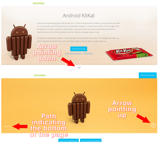
Google employs arrows and paths on their Android KitKat page.
Two of the most effective visual cues you can use to guide a visitor down your homepage are to use arrows and create a path. As you can see with Google, they’re not afraid to employ these elements in their design. Their arrows and paths don’t just show where users should go on their page, they also show users where they are on the page.
Arrows are universal signs that encourage people to look in the direction they’re pointing, and paths effectively guide a visitor down a predetermined route. Combine these two elements and you have an effective 1-2 punch that dramatically increases the chances of your visitors scrolling down.
2. Get Your Users to Notice Something
From brightly colored road signs, to brightly colored buttons on your favorite websites, the concept of using contrast to call attention to an object is something we see every day - and for good reason.
Take a look at Apple's page for their new Mac Pro:
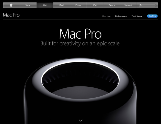
Apple strategically placed a bright blue button on a page that would otherwise be lacking in color.
With huge white copy on a black background and a high-res photo of the product, it's hard not to stare at the middle of the screen. But there's another element that calls your attention through contrast - the bright blue button with the "Buy Now" call to action.
With most of the page in black and white shades, even the smallest hint of color is enough to command your attention. This bright blue button set against the minimalist design and color palette of the page makes it easy to know where to click when you're ready to make a purchase.
A quick run through Feng Gui gives you a rough idea of where users are most likely to look on the Mac Pro page:
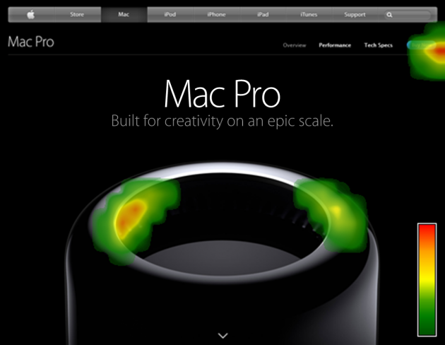
A heatmap analysis of Apple's Mac Pro page shows the most activity near the blue "Buy Now" button
But color isn't the only way to effectively use contrast to draw attention. You can also use contrast principles with text. You see it all the time with marketing emails and copy, like this email from Crate & Barrel. Go ahead, skim it first before reading the copy in detail.
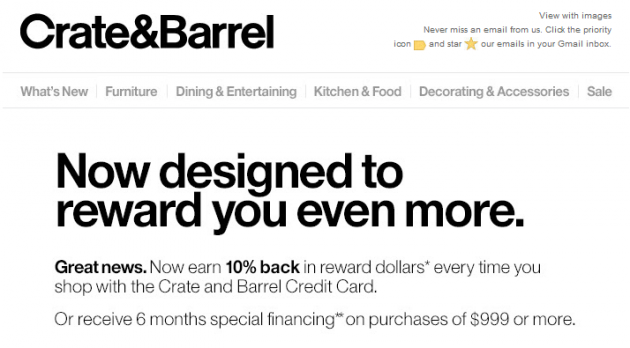
By using bold text, color and different font sizes in the ad, Crate & Barrel creates a hierarchy of where your eyes should look first.
If you skimmed through this ad, your brain probably only processed "Now designed to reward you even more... Great news... 10% back," which is exactly what they wanted to communicate with this email.
3. Get Your Users to Click Your CTA
I know, this sounds really obvious, but your CTAs could be the reason you're not converting as much as you'd like. What if I told you that a company was able to increase their revenue by millions of dollars simply by making a small change to their CTA?
After running studies on their site, StubHub discovered that some users were interpreting their "See Details" as a link to fine print, rather than a link to the ticket purchase page. They ran a few more studies and eventually decided to change their CTA to something a bit more straightforward - "Go."
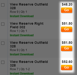
The “Go Button” that you can now find on every StubHub event page.
Shortly after implementing this change, StubHub saw an increase in conversion rates, which as I mentioned earlier, resulted in millions of dollars in additional revenue. You can read the full story on StubHub's success at this link.
The lesson to be learned from StubHub's experience is that you have to be clear about what your CTA does. The last thing you would want is for your site's visitors to start looking elsewhere on your page to complete an action, or worse, leave your site altogether out of frustration.
Test your own CTAs and try out few variations. They may take up the least real estate on your page, but as you can see with StubHub, small tweaks based on your study findings can lead to huge changes in your conversion rates.
Test Everything
Getting a fresh pair of eyes on your copy or a new design is always a great way to find things you might have overlooked. It's not precognition, but it's probably the next best thing.
Whether it's through UserTesting or running hallway tests with your co-workers, gathering feedback from others will allow you to anticipate how users will react to your site or app... which oddly enough, sounds like a super power to me.

Insights that drive innovation
Get our best human insight resources delivered right to your inbox every month. As a bonus, we'll send you our latest industry report: When business is human, insights drive innovation.

Harvey Rañola is a former Marketing Associate at UserTesting. Outside of the office, he's busy watching sports or trying to convince his wife not to throw away his stash of death metal band shirts.