How to use an affinity diagram to organize UX research

When it comes to categorizing information, nothing is obvious. The way you perceive one bit of information can (and often will) differ from the next person. Why? Well, explaining that is difficult because it’s a bit like trying to explain how your brain works. Rather than getting to the bottom of neurons and synapses, UX researchers came up with a method for categorizing and sorting information using an affinity diagram, called affinity mapping.
What is affinity mapping?
Affinity mapping, sometimes also known as affinity diagramming, snowballing, or collaborative sorting, is the process of creating an affinity diagram. Simply, it’s when you gather qualitative information about your users and group it by category.
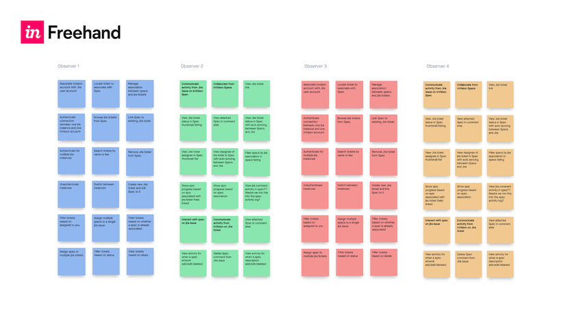
To get started with affinity mapping, you need to gather information about your users through usability testing, surveys, observation, or any other method for collecting feedback. Once garnered, you’ll need to write out each idea or finding on movable cards, like sticky notes. Then, you’ll need a large space (or a real-time online whiteboard) where you can stick, organize, and rearrange the ideas.
But what exactly are you trying to create by rearranging all these sticky notes? An affinity diagram, of course.
What is an affinity diagram?
An affinity diagram, sometimes also known as a cluster map, is used to organize information and is the output of affinity mapping. Affinity diagrams help organize information into groups of similar items—particularly useful when analyzing qualitative data or observations.
When it comes to UX, understanding your users’ needs can be complicated. You have multiple sources for collecting customer insights or feedback beyond usability tests, like support tickets, customer service chats, interviews, and much more. But all of this information doesn’t reduce down to a number or statistic that can be measured against a KPI. That’s why making qualitative data actionable can be difficult, not to mention ambiguous.
With the use of an affinity diagram, design, research, and product teams are one step closer to synthesizing qualitative data—from multiple sources—into one, actionable visual.
How to use affinity diagrams for analyzing user research
User research is used to understand the needs, behaviors, and motivations of users in order to deliver an exceptional user experience. While monitoring click-paths, conversions, and other forms of quantitative data is useful, truly delighting your user requires you to pay attention to the things only uncovered during qualitative discovery. However, this information isn’t as easily synthesized as quantitative data, as mentioned earlier.
Commonly, user research is digested through thematic analysis. During thematic analysis, you aim to make sense of all the notes, observations, and discoveries you’ve documented across all your information sources, by creating themes to organize the information and build throughlines across every individual idea. If you haven’t guessed it already, an affinity diagram is an excellent tool for thematic analysis.
Depending on your role and the type of research you conduct, the themes you create for your affinity diagram can vary. Here are some examples of affinity groups that you could form from your UX research:
- User sentiment and facial expressions when completing certain tasks
- Frequently used words or phrases when describing a product or experience
- Suggestions for improving your product or experience
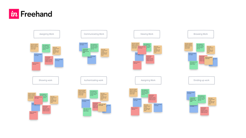
How to create a traditional affinity diagram in five easy steps
- Record all notes or observations on individual cards or sticky notes
- Look for patterns in notes or observations that are related and group them
- Create a group for each pattern or theme
- Give each theme or group a name
- Create a statement of what you learned about each group (provide your analysis or key insight)
Now that you’ve completed your affinity diagram, it’s likely time for you to share your findings with the larger group. This could include key stakeholders within your team or even the c-suite. So, surely, you want to make a good impression that tells a strong story. Unfortunately, the traditional method for affinity mapping isn’t very shareable—as whiteboards and office walls aren’t easily transported.
Make sense of your research remotely with a virtual affinity diagram template
We’re excited to announce that we’ve partnered with InVision to create an affinity diagram template for teams to organize ideas and data to collaborate remotely in real-time. The template is available in InVision’s online whiteboard, Freehand, and is completely free to use.
How to use the affinity diagram template
Step 1: Import your data from UX research
Bring your ideas to the table by creating a virtual sticky for each data point. If multiple people are collaborating on research, work synchronously and allow each person a place to record their observations.
Step 2: Look for patterns and sort by theme
Ask your team to help organize your stickies into groups. Watch each member of the team make their own connections between the data points.
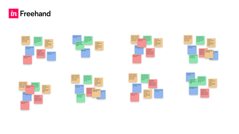
Step 3: Name the groups
When every sticky has a spot, discuss what makes them similar and name each group.
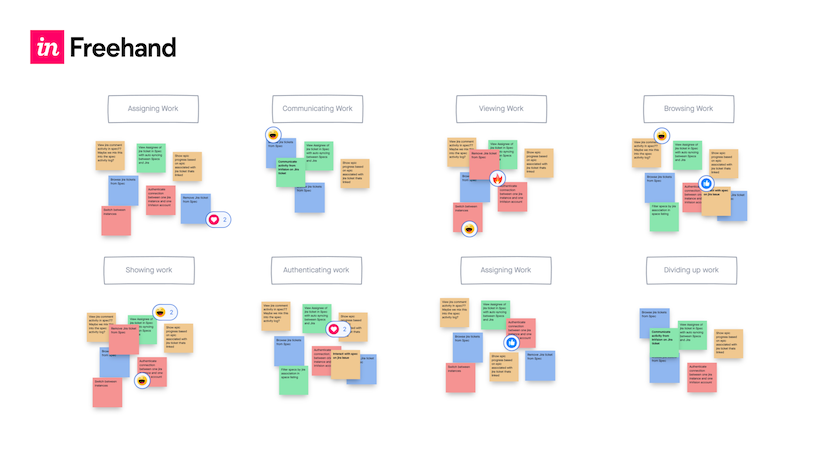
Step 4: Speak up
Use Freehand reactions (animated emojis to provide feedback in real-time) to vote on each category’s priority, value, and impact on the business.
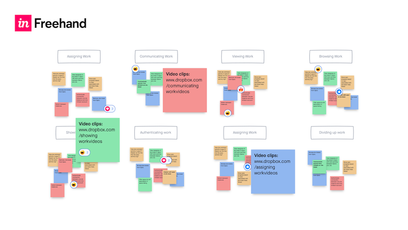
Step 5: Add content
Drop in any video, photo, or other content that can reinforce each group’s theme. Add each piece of content to the Freehand for reference after your mapping session is complete.
At the end of your session, your team will better be able to synthesize your UX research methods into a more thorough understanding of your data with an easy-to-use affinity diagram template.
Next steps
Check out the new Freehand template gallery today, filled with inspiring templates contributed by industry leaders. And start using the UserTesting Affinity Diagram template to accelerate your qualitative research analysis, as well as other templates for brainstorming, sprint planning, and more.
The UX research methodology guidebook
Learn how to make customer feedback the cornerstone for building great experiences.

Allison is a Product Marketing Manager at UserTesting where she’s focused on go-to-market strategies for UserTesting partnerships and technical integrations. Aside from Product Marketing, she loves Boston sports and her cat, Stevie.