Several months ago I signed up for a free trial account with a popular online shipping service. Signing up was easy. Until I was asked for my credit card information. Naturally I hesitated. Why did this company need that information for a free trial? I knew this trick. I’d sign up, use the service a few times and promptly forget all about it. But the company had my credit card information, and that free trial would automatically turn into a subscription unless I cancelled it. And I probably wouldn’t even notice. At least not until several months later when I would recognize the recurring charge on my credit card bill.
I hovered my mouse over to close the tab, when a exit overlay appeared, pleading me not to leave just yet. The service promised it would be easy to cancel when my trial was up. They said it with such genuine empathy for my situation that I was swayed to continue.
But this time I was going to remember to cancel! I put a note in my calendar, and when the day arrived I went to the site to “quickly and easily” cancel my account. That’s when I started to get that sinking feeling.
There was no clearly marked button. Nothing in my account settings. Only after about 10 minutes of digging did I find a note buried in the company’s FAQ section that curtly directed users to call a 1-800 number to speak with a representative about your account options.
I didn’t realize it then, but I had fallen victim to a deceptive pattern UX—what DarkPatterns.org calls a “roach motel” and is also an example of “forced continuity” (we’ll get into more details on these below). In fact, most of us encounter deceptive patterns in UX on a regular basis and may not realize it.
And it’s not surprising. The dark side of user experience isn’t something we like to talk about in the UX community. After all, UX is a force for good, right? Well, as it turns out, just like with superheroes, great power comes with great responsibility.
Understanding your users gives you the insight to give them a better experience, but it can also show you how to manipulate them as well.
In this article I’m going to share a few examples of deceptive patterns in UX, and how they can impact your relationship with your users. I’ll also share a few suggestions on how you can modify deceptive patterns to become a force for good.
Forced continuity
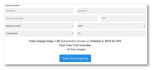
This one is so prevalent in the digital world, you might recognize it as a common sales tactic, rather than something more sinister. This happened in my original example with the shipping company. And I came across it again a few weeks ago when I signed up for a “free” two week trial with a stock photo service.
In order to access the free trial, I had to sign up for an account, credit card and all. All I had to do was cancel my membership after the trial was up. But if I was happy with the service, I didn’t have to do a thing. My membership would go into effect immediately after my trial ended and my credit card would get charged monthly, indefinitely. Or until I got around to canceling.
What’s so ‘dark’ about it?
There’s a lot of psychology that goes into creating deceptive patterns. They work because they take advantage of how most of us naturally think or react.
In the case of forced continuity, companies who use this tactic are betting on the fact that you’ll forget to cancel your membership before the trial ends. At a minimum, they’ll get at least a month’s worth—or longer—of fees before you get wise and cancel.
How to make it an honest pattern
While it seems a bit suspicious to ask for payment information for a free trial, I can understand the logic. If you encourage users to provide that information up front, they’re probably a lot more likely to choose to continue to use your product or service after the trial period ends. Especially if they don’t have to go through the effort of setting up an account. You’re actually saving them time and making the on-boarding process smoother.
So if you want to use this tactic, there are just a few tweaks you can make that make this a more honest approach that’s good for your users, and your business:
- Notify users before the trial ends - If you’re going to automatically start charging a user, be sure to notify them before you do. You probably already have their email, so send them a note, or post a message to their account the next time they log in to let them know their trial is ending and give them the option to cancel, or continue.
- Provide clear and easy cancellation - Don’t make users hunt for cancellation instructions. Provide a clear instructions and a direct link to a form or landing page that enables them to cancel their account.
Misdirection
Misdirection is also used a lot. I’ve noticed it most recently in mobile games. Specifically, through my obsession with Two Dots.
Players are trained to associate the green buttons with gameplay. You select a green button to start the game once you’ve opened the app. Then once again when you’ve selected the level you’d like to play, and yet again before you begin that level. That’s three times you’re asked to select the green button.
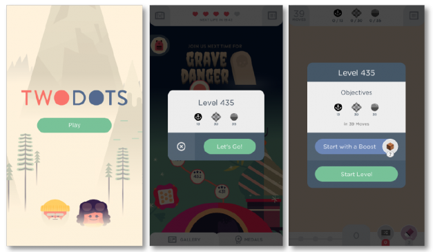
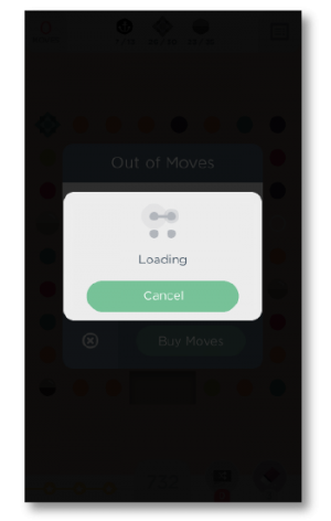
Now here’s what players see if they lose a round:
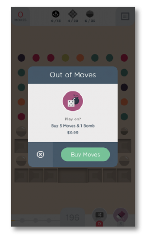
Guess how many times I’ve tapped the green button? I actually have no idea because I’ve lost count at this point. Despite knowing exactly what would happen if I selected the green button, my brain is already hardwired to give it a tap.
It also doesn’t help me that the “cancel” option is a tiny little “X” to the side, that I naturally overlook, again, because I’ve been trained to select the green button.
What’s so 'dark' about it
As a business, it’s perfectly natural to want your users to take some sort of action. Whether it’s to buy your product or sign up for a newsletter, there’s nothing wrong with having goals.
Where things get dark, however, is when your user’s choices are influenced heavily by design. To be clear, I’m not talking about choosing a red button versus a green one after a series of A/B tests showed it performed better.
But when a company purposely leads a user down a certain path by highlighting options that are beneficial to the company, but not necessarily the user, that’s getting into shady territory.
How to make it an honest pattern
Thankfully my beloved Two Dots redeems themselves a bit here. Immediately after accidentally selecting the ‘Buy More Moves’ button, the next window prominently displays a ‘Cancel’ button, which is helpful because it usually only takes me a fraction of a second to realize what I’ve done.
And as an additional safeguard, I’d still have to log in to the app store to complete the purchase. So while the misdirection is a bit irksome, no real harm was done. Yet that doesn’t get them off the hook completely.
Here’s what they could do to make the experience feel a bit less dark:
- Give all options equal weight - While you may really want your users to click that buy button, you don’t want them to feel tricked into doing so. Present choices as equally as possible so that your users don’t feel misled.
- Confirm - If you don’t have the space to put all the options on the table, then make sure you’re confirming after a selection is made by your user. Reiterate back to your user what they’ve just selected, and give them the option to continue or cancel.
Roach motel
Don’t let the clever name fool you. The roach motel is a super common tactic that’s used in the digital and physical world. The concept is simple: make it easy for users to “get in,” and then make it exceedingly difficult to “get out.”
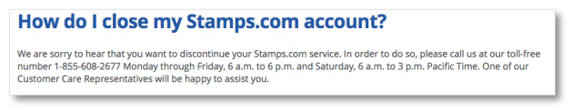
Subscription-based products are notorious offenders of this tactic. Signing up is easy to do and typically requires little information from you. But if you want to cancel? Good luck figuring out how to do that. Cancellation information is often buried or not listed at all.
And often companies require you to put in a lot of effort to close out your account. A popular method is requiring you to call an 800 number and speak to a customer service representative. Nobody wants to do that.
What’s so dark about it?
This approach is like being a fair weather friend. A business has to take the good with the bad, which means being honest and helpful to users all the time—not just when it’s beneficial to the bottom line.
How to make it an honest pattern
In this case, all you really need to do is treat your users equally, no matter what action they’re trying to take. If you make signing up for a newsletter super easy, then make unsubscribing just as easy (or easier).
- Create in-kind options - If you allowed users to sign up for a service on your website, then let them cancel there as well. Don’t make them call an 800 number or mail a written request.
- Be upfront about the process - If for some reason you just can’t make things easy on both sides of the fence, then give your users fair warning ahead of time. Let them know that if they choose to cancel their account, they’ll need to do so in writing, or whatever your requirement may be.
- Make it findable - The only thing more frustrating than having to call an 800 number to cancel a subscription, is not being able to find that number in the first place. Make your cancellation or unsubscribe instructions clear, easy to read, and most of all, easy to find.
Understanding your users is the best way to be sure you’re providing a product or service they’ll want and use. And while it can be tempting to use that knowledge for your own benefit, resist the urge to turn to the dark side and use your UX powers for good instead.
Insights that drive innovation
Get our best human insight resources delivered right to your inbox every month. As a bonus, we'll send you our latest industry report: When business is human, insights drive innovation.

Jennifer is a Senior Content Strategist for UserTesting. When she's not dreaming up new ways to connect with audiences, you can find her traveling around the world or enjoying a glass of wine with friends.


