
To design a compelling user experience (UX), it helps to learn the basics of design psychology. If you understand how the human mind works, it becomes easier to design experiences that capture attention and keep it. Psychological principles are the (sometimes) invisible forces in design psychology that influence people and drive them to action. In this post, we’ll uncover the many different principles that exist, and how you can use them to build better experiences for your customers and beyond.
Why design psychology is important for UX
Unless you’re building entirely automated experiences, there is some element of human behavior that needs to be considered when designing products or experiences. After all, it’s humans that will ultimately be your end-user, and it’s how they interact with your product that will determine its success and usefulness.
By understanding how different psychology principles influence human behavior, you can design products that elicit specific responses, emotions, and actions from your target users. Let’s take a look at some of the design psychology principles.
1. Hick’s Law
Hick’s Law explains that the time it takes for a person to make a decision depends on the number and complexity of choices available to them. So if the number—or complexity—of choices increases the time to make a decision increases logarithmically.
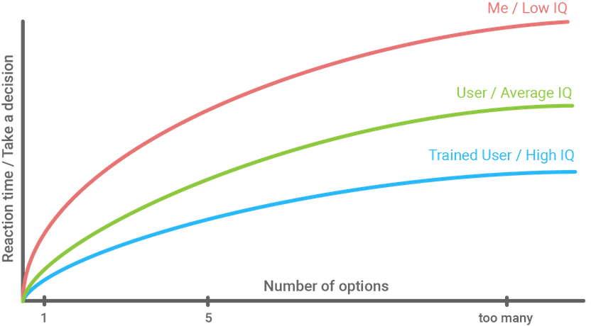
So, as a designer, you’ll want to consider these three things when building products and experiences as it relates to Hick’s Law:
- Simplify choices for your user by breaking down complex tasks into simpler steps
- Avoid overwhelming users by suggesting options rather than listing all of them
- Minimize the user’s cognitive load by providing an experience that’s logical and progressive
2. Cognitive load
Cognitive load describes the mental effort that’s required to learn new information. In UX design, we can think of cognitive load as the amount of thought you need to exercise in order to use a product or complete a specific task. So if the amount of information that needs to be processed to complete a task is very high—or exceeds the user’s ability to understand—the product’s overall success suffers.
You can’t change your users’ actual processing power, but you can begin to understand their limits. By watching your users use your product or complete an experience you’ve designed, you’ll become more familiar with their expectations and ability to process information. Remote usability testing is a great solution to better understand your users.
3. Gestalt Principles
The human brain is wired to see structure, logic, and patterns. It helps you make sense of the world. In the 1920s, a group of German psychologists developed theories around how people perceive the world around them and called them the Gestalt Principles.
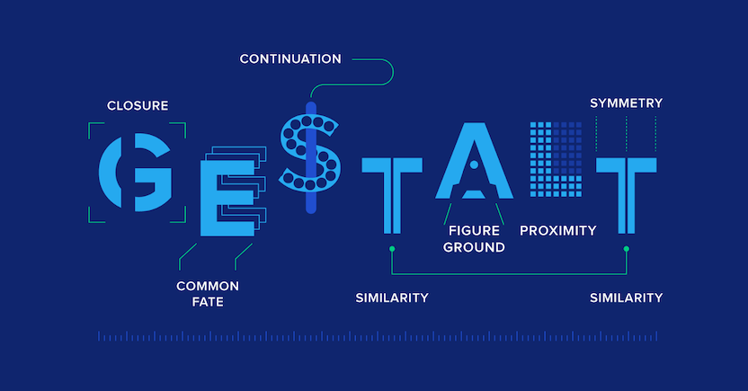
Essentially, the Gestalt principles of visual perception relate to design psychology because they detail how our brains create structure by default. And this is essential for designing persuasive UX. There are seven principles that we’ll detail briefly here, but check out this post for more detail: 7 Gestalt Principles of visual perception.
Figure-ground
The figure-ground principle states that people instinctively perceive objects as either being in the foreground or the background. They either stand out prominently in the front (the figure) or recede into the back (the ground).

Similarity
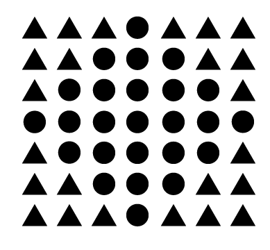
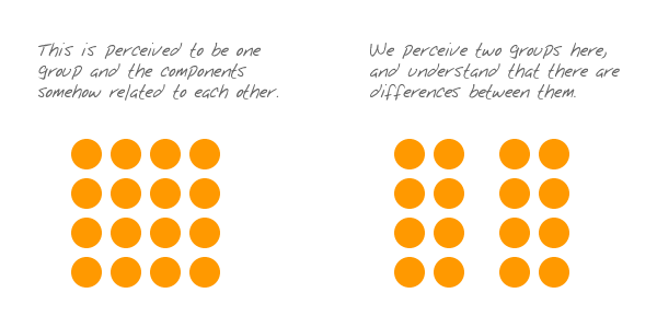
The principle of similarity states that when things appear to be similar to each other, we group them together. We also tend to think they have the same function.
For instance, in this image, there appear to be two separate and distinct groups based on shape: the circles and the triangles.
A variety of design elements, like color and organization, can be used to establish similar groups. In the image below, for example, even though all of the shapes are the same, it’s clear that each column represents a distinct group:

Proximity
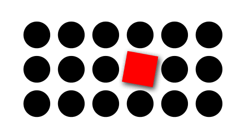
The principle of proximity states that things that are close together appear to be more related than things that are spaced farther apart.
Proximity is so powerful that it overrides the similarity of color, shape, and other factors that might differentiate a group of objects.
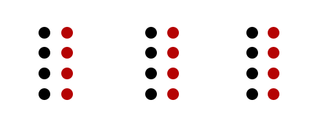
Notice the three groups of black and red dots above? The relative nearness of the objects has an even stronger influence on grouping than color does.
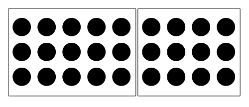
Common region
The principle of common region is highly related to proximity. It states that when objects are located within the same closed region, we perceive them as being grouped together.
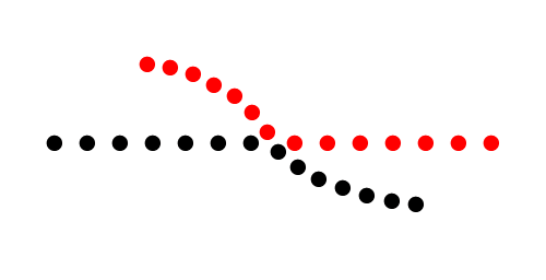
Continuity
The principle of continuity states that elements that are arranged on a line or curve are perceived to be more related than elements not on the line or curve.
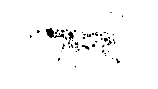
Closure
The principle of closure states that when we look at a complex arrangement of visual elements, we tend to look for a single, recognizable pattern.
Focal point
The focal point principle states that whatever stands out visually will capture and hold the viewer’s attention first.
4. The Isolation Effect
The Isolation Effect (sometimes referred to as the Von Restorff Effect, affectionately named after its inventor) predicts that when multiple similar objects are present, the one that differs from the rest is most likely to be remembered.
In UX, think about a pricing chart on websites.
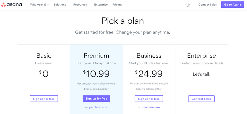
In the example, Asana draws your attention to the Premium pricing plan. The highlighted blue enclosure that it’s placed in ensures the Premium plan is what you pay attention to initially.
5. Aesthetic Usability Effect
The Aesthetic Usability Effect refers to the idea that users often perceive aesthetically pleasing designs as design that’s more user-friendly.
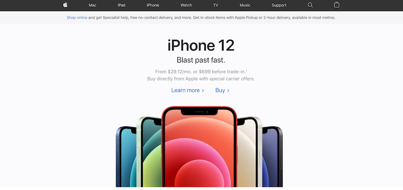
Many argue that Apple’s success can be attributed (partly) by paying close attention to aesthetics because it creates a positive response in the user’s brain and leads them to believe it actually works better. While aesthetics matter, the effect has its limits. A delightful design can make users forgiving of minor usability issues, but certainly not larger ones.
6. Jakob’s Law
Jakob’s Law states that users spend most of their time on other sites—meaning that users prefer your site works similarly to the other sites they already know. While this might seem like the guillotine of innovation, the underlying message is important.
How your experiences and products measure up to the competition is critical. That’s why competitive analysis is key.
But it’s important to remember, your competition isn’t always your competition. People who use Netflix, for example, have developed a taste for ease of use, content targeting, etc. So, if you’re developing a grocery store app, it might be smart to mimic some of the things Netflix does with their app—despite how they’re not competing for the same market.
7. Psychology of color
Color is one of the most powerful tools in the designer’s toolkit. You can use color to impact users’ emotions, draw their attention, drive conversions, and put them in the right frame of mind to make a purchase.
Ultimately, colors can provoke various emotions for many people. Take a look at the color psychology chart below to see some of the emotions and themes traditionally associated with colors:
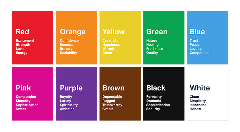
Keep in mind that color associations vary from culture to culture and from person to person. Men and women often have different color preferences, and colors that are en vogue this year might be effective for one group of people today and another tomorrow. If you'd like to learn more about color meanings, check out Canva's interactive tool on color meanings and symbolism.
8. Chunking
Chunking is an element of design psychology introduced by George A. Miller, which is why the concept is closely related to Miller’s Law. It states,
The average person can only keep 7 (plus or minus 2) items in their working memory.
Because of this concept, chunking was introduced to UX design as a way to group (or chunk) information into manageable bits of similar information. That way, people can process information more quickly. Possibly the most recognizable example of chunking is in the classic phonebook or dictionary.

9. Memory limitation
Memory is not always reliable. The way we store information is reconstructed by our thoughts, feelings, beliefs, and surrounding environment. Therefore, by knowing how memory works, designers can create human-centered interfaces that correspond to the users’ natural abilities, save their effort, and boost usability.
To design an interface that is user-friendly, UX designers should focus on design psychology and these basic laws of memory:
- Concentration: To remember something, people need to concentrate on it, or they will lose it in their short-term memory. The Gestalt principles and chunking help with this.
- Association: Memory works by connecting data with associations. If people are able to do this through your design, they’re more likely to store it in their long-term memory. The Isolation Effect is useful for associations.
- Repetition: Repetition is effective in moving information to long-term memory.
A final note on design psychology
While you don’t need to be an expert in psychology in order to be a proficient UX designer, understanding the basic principles of design psychology will help you build better products and experiences for your users.
By taking advantage of psychological principles you’re able to ethically guide user behavior and sometimes persuade them to action. While it’s true that a successful design today may not be a successful design tomorrow, adhering to the principles above ensures that you’re never missing the mark.
Testing at every stage of the design process
Explore tips and use cases for designers who test at every stage of their design process.


Steven is a Marketing Content Strategist. When he’s not inserting oxford commas where they belong, you can find him shooting pool at a local dive or building killer playlists on Spotify.