Interview with Oli Gardner from Unbounce: Landing Pages, Design, and Conversions

On August 19, Oli Gardner, Co-founder of Unbounce, joined us for an Ask Me Anything webinar. Oli has seen more landing pages than anyone on the planet, and he shared some of his lead gen techniques and conversion rate optimization tricks in the webinar. Before the webinar, we asked him a few exclusive questions.
What's the best way to get people to fill out a form?
There are a couple of things you need to consider with lead generation forms.
- First, are you offering sufficient value for the exchange? Are you balancing the “size of the prize” with the amount of friction required to get it? If you’re giving away an ebook, you don’t need much more than an email address.
- The other side of successful lead gen is about balance. Are you asking for enough information to separate quality leads/customers from the lookie-loos? Sometimes the answer to your acquisition challenges isn’t a higher conversion rate; it’s higher quality. This is critical when you have a sales team, as they don’t have time to deal with hundreds of low-quality prospects. This is where you have to trust in the counterintuitive approach of making your forms longer and more complex, as the net result will be leads that are well qualified and care enough to go through the extra effort to register.
In terms of design, I like to approach it with something I call “Form-First Landing Page Design.” The goal is to design your landing page as if it’s only a form and nothing else. You’ll see how this looks in the second example I show in the final question below. If you can communicate exactly what the page is about and what you can expect to get from interacting with it, then you have a smart form design. After which, you can work on testing adding different amounts of supporting content around the form until you find you optimal landing page.
Is it better to keep your CTA above the fold?
"Better" is a very subjective term, and the short answer is that every situation is different, and you have to test it to know. Above the fold is certainly the most common scenario.
As a general rule, the more complex the offer, and the more information (content) that’s required to convince a prospect to process, the more likely a below-the-fold experience might be the best option.
There’s an old marketing concept known as AIDA: Attention, Interest, Desire, Action. This describes a storytelling approach to landing page design, where you wait until you’ve seduced your visitor sufficiently before extending the “ask.”
You can read more about this topic on The Smart Marketer’s Landing Page Conversion Course.
Is it okay to use white text on a dark background on a landing page?
Absolutely! If you want to make it hard to read, annoy your visitors and have poor conversion rates.
Clarity is arguably the most important aspect of a high-converting landing page. You can break clarity down into two fundamental aspects: visual clarity and clarity of communication.
Effective visual design includes making it easy to read. You want to avoid a few things here:
-
Copy that’s small will be glossed over because it requires effort.
-
Too much copy can add unwanted perceived friction to the page. (“I have to read all of that? No thanks.”)
-
Poor readability—this is where white text on a dark background comes in.
-
Elaborate cursive font choices. Headlines should be easily scannable. If you get too fancy, you add another barrier to comprehension.
Can you give an example of a successful landing page you built and tell us why it works?
Following on from the AIDA mention earlier, I’ve started working on an updated methodology for this style of landing page design that I call WWWH: What, Why, When, How.
Stepping back, take a look at this landing page for an ebook:
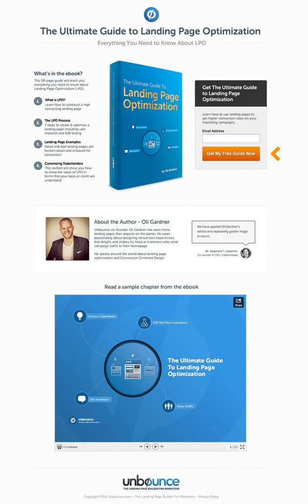
This is a very effective landing page (converts at around 60%), leveraging social proof and a free ungated preview of the ebook. However, there is quite a bit of information to take in, and you need to read from side to side to read the contents and the form information.
Taking the WWWH approach, I came up with this new version:
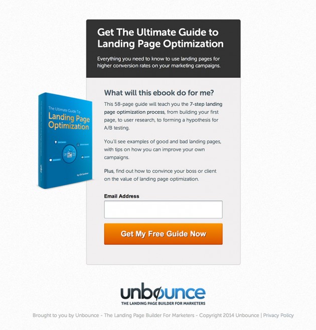
The information is greatly reduced and the reading experience is completely linear, from top to bottom. Breaking it down:
What: The headline and subhead clearly describe what the book is called and what’s inside.
Why: To increase the clarity, the question that your visitor would have is actually posed on the page, and then answered.
When: This isn’t an event, so the when isn’t required. If it were a webinar registration page, it would have the date and time here.
How: The simple one field form and a very clear and visually-contrasting call to action.
This version converts at 70%. That's a conversion lift of 16.7%, which is really good for an already high-converting page.
The WWWH method is very easy to apply to your landing pages, as it forces you to answer 4 very simple questions in your copywriting and design.
Want more landing page wisdom from Oli? Watch our on-demand webinar, Ask Me Anything with Oli Gardner.
Insights that drive innovation
Get our best human insight resources delivered right to your inbox every month. As a bonus, we'll send you our latest industry report: When business is human, insights drive innovation.

Oli has seen more landing pages than anyone on the planet. He coined the term "Conversion Centered Design," authoring the marketing theory behind its seven principles. At Unbounce, he lives in front of a 20ft whiteboard, mashing up usability, interaction design and landing page optimization to create better conversion experiences. His disdain for marketers who send campaign traffic to their homepage is legendary. He was recently named "The 2014 marketer to watch" in the under-42 category by his mother.