Several years ago I treated myself to dinner at a fancy restaurant in Paris. The place was not surprisingly known for its outstanding cuisine, but what really drew me there was its reputation for attentive yet “invisible” service. That sounded a bit like an oxymoron, so I made it my mission to find out.
When I arrived, no less than six waitstaff interacted with me between the maitre d' and my table. This “invisible” thing was starting to look like a marketing ploy. But as soon as I was seated, the magic began to unfold. While one waiter was introducing himself and patiently enduring my attempts to speak French, a small army of others began cultivating the experience I’d heard so much about. Without a word or even my noticing, candles were lit, champagne and caviar carts appeared, and a special table to place my purse materialized by my side.
The rest of the night, anything and everything I could imagine wanting somehow magically appeared at my table nearly before I’d finished thinking about it.
I now understood what all those reviewers meant by “invisible” service.
Invisible interfaces
A great experience doesn’t necessarily require a handful of apps and gadgets. In fact, sometimes it’s best to have no interface at all—or at least one that’s less obvious to the user.
Good design is obvious. Great design is transparent. -Joe Sparano
Invisible or hidden interfaces sometimes referred to as “zero UI”, are a hot topic in the design community. And for good reason. As connected devices like the Nest thermostat, Amazon Echo, and Fitbit become more and more commonplace, traditional interfaces like screens become less practical.
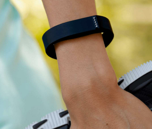
Via Fitbit.com
But it’s not just trendy new gadgets that benefit from invisible interfaces: traditional products that still rely on screen-based interactions can learn something from this new trend, too.
Let’s take a look at why invisible interfaces are becoming such a trend and how they can help, or hurt, UX.
The allure of invisible UI
It’s hard to imagine getting attached to something users don’t interact with often. That is until you recall how positive a frictionless interaction can be for users. Interfaces that weed out as much unnecessary effort as possible are really just seeking to achieve what any UX champion is striving for: a delightful, usable experience that solves a problem users have.
The real problem with the interface is that it is an interface. Interfaces get in the way. I don’t want to focus my energies on an interface. I want to focus on the job…I don’t want to think of myself as using a computer, I want to think of myself as doing my job. -Don Norman
A screenless mindset for a screen-filled world
It’s a nice vision of the future, but what about all the apps, sites, and products that still rely on a screen to interact with users? Interfaces may sometimes add extra steps, but they’re also built into much of the technology we use today—and they probably won’t be going away anytime soon.
The good news is that, just because your product needs an interface, that doesn’t mean you can’t aspire to make it as invisible as possible.
Many interfaces are designed to guide users as they learn how to use a product. But when products are designed to personalize and anticipate the user’s needs, a few layers of interfacing can immediately be reduced—if not eliminated entirely.
The concept of an invisible interface isn’t just the latest UX design fad: it’s a new way of approaching the user experience that thinks beyond the screen.
Anticipatory design
The concept of anticipatory design was first coined by HUGE CEO, Aaron Shapiro, and promotes designing products and experiences that use available data to anticipate what customers want to do next. This concept can be taken a step further with invisible interfaces in mind to see where steps can be eliminated, further streamlining their experience.
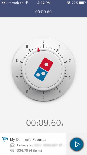
Let’s take one of my favorite guilty pleasures, Dominos, as an example. Sometimes you just want a pizza and you want it now. The company realized that many of its customers were placing the same order again and again, so they designed an app that takes ordering out of the process completely with their Zero Click app. Customers only had to sign in to their account when setting up the app, at which point they selected their preferred order. After that, simply opening the app on their phone will place an order (after a 10-second grace period to prevent accidental orders).
Personalization
Have you ever opened up an email because it felt like it was curated just for you? Or visited a website that seemed perfectly tailored to your needs? Personalization is one way that companies can connect with their users that gives them the information they need in a way that feels genuine. It also happens to be another way you can work toward having a more invisible UI. The onboarding process is a great place to start gathering information about your users that can be saved and pre-populated for future interactions.
By finding out at much as you can about your users during their initial interactions, you can save them time and the mental effort needed to provide known information in the future. ModCloth does a great job of this with its ‘Fit for Me’ feature in its app. The feature lets users input their measurements, then makes suggestions based on similar-sized users reviews.
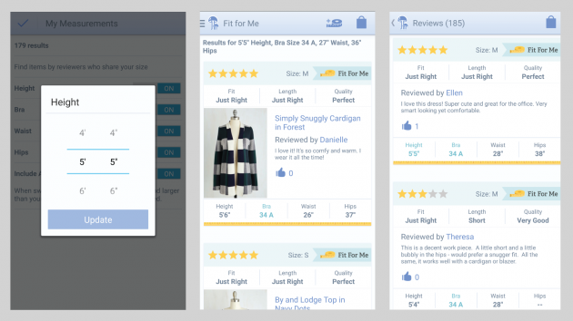
You can read more about personalization and the ModCloth feature here.
Empathy
We talk about empathy a lot in the UX community and there’s a good reason for it: it’s at the heart of everything we do to delight and engage users. When it comes to an interface, empathy can be one of your most powerful tools.
Understanding what your users want, need, and can achieve with your product will help you design it to fit within their lives rather than forcing them to adapt to using your product. Get out of the office and observe how real people are currently handling the problem you’re trying to solve. Will an additional interface really help your users achieve what they’re trying to do, or are there ways you can simplify things behind the scenes instead? Staying empathetic to the needs of your users will keep you centered on finding a solution that works best for them.
Be invaluable if not invisible
Not everyone is ready to completely eliminate the screen from user interaction. But that doesn’t mean invisible UI can’t still provide valuable insight for designers. By focusing on the experience and not the interface, you’ll ensure that your users remain at the core of your mission. And whatever interface you use will make their lives easier and better.
Insights that drive innovation
Get our best human insight resources delivered right to your inbox every month. As a bonus, we'll send you our latest industry report: When business is human, insights drive innovation.

Jennifer is a Senior Content Strategist for UserTesting. When she's not dreaming up new ways to connect with audiences, you can find her traveling around the world or enjoying a glass of wine with friends.