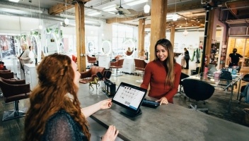
UserTesting success story: how CaringBridge increased app engagement by 25%
UserTesting recently awarded CaringBridge, a personal health journal site and app to help connect family and friends throughout any health journey, a grant of pro bono studies through our OneWorld program for nonprofits. UserTesting OneWorld helps charitable organizations create better fundraising and donor experiences, thereby increasing their impact in the community.
We sat down with Monika Perkerwicz, Mobile UX Designer, and Philip Noyed, Senior Creative Director, for a quick Q&A to talk about the successes the CaringBridge team achieved on their website and app through their partnership with UserTesting OneWorld.
The team conducted a variety of tests to help enhance its iOS and Android mobile app, responsive website, and gather valuable insight on menu affordance/labeling, navigation, and user preferences.

What are examples of some of the studies you launched?
Mobile app
For our newly refreshed UX of our mobile app, we tested prototypes created in Sketch to regression test a few of our major personas. These tests specifically tested the UX to ensure that we were delivering an intuitive experience before bringing these concepts into development.
We also tested IPAs and APKs uploaded to UserTesting so we could see how users interact with our platform. The goal was to ensure we would not run into any backend issues, users could successfully search, post, and interact with the full CaringBridge app.
Responsive site
We tested prototypes for our responsive website which gathered user feedback in an A/B test fashion. We asked users which concept they preferred more, and more detailed questions related to the ease of completing tasks such as authentication, searching for a CaringBridge site, finding specific content on that site such as the patient’s personal fundraising campaign, and leaving thoughts and well wishes to the patient.
Preference studies
We tested prototypes asking users which UI components they preferred, and why. The goal was to gather perspectives of our target audience to ensure coloring, sizing, and layout were all sensible. Since many of our users are over the age of 60, ensuring that our product is easy to navigate is one of the top priorities for CaringBridge.
Menu affordance and labels
We ran a series of card sorting tests to gather insights as to what labels made the most sense to a user. This gave us great ideas to inform the discovery phase of our site architecture. We foresee ourselves revisiting these tests as we get further into our UX design phase.
Navigation
We ran a number of smaller tests that focused our users on one specific piece of functionality. The goal was to quickly get insights so our design and product team could quickly deliver data-driven details to our development team.
What did you learn and what changes did you make based on these insights?
A few notable changes we were able to apply based on the insight we gathered through UserTesting varied from small navigation changes, ensuring that we’re on the right track, and catching authentication issues new users were running into.
Navigation
Our iOS and Android app had originally introduced a concept of an ‘action bar’ for our users who were reading a journal entry. As we started to circulate beta builds internally, we realized that many users were having trouble finding where they can comment on a journal entry. The icon was lacking a label and was in an obscure position on the screen.
We saw the opportunity to clarify this action to users by testing a prototype with two new concepts. By quickly sending these tests out to a pool of users, we were able to get quality responses, hearing thoughts of users as we gave them the tasks at hand to comment on a journal entry. We were then able to confidently adjust our UX and develop on our concept.
Regression testing
Before launching our apps, we ran a series of regression tests with our iOS and Android builds which gave us positive feedback from users of their experience as both new and existing users. Some feedback that users gave us said that the app was easy to navigate and they thought that the UI looked professional. They also noted that the app required no tutorials to onboard them, but they were confused about the difference between a donation and a tribute.
We also gathered feedback on areas to enhance, such as how we display our photo gallery and that users wanted to see a preview of captions. Users also wanted enhancements on photo sizes and more details on a site author’s back story.
Lastly, we gathered feedback on issues that users had with authentication for both a new and existing user.
Starting a site
We ran a series of tests asking users specific questions on starting a CaringBridge site. We integrated steps into the workflow to ask them if they would skip over the steps or if they found value in completing certain steps. It was interesting to see different answers from different user demographics, which will help us make decisions during our planned revitalization to the platform in 2019.
Do you have any metrics you can share? How do you know the changes you made were successful?
Our mobile app is still young, but overall from a refreshed user experience and technology that’s been tested, mobile app installations on iOS have increased 26% and app sessions (using the app for more than two seconds) have increased by 25%.
Additionally, our average App Store rating has improved as well. Prior to the relaunch, our rating was an average of 2.5 stars. Following our app redesign and leveraging UserTesting, our app now has an average rating of 4.1 stars.
For our responsive website, we gathered valuable feedback in our first round of tests that we put into production and traffic impacts. The concept we tested with UserTesting was a major UX change for CaringBridge called a ‘Task Bar.’
Prior to our new taskbar, a CaringBridge site page had three large icons at the top of the page for three actions a user can take, and three other action icons at the bottom of the page. We prototyped a new concept that presented all actions at the top of the page in a ‘taskbar’, denoted by both an icon and label.
During testing, we asked users to complete tasks that were located under the taskbar items. They were able to successfully complete each task and give us comments, saying that liked not having to scroll down to the bottom of the page to see everything the site had to offer. They also liked that our new concept appeared more organized and the placement of the icons was intentional. Lastly, they liked that the icons helped with wayfinding. Our new taskbar shows that the site has increased engagement by 3%.
Want to learn more?
If you’d like to learn more about how UserTesting can help you understand your customers through on-demand human insight, contact us here.
You can also learn more about and apply for a UserTesting OneWorld grant here.
Insights that drive innovation
Get our best human insight resources delivered right to your inbox every month. As a bonus, we'll send you our latest industry report: When business is human, insights drive innovation.

Lara leads the Digital Marketing team at UserTesting, overseeing social media, content, webinars, and SEO.