
In this report
Which online grocery retailers deliver an exceptional customer experience?
Which online grocery retailers deliver an exceptional customer experience?

This report is for retail executives working to deliver seamless online shopping digital experiences during accelerated customer demand and fierce competition. This is a competitive UX measurement report.
What's competitive UX measurement?
Competitive UX measurement is a way to evaluate the performance of your product’s or service’s user experience relative to your competitors.
UserZoom's approach to competitive UX measurement is unique because:
- Aligns to strategic business KPIs and revenue-critical experiences
- Quantifies users’ attitudes and behaviors into a single score to provide a complete view of the user experience
- Identifies tactical areas of improvement
- Consistent across all competitors (we use the same tasks, questions, and screeners each time)
Now let's reveal the US and UK online grocers we'll evaluate.
| USA | UK |
| Walmart | Iceland |
| Instacart | Waitrose |
| Amazonfresh | ASDA |
| Target | Sainsbury's |
| Kroger | Morrisons |
| Tesco | |
| Amazon.co.uk |
Introduction
The pandemic put online grocery retailers under huge and unexpected pressure as consumers shifted their spending online.
In response to this demand, retailers have had to rethink operations, supply chains, and the online experience. Some have struggled to keep websites up and running, others to continue to match customer expectations around delivery and stock availability. This isn't an isolated challenge, as McKinsey expects a 41% increase in people purchasing groceries online when COVID-19 has subsided.
With more and more consumers planning to shift the majority, or even all, of their spending online, this change in customer behavior will permanently affect the retail industry. As online grocers scale up or adapt to changing customer behavior, the user experience has never been more vital. It enables organizations to retain its new customers and underpin future growth.
How can you ensure your digital experience meets new consumer demands?
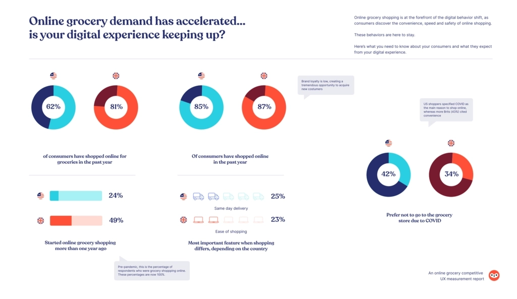
Leaders and runners-up

To truly measure our 12 online grocery competitors analytically rigorously, we use QXscore.
QXscore is a holistic score combining behavioral and attitudinal data, plotted on a 100-point index. This meaningful, easily understood standard for measuring user experience identifies tactical areas to improve UX health. It can be used to track progress over time, relative to competitors, or across multiple lines of business, digital properties, and products.
Both sites also offer a great experience when browsing through categories and searching for specific products. This is a key victory because 'search' was ranked the most important feature by consumers in both regions.
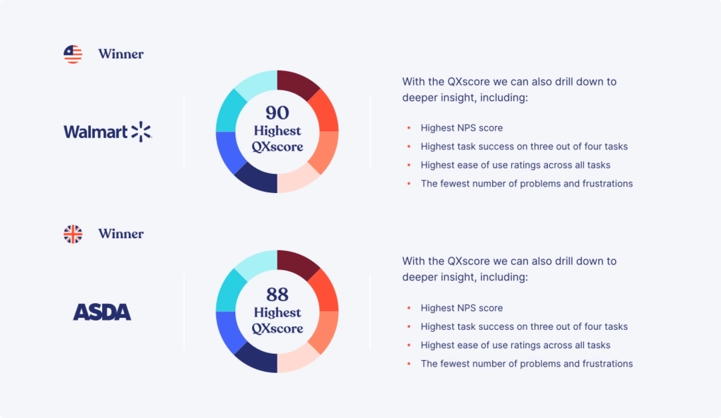
Overall ranking
Using QXscore, this is how the global competitors are stacked up against each other.
It’s encouraging to see all sites classified as 'good experiences' with only three of our competing brands on the lower end of 'good' bordering on 'average' experience.
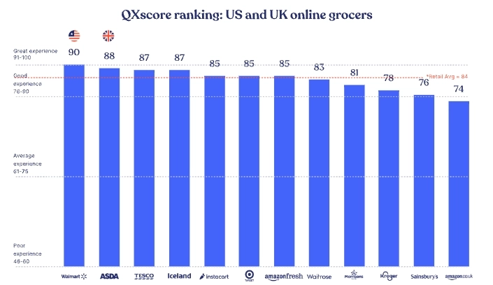
Bottom of the table
At the other end of the table, we see our lowest-ranking US competitor, Kroger, and our lowest-ranking UK competitor, Amazon.co.uk.
Lessons from the report

77% of professionals want to track UX improvements over time, and 69% want to see their data relative to competitors, as these are incredibly powerful ways to see the value of UX and communicate the impact UX has on business goals.
However, digital experience professionals struggle to track the results of their activities because they’re unsure of which metrics are most important. 58% of professionals rely on product or site analytics (58%) rather than direct measures of UX. Fewer than half rely on behavioral UX data like task success or time-on-task.
This means they're missing half the story. And if you're missing half the story, you can't provide a completely satisfying customer experience.
With our QXscore, we not only combine attitudinal and behavioral metrics to reveal what users say, do and feel, but we can dive deeper into specific component areas and their related tasks to reveal actionable insights.
Using QXscore, we analyzed the digital experiences of 12 leading grocery retailers across North America and the United Kingdom. Here we’ll take a deeper dive into some of those task-based insights, revealing exactly what consumers are looking for when they visit an online grocer.
Browsing by category
In this task, we asked respondents to browse by categories, without using the search feature.
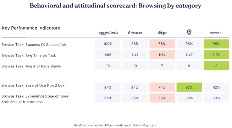
On average it took Walmart customers less time and fewer pages to complete the task successfully.
Kroger is the bottom performer, with the lowest task success and ease of use, and highest number of problems.
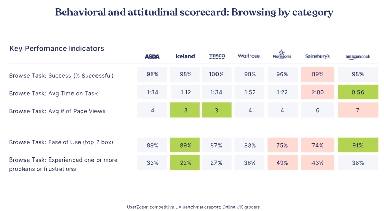
For our UX competitors, Amazon.co.uk had the lowest average time on task and highest ease of use score; but the most page views, while Sainsbury’s and Morrisons were the most difficult to use, and customers experienced the most problems and frustrations.
Why is browsing by category a big deal?
It’s an accessibility issue. Not everyone can type into a search tool, and although there is speech recognition software that can input text for users, this may not give the most accurate results.
Accuracy is also a key factor. In this sentence, I’ve typed broccoli incorrectly several times before letting autocorrect take over. How many retail search tools allow for mistakes or inaccuracies or ‘near enough’ searches?
It’s also a question of preference. There are numerous studies about whether users prefer to use search vs. menu navigation to find what they want, and generally, there’s a 50/50 split. So it’s clear that you need to optimize navigation and search to provide a good user experience for 100% of your costumes.
And it also comes down to consumers not having a brand preference and just wanting to see what’s in stock and the relative price differences. The more information you give your users from the get-go, the less they’ll have to root around for the answers and increase the chances they’ll navigate away from your website.
Best practice
Amazon Fresh has helpful images associated with top categories, and clear sub-categorization of products
Walmart has a clear menu structure and filters to help quickly narrow by brand, type, and more.
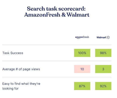
Amazon's UK counterpart has clear and easy navigation, with the helpful use of photos in the main category menu. Clear sub-categories make it easy to locate desired individual products quickly.
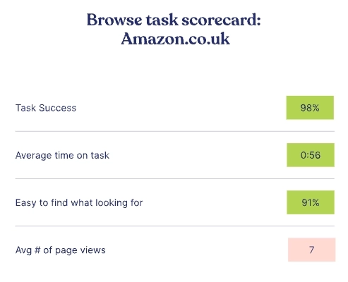
Both Amazon.com and co.uk could also reduce the higher than average number of pageviews needed by including the most important information in the product summary. For example, in the grocery category, very few product reviews are available, making the star ratings much less relevant than say if the item is on sale or if it’s been purchased before.
Using search and save for later
In this task, we asked participants to find and add two packs of Tide pods (US) or Surf Capsules (UK) and some bananas to their basket, and save them for quick access or reordering in the future.
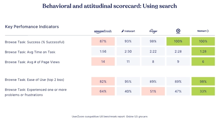
Walmart is top performer here with 100% success, lowest average time on task and pageviews, and presenting the least number of problems.
Amazon Fresh users have lowest success, suffer the most effort, and experience the most problems and frustrations.
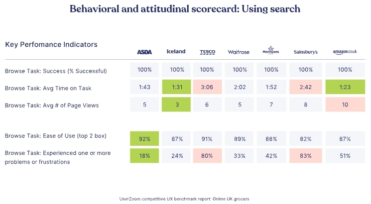
For the UK competitors, ASDA customers had the fewest problems and highest ease of use rating and Iceland had the lowest number of pageviews and one of the lowest time on task results.
Tesco and Sainsbury’s customers experienced the most problems/ frustrations mostly due to not being able to save items.
Why is saving for later a big deal?
It’s all about providing convenience, while encouraging repeat visits to your site. If it’s a customer’s first time visiting your site, they may not be ready to do a full shop just yet or are possibly comparing against other retailers, so offering them the chance to save items is a convenient option so they know they’re products are available in a safe and handy place.
Being able to save or favorite items that you regularly shop also encourages repeat visits, as customers know that it will be quicker and easier to shop with you, as there’s a purpose-built shopping list waiting for them.
The speed of online grocery shopping is a key discovery for people new to online shopping, and the faster you make the ongoing process of weekly shopping, the less likely they’ll stray to a competitor.
Best practice
Walmart provides a clear and prominent search bar on the top, and gives relevant search results. Users have the ability to add multiple quantities of items from the results page.
Following your users’ mental models for achieving simple tasks is an effective way to add speed and convenience to your experience. You can suggest an action via short-hand by using the most popular and logical feature. For instance, using a heart symbol to indicate ‘save to favorite’. As you can see in the comparison below, problems and frustrations arise when this mental model isn’t adhered to.
4 features consumers loved when grocery shopping online

When creating digital experiences your consumers love and keep coming back for, you need to design features that offer convenience, speed, and ease. But you won't truly know what's working until you run meaningful, analytically rigorous testing.
Competitive UX measurement can unlock insight into which of your rivals' features are tempting users to stay and shop and how they compare against your product.
The following examples offer a glimpse into what features our participants responded positively to during the studies. But remember, what works for one retail website may not work for you, so researching any feature development is crucial to understanding your customers.
#1 Adding or opening items from the search dropdown
ASDA and Iceland were unique in offering the ability to add items to their basket or open the product page directly from the search drop-down.
These two sites were the top performers on the search task and overall.
#2 Opening the categories menu by default when the page loads
Tesco was the sole grocer to offer this unique feature.
This resulted in a significantly higher number of users browsing by category compared to most other sites
#3 Offering a prominent search bar
Both Kroger and Walmart have a prominent search bar at the top of the page and large adverts and promotions below. This design made customers more likely to use search than the other retailers.
#4 Offer clear layouts and calls-to-action
Amazon and ASDA customers are likelier to scroll and add items to the basket directly from the home page.
Both sites are designed with a clear layout and calls-to-action, making it easy for users to add items to their basket directly.
Why UX measurement matters for online grocers

In a highly competitive industry that's seeing increasing demands and pressure from consumers, the need to adapt quickly is essential but this has to be done with complete confidence that it's what your customers demand.
User research is integral to optimizing features and products, and the key to ensuring user-focused product decisions are made is by implementing a UX measurement program tied to business KPIs. This puts a numerical value on UX improvements you can track and manage.
An analytically rigorous measurement program gives confidence in design decisions. You have concrete evidence to support how UX impacts specific business KPIs and data to sell to leadership teams and stakeholders for further investment and improvements.
Here are our quick-win guides to why you should measure your performance:
- Identify product strengths and weaknesses
- Validate features against organizational objectives
- Demonstrate the positive impact of your efforts on the organization
- Inform your strategy and product roadmap
- Provide high confidence for critical decisions and product investments
- Know what product improvements to scale and prioritize
Why should you compare your experience against your competitors?
- Your competitors' digital experiences shape your own customers' expectations
- Help identify best-in-class experiences within your industry and beyond
- Understand if that shiny new feature is worth replicating or if it's a waste of resources
Methodology

Remote unmoderated usability testing
Participants follow the on-screen prompts independently to guide them through the questions and tasks we’re interested in measuring.
Quantitative and qualitative approach: 50+ customers per site:
- 45 (non-think-out-loud)
- 5-8 (think-out-loud)
Fielding period: August 20 to October 5, 2020
Who are the participants?
- n=621 total
- n=270 (US)
- n=351 (UK)
- Mix of genders
- Mix of ages
- Existing online customers of the grocer tested

WEBINAR: Better together: Unlocking deeper audience access with UserTesting + User Interviews
Want to learn how UserTesting and User Interviews work together?
You’ll learn:
- How to reach harder-to-find audiences
- When to use advanced screening and manual recruiting
- How teams scale diary studies and real customer research