
How the Iowa caucus debacle could have been avoided with usability testing

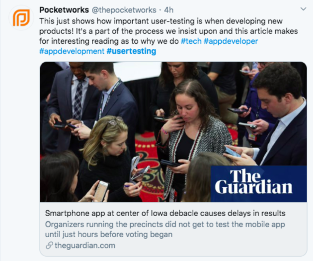
As the country waited for the results of the Democratic caucus in Iowa on Monday night, arguably one of the most widely-anticipated caucuses in recent history, it’s become apparent that organizers were scrambling to deal with the failure of an app being used for the first time to collect the state’s results.
Reports started to trickle in of users having problems with the app, and worse, those that gave up using the app had challenges reporting by phone—which was the intended backup plan.
Designers and UX professionals on social media quickly picked up on what went wrong: the organizers didn’t fully consider the end-user experience and the full system hadn’t been adequately tested.
Some commentators took the stance that technology should not be relied on for elections because the fallout of something going wrong is too great. However, by following a few simple steps, there are ways to mitigate the risk of introducing a new experience to your users.
- Basic usability testing: Does the app do what it’s supposed to do with no bugs?
- Testing with your user: Is your user able to use the app intuitively or with the instructions you provided without needing additional instruction or assistance?
- Testing the end to end experience: What other factors does your experience rely on? In this case, what’s the backup plan if the wifi goes down? If it’s phone reporting, will the same phone line be used for caucus chairs calling in results and for people with questions about the app? What are the risks of that and how can they be mitigated?
How to conduct user testing when secrecy is key
Party officials only made the app available to caucus chairs hours before they were expected to use it. Not surprisingly, many reported that they were uncomfortable with the new tool and some even chose not to download it due to secrecy, lack of information, and the security alerts they got on their phones when downloading. Had the experience of downloading and using it been tested, users could have been provided with better instructions for using the app and warned of the security alerts they’d receive when downloading it.
For security reasons, we understand that it may not be possible to test your exact app ahead of launch, however that doesn’t mean you can’t test the end-user experience. By leveraging prototypes or other proxies, it’s still possible to walk your users through the product experience and gauge their reactions.
There’s no such thing as user error
When reports started finding their way to the media that precinct chairs were having trouble with the app, the state party headquarters’ initial response was that the issues were due to user error.
For UX professionals, and others who focus their work on user and customer experience, blaming the user is a cardinal sin. If your target user isn’t able to do what you intended for them to do within your product, it’s time to take a step back and evaluate what went wrong during the design and launch.
Most commonly when “user-error” is raised as the reason for setbacks, developers and designers haven’t taken the time to develop empathy with their users. This can be done by gathering insights about them as humans to better understand their needs and wants, as well as spending time watching them interact with your solution.
In this case, after facing challenges with both the app and the phone line, some caucus chairs resorted to calculating results themselves and texting photos of their calculations to party officials. Imagine if those volunteers had been consulted early in the app development process. With input from those who have experience doing that job that needs to be done, there’s no question the resulting solution would have been far better.
Technology didn’t fail—the design did
The events of Monday night raised many questions about relying too much on technology, especially when the outcome of an election is at stake. But the fact is that the technology didn’t fail. The app didn’t go down. The system wasn’t hacked. What failed was designers not considering the humans at the other end of the experience they were creating.
In this Article
About the author(s)
Related Blog Posts


Get the latest news on events, research, and product launches
© UserTesting 2024