
Users Have Spoken - "New" Google is Better Than "Old" Google

Last week, Google rolled out the latest version of their search results page to mixed reviews. With a number of prominent outlets detailing the changes, we decided to take a it a step further and put it to the test.
Google’s official statement pointed out four changes to their existing design:
- A new yellow "ad" icon next to paid results
- Larger result titles
- No more underlines
- Evenly spaced line heights
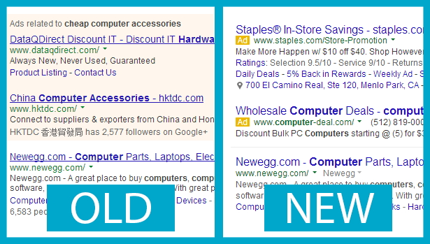
A side-by-side comparison of Google's old and new results pages.
According to the official statement, the goal of the redesign was to improve legibility and provide a cleaner look for their search results, but did they achieve what they set out to accomplish?
How We Set Up the Study
To answer this question, we set up a 50-person remote usability study and asked participants to rate the redesigned aspects of Google’s search results page, on both the current version and the previous version. Then, we asked them to compare the sites side-by-side.
Part 1: Testing Each Version on Its Own
Paid Links vs. Unpaid Links
Old Google Score: B (87.2%) | Avg. Score: 4.36 (out of 5) New Google Score: B (87.2%) | Avg. Score: 4.36 (out of 5)
In the previous version of Google’s search results page, the top three paid links were highlighted with a yellow background. The latest version of Google’s search results page uses a yellow “ad” icon to differentiate paid links from unpaid links.

Google's ad icon has made its way from mobile to desktop devices.
We asked testers to rate how easy or difficult it was to differentiate between paid links and unpaid links, and the results were surprising (or not, depending on how you look at it).
No, that's not a typo on the score. Despite being one of the most obvious changes to Google’s search results page, our users found it equally easy to figure out which links were paid and which ones weren’t.
What’s interesting is that there were a few users like the one in the video below who pointed out that the formatting on the old layout may have been around long enough to condition them not to look at ads.
Is Bigger (and not Underlined) Better?
Old Google Score: A- (90.4%) | Avg. Score: 4.70 (out of 5) New Google Score: A- (90.4%) | Avg. Score: 4.70 (out of 5)
In an effort to reduce the clutter on their search engine pages and make links more legible, Google stopped underlining them and made them bigger. We asked testers to rate how easy or difficult it was to read links on both the previous and current versions of Google’s search results pages, and our results once again yielded a stalemate.
For both versions of Google’s results pages, a number of testers commented on how the links were easily legible and identifiable because they were large and had a different color from the rest of the text.
Did Line Spacing Affect Legibility?
Old Google Score: B (87.6%) | Avg. Score: 4.38 (out of 5) New Google Score: A- (90.8%) | Avg. Score: 4.54 (out of 5)
While line spacing was one of the more subtle changes to Google’s search results page, it was this feature that tipped the scales in favor of Google’s newly designed page.
We asked our testers to rate how easy or difficult it was to read the description below each link, and as you can see in the score above, Google’s new layout came out ahead by a nose.
Part 2: Comparing Each Version Side-by-Side
For the second part of our study, we asked users to compare old Google with the new Google side-by-side and choose whether one was more effective than the other, or if both styles were equally effective.
While both styles fared equally well when viewed on their own, when viewed side-by-side, the clear winner with our users was new Google, which was preferred by a majority of our participants in each category.
Here are a few of the highlights from the results in the second part of our study:
Unpaid vs. Paid Links
Winner: New Google (preferred by 26 of participants)
Many of our users found that the new “Ad” icon was much more effective in helping them determine which links were paid and which ones weren’t.
While new Google won over a majority of users, the other 24 participants were evenly split: 12 found the old format more effective; 12 found both versions equally effective.
Is Bigger (and not Underlined) Better?
Winner: New Google (preferred by 33 of our participants)
A number of users found the new layout easier to read because of the larger font, which made the links and descriptions easier to read. For many of the users in our study, bigger was better when it came to the formatting of the link titles.
What's interesting to note is that many of the users who preferred the old format didn't mention the underlined links as a factor in their decision.
Did Line Spacing Affect Legibility?
Winner: New Google (preferred by 29 of our participants)
While a number of users found the new layout more legible, many of them were like the user in the video below, and couldn't quite pinpoint the reason.
Overall Score
Winner: New Google (preferred by 33 of our participants)
"Clean," "fresh" and "uncluttered" were among the adjectives users used to describe Google's new search results format. The user in the video below sums up what many of the study's participants said in this part of this test.
Mission Accomplished?
Based on our results, it appears that Google accomplished what they set out to do: create a cleaner and more legible results page. Although users ultimately favored Google's new format, results from the first part of our test showed that Google's old format was just as functional and easy to use.
Which One Do You Like Best?
What are your thoughts on Google's new format? Do you agree or disagree with the participants in our study? Pick a side in our poll, then sound off in our comments section below!
In this Article
About the author(s)
Related Blog Posts


Get the latest news on events, research, and product launches
© UserTesting 2024