
Why You Need to Get Rid of Your Multi-Level Menu

Let’s take a look at one of your site’s most important elements---your navigation.
Most designers create multi-level navs with good intentions. They take up less space, and they contain all of the information a site visitor would need without cluttering up the page. That’s a good thing, right?
While it sounds great in theory, what happens when visitors on your site actually use them is a different story.
Think of the last time you came across a multi-level nav on a site. Did the menu collapse before you could click on the option you wanted? Did it make you more conscious about the precision of your mouse movements on your second attempt? Did you grimace at the thought of the menu collapsing before you could get to your choice another time?
If your site’s visitors are feeling even a hint of frustration, especially at the start of their visit, you’re increasing their chances of leaving without buying anything. This is why it’s important to test how visitors are interacting with your site, especially with important elements like your navigation.
What we’ve found is that multi-level menus are difficult to use, which results in frustration and confusion. For many users, their initial reaction after a failed attempt to use your menu is to use your site’s internal search, but for others, their first reaction is to simply leave your site. So how do you keep them from jumping ship?
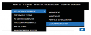
Solution 1: Mega Menus
The similarities between the menus of the Web’s two biggest online marketplaces, Amazon and eBay, are no coincidence. Their menus share a number of features, which you can compare below.
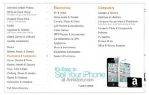
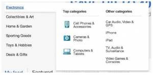
Aesthetics aside, you can see that Amazon and eBay’s menus have three things in common:
- They only have one level
- They include all submenus that are related with the parent category
- They take up a considerable amount of real estate on the page
This leaves little room for users to encounter menu behaviors that will irritate them like the menu collapsing if a user’s cursor ventures too far off the menu item. Without these potential irritants, you’re allowing your customer to focus on the important aspects of your site: your products, services, and content.
Solution 2: Clickable Menus
You may have noticed that some of the biggest headaches from multi-level menus come from having to hover your mouse over items to activate them. Thankfully, there are other options that our studies have shown to be more user-friendly, like clickable menus.
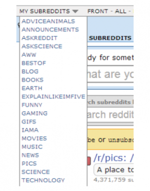
The main benefit of having a clickable menu is that your site’s visitors don’t have to be as careful when selecting items. Once they’ve clicked on your menu and the options drop down, they’ll remain there until the user has clicked the menu link again. It’s predictable and easy, which is just the way your customers like it.
For more tips on improving your menu, take a look at our list of navigation resources.
In this Article
About the author(s)
Related Blog Posts


Get the latest news on events, research, and product launches
© UserTesting 2024