
3 mobile UX design principles from apps we love

Getting people to download your app is a challenge.
And even if you do, getting users to come back a second time can be even harder.
Research has shown that 20% of the time they download an app, use it once, and never use it again. And 95% of downloaded apps are abandoned within a month.
[clickToTweet tweet="If you don’t immediately deliver a great experience, users close your app and forget about it" quote="If you don’t immediately deliver a great experience, users close your app and forget about it"]
That being said, it’s important to deliver value to your users as quickly as possible. And to illustrate what they looks like in action, here are 3 examples of mobile apps that give their users tons of value and a delightful experience—and a quick breakdown of what makes them great.
1. Instacart: easy learning curve
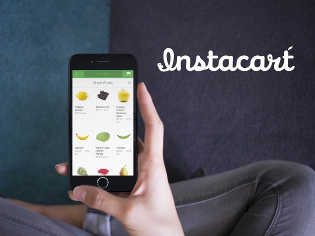
Instacart makes it easy for new users to get started and figure out what they’re supposed to do. The signup workflow is fast, effective, and well-designed.
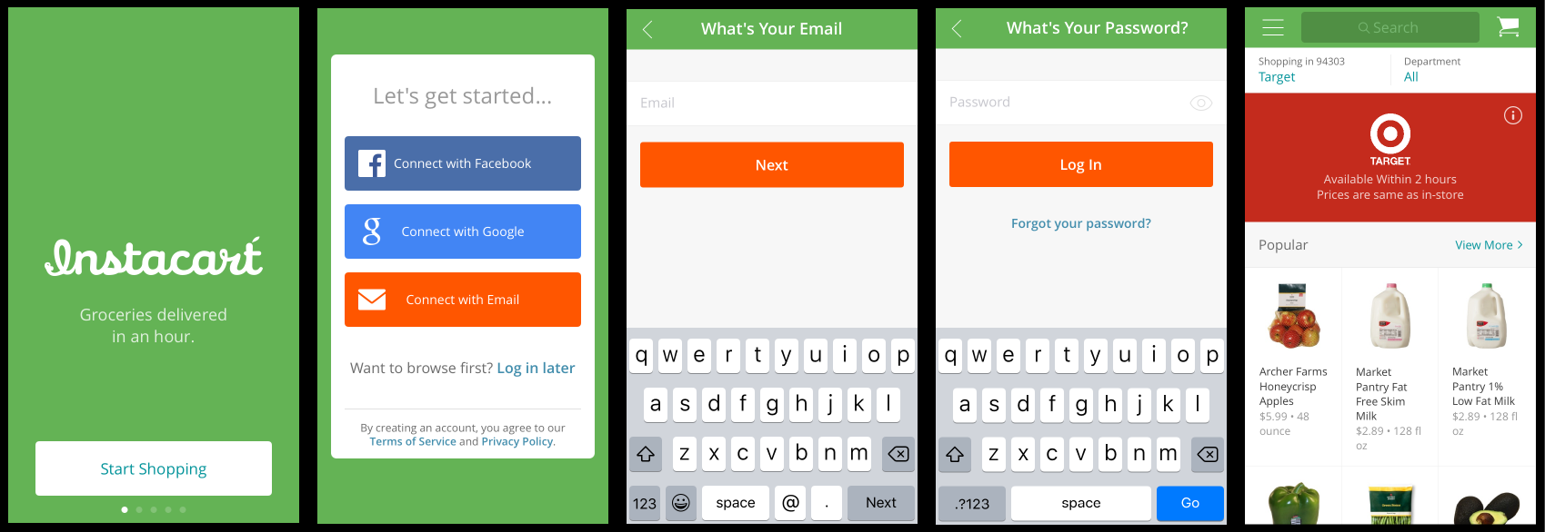
Here's what one test participant said about the signup process:
"It's super easy to do each step. I hate when it's all on the same page because it feels like it takes forever. But when you just do a couple things at a time it feels like it's easier and doesn't take as long."
And Instacart's intuitive interface makes it easy to figure out what to do once you start interacting with the app. Everything about the app is smooth and easy: from the search functionality and navigation to the visual representation of groceries and the shopping cart workflow.
Adding things to your cart is a cinch, and Instacart remembers your payment information so you don’t have to type in your credit card information every time you buy something. It also remembers your address so you basically spend no time filling out forms (which is awesome because forms on mobile are a nightmare).
2. Uber: streamlined workflow
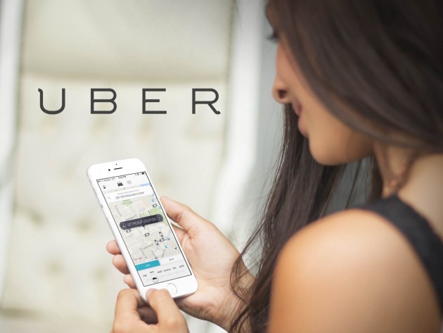
Uber gives its users the result they want as quickly as possible, with little to no effort on their part. You just tap three buttons and someone comes to pick you up and take you where you need to go.
And since your payment information is already saved in the app, you don’t have to carry cash or a card with you to pay the driver. Once you get dropped off, Uber automatically charges you for the ride.
Like Forrester Analyst Leah Buley said, “The magic is no longer in the machine; it's in the machine's ability to make life better.” I’ve used Uber several times a week for the past year, and it's definitely made my life easier.
[clickToTweet tweet="The magic is no longer in the machine. It's in the machine's ability to make life better @leahbuley" quote="The magic is no longer in the machine. It's in the machine's ability to make life better"]
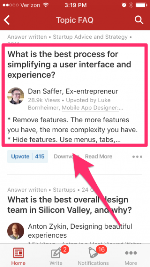
3. Quora: easy access to high-quality, personalized information

Quora has a beautiful interface. But what makes Quora’s UX great isn’t the way that the app is designed—it has nothing to do with UI, information architecture, or the layout.
What makes it great is that there are incredibly influential people on Quora answering questions. For example, you can find answers from UX pros like:
- Jeff Gothelf — Author of Lean UX
- Dan Saffer — Author of Microinteractions
- Dave Malouf — Founder of IxDA
And you’ll also find business executives at top companies like Sheryl Sandberg (COO of Facebook), Andrew Chen (Supply Growth at Uber), Andy Johns (Former Product Manager of Growth at Facebook and Twitter), and more on Quora.
Quora has seeded their community with thought leaders and experts in almost every field you can think of.
That means you’re not just getting answers from random people on the internet, you’re getting advice from seasoned veterans who have wisdom and experience to share. And if Quora had the exact same UI design but those people left, the experience would suffer in a big way.
[clickToTweet tweet="What makes Quora's UX great is the community, not just the technology" quote="What makes Quora's UX great is the community, not just the technology"]
That being said, they’ve also designed the app to make it easy for users to discover high-quality information on topics they care about (without having to dig through dozens of answers to find the best stuff).
And they accomplished that by pairing questions with answers from people you follow—or from someone who has the credibility and experience to answer it authoritatively.
Further reading:
One of the things these apps have in common is how quickly they give you something useful. The time to value is very short. And that’s important in an increasingly mobile world where the bar is always being raised.
The more often people use apps with amazing UX, the more they come to expect every app to deliver the same value. And if you can’t meet their expectations, they’ll just move on to something else that will.
If you want to learn more about how to create mobile experiences your users love, check out the resources below:
- The 4 Mindsets of Mobile Product Design
- Lean Mobile UX Lessons To Keep Your App From Sinking Like The Vasa Ship
- eBook: Getting Out of the Office: Testing Mobile App Prototypes With Users
- 7 Lessons Learned From Interviewing 100+ App Developers
- Interview with Luke Wroblewski: Mobile Behavior and Design Trends
- Personalization: The Pillar of the Mobile User Experience
- Thinking Like An App Designer
In this Article
About the author(s)
Related Blog Posts


Get the latest news on events, research, and product launches
© UserTesting 2024