
3 Practical Ways to Optimize Your Web Forms For Maximum Conversion

Do your forms convert as well as they could?
Optimizing forms is arguably one of the least sexy aspects of conversion optimization. Because of that, forms often get overlooked.
And it’s really too bad.
Because whether you use web forms to generate leads or sell products, they represent a critical point in your conversion funnel. Small details like headers, field label alignment, and button copy have a direct impact on your prospects' decisions and, by extension, your completion and conversion rates.
Small details have a direct impact on your conversion rates.
Web forms have mission-critical elements that your potential customers have to interact with in order to do what you want them to do. And small tweaks can have huge impact.
But if you don't optimize your forms, you can waste a lot of time, money, and traffic getting people all the way up to your form, just to have them abandon it.
In a recent webinar, Unbounce’s Senior Conversion Rate Optimizer—Michael Aagaard—broke down over a dozen conversion principles and lead generation techniques based on real-world case studies. Let’s take a look at three of those tactics that marketers, designers, and product folks can immediately use to improve form-based conversions on their website.
1. Headers and subheads
As for anything that has to do with copy online: clarity trumps persuasion. This is the same with forms.
Think of your form as a landing page within the page. Your form has to be able to stand alone. In other words, it needs to make sense even if the form is the only thing you read. So, clearly tell your prospects what they’re going to get, and what’s going to happen next.
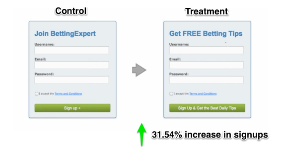
Focus on what they’re going to get
If you want people to do something, don’t just bark an order at them. Instead, give them a good reason to do it. For example, by tweaking the header copy to tell the prospect what benefit they’ll get by signing up, BettingExpert saw a 31.54% increase in signups.
2. Form fields and labels
Make the experience of filling out the form as simple as possible. To accomplish this, you need to be conscious of how you align your field labels and your form fields.
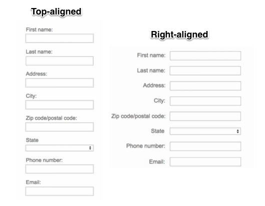
Form label alignments matter, so choose wisely
In Aagaard’s experience, top-aligned and right-aligned form labels tend to be the easiest to read, easiest to scan, and generally have the highest conversion rates.
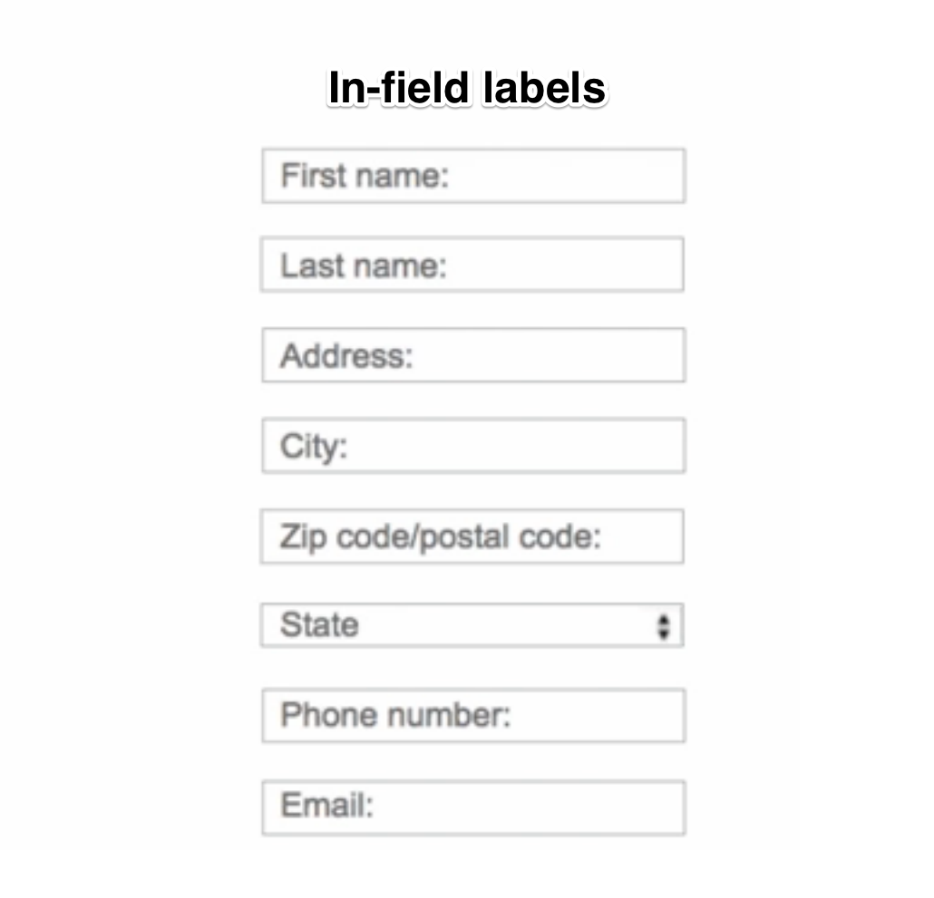
In-field labels make your forms hard to scan, because people usually use the white space to identify form fields. Also, when you start typing the label disappears and they might not be able to remember what the label was.
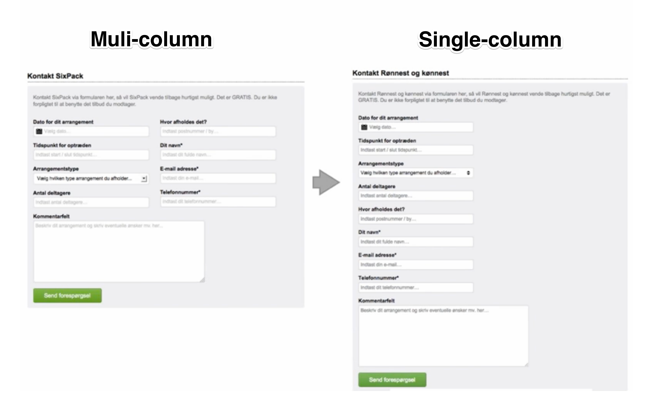
Multiple columns increase friction
Using multiple columns in your forms can make them hard to scan. From a design perspective, it might look nicer and fit into the site layout better, but 1-column forms usually perform better.
Break longer forms into multiple steps
Often what seems most logical to us as marketers and designers isn’t what works for users. It might be logical to say “the more steps in the form, the higher the drop-off rate.” But that’s not always the case. It’s all about the perception of how simple it is to fill out your form.
For example, when a user gets to a form that has 37 form fields, they might begin to fill it out—but if they can’t see the bottom, they’ll start scrolling.
And if they see that they have to fill out 37 different fields, they’ll start to think to themselves, “Wow, that’s a lot to fill out in one bite.” And a large number of them will drop off.
So in cases like this, it’s usually best to divide it up. Aagaard thinks a good rule of thumb is that every time you have a new set of questions, you should have a new step.
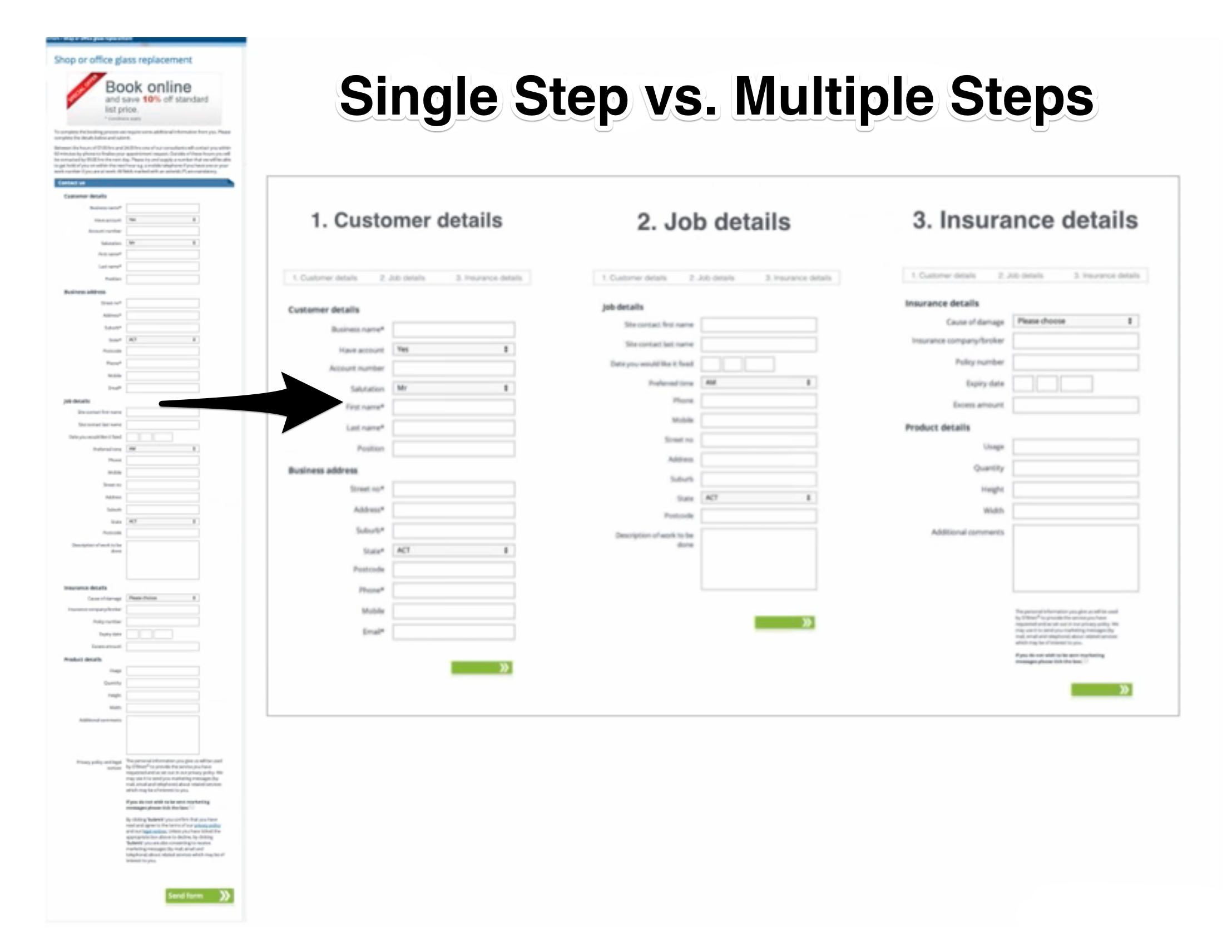
In the example above, the first step would be customer details, the second step would be job details, and the third step would be insurance details. That means that when a prospect lands on your form page, they’ll just see a few fields, and not a 37-step monster.
3. CTA buttons
Use a contrasting button color
Designers and marketers always seem to be looking for the highest converting color, but there’s no universal color that’s best for conversions. Derek Halpern, founder of conversion training blog Social Triggers said, “What stands out gets clicked, what blends in gets ignored.”
The color that converts the best is the color that stands out the most from everything else around it. So use a contrasting color to make your CTA button stand out.
Align your headline and CTA copy
Once your prospects have identified the button, then it’s the button copy that helps them take the final step. Together with your headline, the button copy is one of the few things you can be sure people will read.
Since the CTA button has such a huge impact, it makes sense to align your CTA button copy with your headline. Like we talked about earlier, instead of giving your prospects an order, tell them what they’re going to get.
Focus on what’s behind the click by answering the question, “What will I get by clicking this button?"
For example, when you use something like “Submit” or “Send” for your button copy, it doesn’t tell me what I’m going to get or what’s going to happen. Instead, Aagaard suggests using something like this:
- Get My Free Quote
- Show Job Offers
- Book My Room
It provides clarity to prospects by helping them understand what’s going to happen, what they’re going to get, and the value that’s in it for them.
Optimize your forms like a pro
Almost all forms have a similar anatomy: a header, form fields, and a CTA button. It doesn’t matter if it’s a lead gen form or a checkout funnel, you can tweak all of these form elements to get more people to fill it out.
If you want to get the best tips on how to optimize your forms for maximum conversion, check out this on-demand webinar featuring Unbounce’s Senior Conversion Rate Optimizer, Michael Aagaard.
Michael shares real-world case studies packed with A/B test results and optimization principles. After watching, you'll have a list of fresh ideas you can use to optimize your own web forms right away!
In this Article
About the author(s)
Related Blog Posts


Get the latest news on events, research, and product launches
© UserTesting 2024