3 unconventional lead generation techniques for high conversions and great UX

If you’re running a blog to generate leads for your business, you’ve probably noticed that the standard techniques aren’t as effective as they used to be.
All marketing tactics decrease in effectiveness over time. The average sidebar opt-in and end-of-post opt-in convert between 0.3% and 1.2% of traffic. That means for every 1,000 people who come to your blog, 3—12 people will fill out those forms.
But don’t feel bad: everybody else is getting the same results too. Standard tactics like sidebar opt-in forms, end-of-post opt-in forms, and offering free white papers in exchange for an email address don’t work like they used to. As users get accustomed to seeing those opt-in forms and ads all the time, they become blind to them.
As marketers, we must adapt to changing times to stay ahead of the curve. That means testing new approaches and discovering lead-generation techniques that cut through the noise of the internet, get results, and deliver a great user experience.
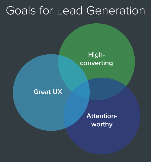
I’ve scoured the web looking for evidence of lead generation techniques that are blowing conventional best practices out of the water while delivering a world-class user experience.
If you want to turn your blog into a lead generation machine and prevent your opt-in forms from being ignored, follow these three powerful techniques that are changing content marketing.
(Note: Full disclosure, we’re just starting to experiment with these techniques on the UserTesting blog. Check back in soon to see some of these techniques in action.)
Technique #1: The Content Upgrade
A Content Upgrade is a free bonus that’s insanely targeted and laser-focused on the topic your visitor is reading about—turning your blog post into an email-collecting machine. Let me explain.
In September 2014, I noticed Bryan Harris—the founder of Videofruit—was doing something weird on his blog that I’d never seen before. Instead of offering his readers a generic free report in exchange for their email address, he gave away a unique resource specific to each blog post.
This article was called Little Known Ways to Increase the Effectiveness of Your Sidebar, and at the end of the post he offered a Keynote template of Videofruit's sidebar opt-in design, and the source code for the opt-in box that you can just copy and paste to use on your own site.
Then I found out that he got the idea from Clay Collins and the LeadPages team. They used content upgrades to increase their subscriber rate from 0.5% to 10% in a 30 day span.
- Before: Collected 5 email addresses for every 1,000 visitors
- After: Collected 100 email addresses for every 1,000 visitors
That’s an incredible lift! But the best part about the content upgrade is that it creates an amazing user experience. Not only does it grab the reader’s attention, but it delivers relevant content that’s personalized to the exact topic they’ve expressed interest in.
How to Create Your Content Upgrade
- Find a high traffic post on your blog — Use your analytics tool (e.g. Google Analytics) to find a blog post that consistently gets the most traffic.
- Create a resource that builds upon the existing content — Your content upgrade should enhance the content from its corresponding blog post. Here are some examples you can use: a PDF checklist that summarizes the critical information or action steps, downloadable PDF version of the article, video walkthrough, expert interview, infographic, list of additional resources, excel spreadsheets, swipe files, templates, and exact word-for-word scripts.
- Add the content upgrade to your blog post — Use a callout box to promote your content upgrade at the beginning of your article. Then turn the conclusion of your post into a description of the content upgrade and what visitors will get when they download it.
- Rinse and repeat — Once you start seeing a lift in your conversion rate on that post, repeat the same process for another high-traffic blog post. Experiment with different content upgrades and find out what works best for your audience.
Technique #2: The Social Squeeze Page
Traditional gated content requires visitors to give their personal information before they can access the content they want. With a social squeeze page, you’re adding value with un-gated content on the page, then allowing visitors to subscribe for more information.
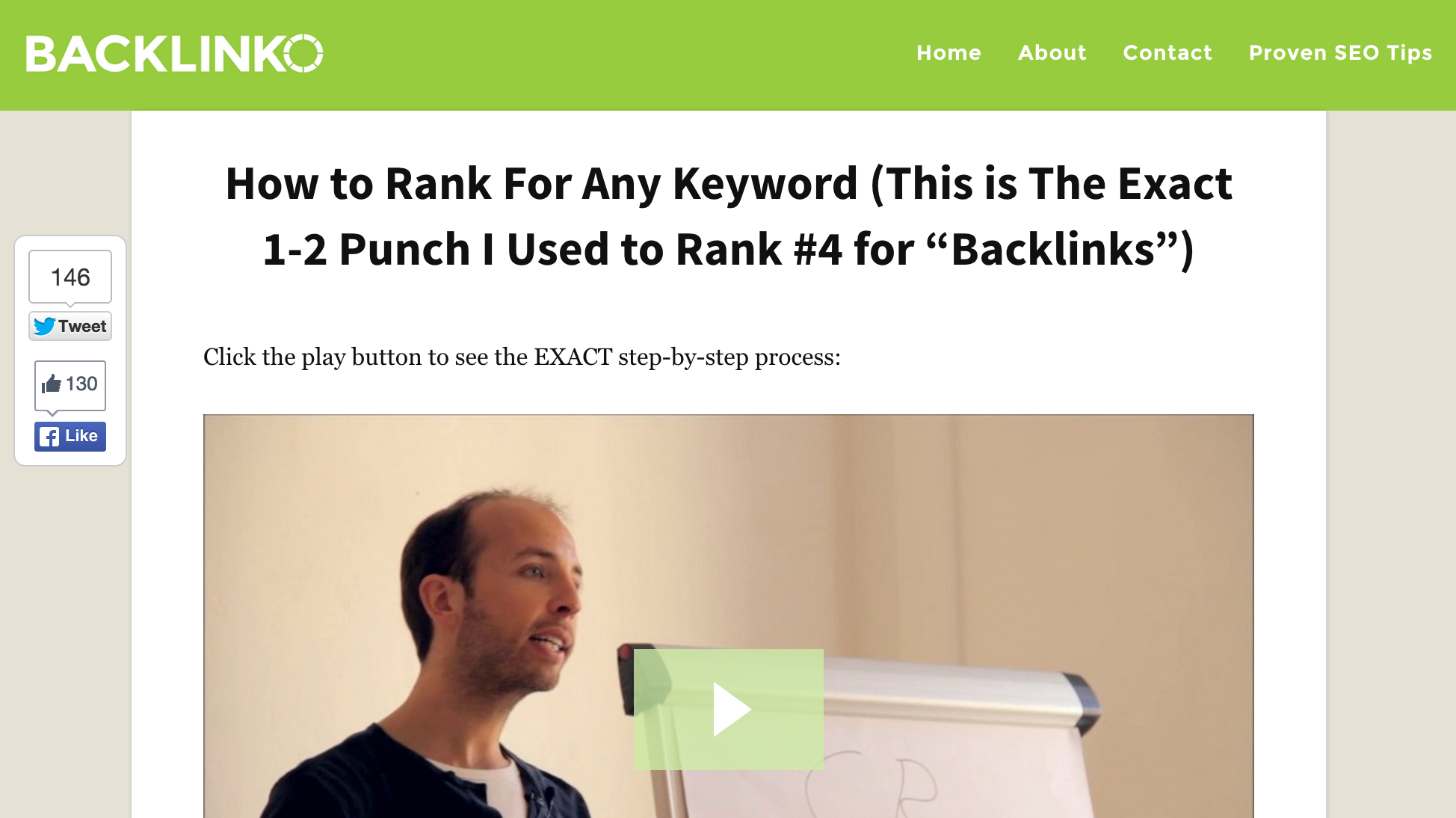
For example, this social squeeze page offers a video that explains the exact step-by-step process that Brian Dean—founder of Backlinko—uses to rank for competitive keywords. And it converts 21.7% of its traffic into new email subscribers.
The most important function of a social squeeze page is giving people valuable information that they desperately want, and presenting it in an engaging way. That’s why it’s critical to choose a topic that your visitors want enough that they’re willing to trade their email address for it. These kinds of topics generally have two things in common:
- They’re currently in high demand
- There’s not enough high quality information available to satisfy that demand
How to Create Your Social Squeeze Page
- Choose your topic — Find a topic that your audience is hungry to learn more about. To find a high demand topic for your social squeeze page look through the comments on your blog and your competitors, search online forums that talk about your space, and use use the Ahrefs Content Explorer to find high performing topic in your niche. What questions are being asked over and over again?
- Chose your content type — One format that works really well is a 3 -10 minute video. If no one of your team is comfortable getting on camera, just record a powerpoint presentation using screen recording software like Camtasia. Other formats that work well are beautifully designed pages and collections of educational resources on a specific topic. I’ve included five social squeeze pages below to help you come up with ideas for your own.
- Add an opt-in form below the content — Place your call to action right below the content. Make it clear and explain exactly what they’ll get if they subscribe. After you give them information they’re hungry for, make it easy for them to sign up for more. Copyblogger does a great job with this squeeze page CTA.
- Add social elements — Since you’re offering such high quality content, your audience will want to share it. Make it easy for them to do that by adding social sharing buttons, and encourage them to join the discussion by leaving a comment. As your social squeeze pages gets more shares and comments, the social proof will improve its performance over time.
- Promote it — Once you’ve finished designing your social squeeze page, it’s time to promote it to your audience. Announce the page to your email list, share it on social media, and you can even add a prominent banner on your sidebar.
Technique #3: The Feature Box
A Feature Box is an email capture form that sits at the top of your blog homepage—front and center—and does three things really well:
- Delivers your value proposition
- Immediately qualifies your traffic
- Converts qualified traffic into leads
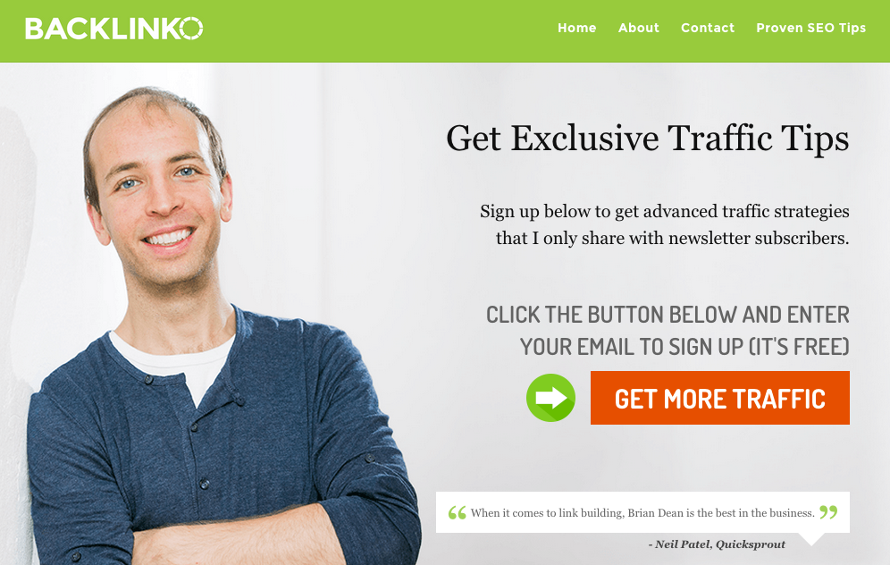
For example, this feature box gets Brian Dean a 4.26% conversion rate on his homepage:
DIY Themes added a Feature Box to their blog homepage and saw a 51.7% increase in daily new subscribers. And it wasn’t just a short-term spike in conversions, they’ve maintained the lift ever since.
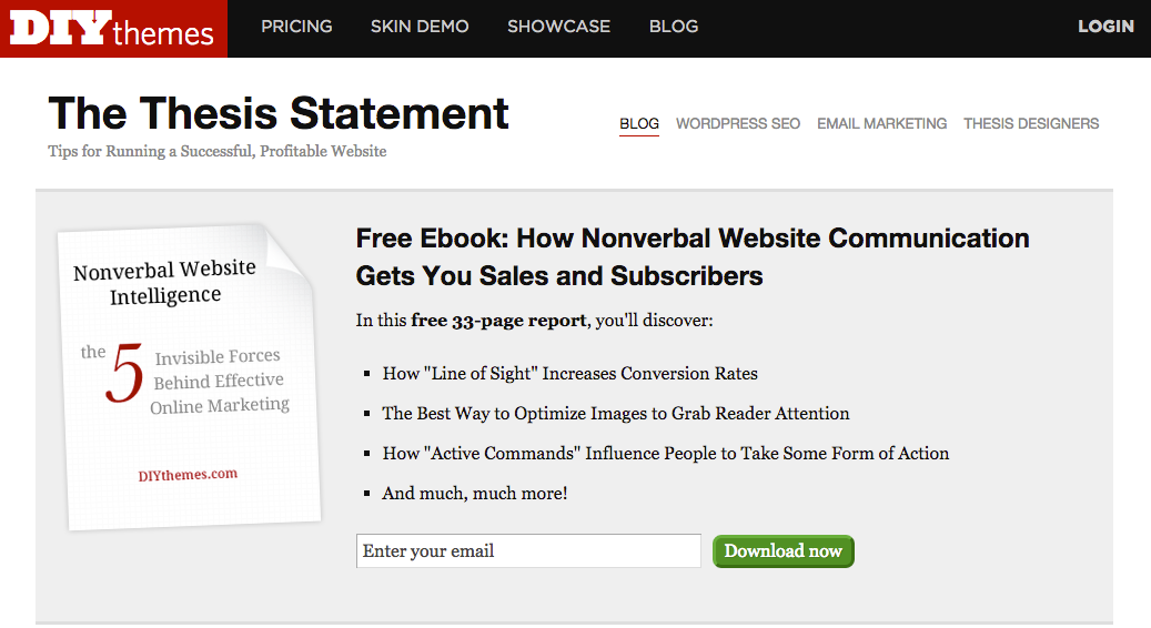
And conversion professional Devesh Khanal’s feature box consistently converts between 5% - 7% of his homepage traffic.
Why does the feature box work so well for generating leads? Derek Halpern—the man who first pioneered the feature box—says the answer is simple:
If the copy resonates, people enter their email right away because they know exactly what they’re signing up for.
How to Design Your Feature Box
Here are the four elements that Backlinko, DIY Themes, Devesh, and other smart marketers use to design feature boxes that work:
- Place it above the fold on your blog’s homepage — You want to place it prominently on your homepage, front and center. That way your visitors can't miss it.
- Craft a strong, benefit-driven headline — Tell visitors what you're going to do for them, and the results you're going to get them. This is what's going to motivate people to enter their email address.
- Offer concrete reasons why people should sign up — For those who are on the fence, give them a reason why they should sign up.
- Leverage social proof in the form of subscriber numbers or a testimonial — The psychological principle of social proof states that people are usually more likely to subscribe when they see that other people have also subscribed. But data shows that's not always true. Test this to see what works best for your company.
Conclusion
The digital marketing landscape is always changing, and the rate of change is accelerating. The lead generation techniques that produced incredible results a year or two ago are now converting poorly—users are becoming blind to them and ignoring them completely.
That’s why we need to adapt as marketers and start experimenting with these three lead generation techniques that are changing content marketing:
- The Content Upgrade — A bonus download that enhances the content from its corresponding blog post (i.e. a free checklist outlining the most critical information)
- The Social Squeeze Page — A page whose sole purpose is to deliver information on a high demand topic that your audience is hungry to learn about, and offer an opportunity to subscribe
- The Feature Box — An email capture box that sits front and center on your blog homepage, collecting email addresses like a boss
Would you rather spend your time optimizing forms that convert around 0.5%, or forms that convert around 5%? My goal with is to prevent you from wasting time and resources optimizing forms that convert poorly, so you can focus on getting big wins like conversion rates of 5%, 10% or even 20%.
The digital marketers who are seeing massive conversion rates aren’t looking for the holy grail of “one tactic to rule them all.” Like Brian Balfour said, they focus on “experimenting like crazy to figure out the most effective things right now, and to stay ahead of the curve.”
It's not just about getting more leads and increasing conversion rates at all costs. It's also about creating a great UX and building a loyal following of engaged readers who trust you and look forward to hearing from you.
What lead generation techniques have been working best for you? Share your success stories below.