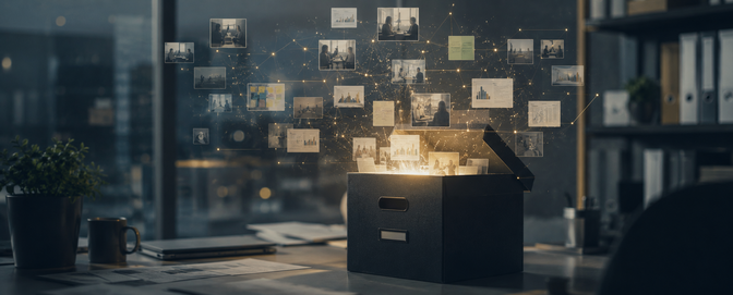
Which color sells the best?
Walk into a store and you’ll probably notice the price tags, the layout, maybe even the smell of fresh leather or baked pretzels wafting from the food court. But here’s the thing: before you process any of that, your brain has already been smacked in the face with color. Color is the silent salesperson, working its magic on your trust levels, your sense of luxury, even your impulse to buy.
So we got curious. If colors are secretly pulling the strings, which ones actually work best? We asked 200 U.S. respondents in a UserTesting survey about their favorite colors across four shopping environments: high-end in-store, online shopping, professional/corporate websites, and everyday products. And the answers? Let’s just say they tell us a lot about how our wallets (and psyches) are wired.
We didn’t want to just know people’s favorite color in general (“blue” always wins that game, boring). Instead, we framed the questions around specific contexts:
- Premium in-store shopping (think $200+ purchases).
- Online shopping experiences.
- Professional websites (job hunting, B2B).
- Everyday personal items (phones, bags, bottles).
Then we sliced the data by gender, income level, and region—because taste isn’t universal, and what feels trustworthy in New York might feel sterile in Dallas.
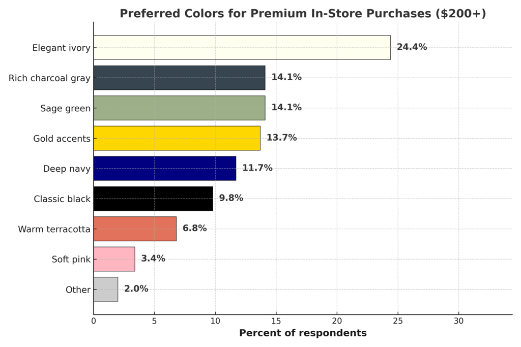
Ivory and charcoal mean “luxury”
When the stakes are high (fashion, furniture, tech), people want elegance. The top choice overall was Elegant Ivory, but men leaned toward Gold Accents and Charcoal Gray (apparently guys trust their gadgets more if they look like Iron Man’s suit). High earners, unsurprisingly, went darker: Charcoal Gray and Navy—the color of power suits and premium car interiors. Calming sage green also did well, especially among women.
Regionally, the South showed a sweet spot for Gold Accents (we see you, gilded chandeliers), while the West Coast leaned into Navy + Ivory minimalism. Meanwhile, the Midwest kept it classic with Ivory and Black. Think “restoration hardware” meets “Midwestern practicality.”
Blue wins for shopping online
Here’s where things get fun: the internet, it turns out, is painted blue. Soft Blue won the crown, especially in the South where nearly half chose it. Why? Probably because it screams “trust me, I won’t steal your credit card info.”
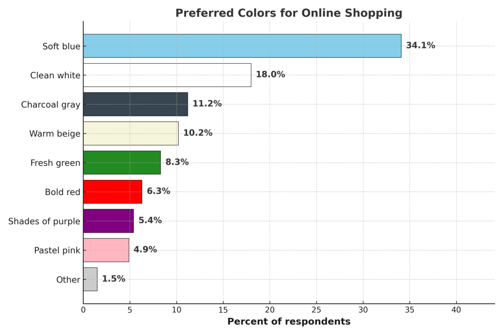
High earners leaned more into Navy Blue, the corporate cousin of Soft Blue. East Coasters wanted a bit more cleanliness (White was strong here), while the Midwest again brought in Crisp White alongside their blues. Designers take note: if your CTA button isn’t some shade of blue, you might be fighting an uphill battle.
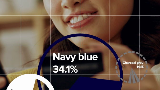
Navy blue is still the most trusted for corporate sites
This one is less surprising: Navy Blue crushed the competition. If LinkedIn rebranded tomorrow in hot pink, people would riot. Navy says “we’re serious,” “we’re trustworthy,” and maybe even, “yes, we wear blazers on Zoom calls.”
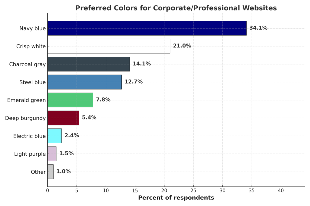
That said, Crisp White came in strong, especially in the Midwest and East Coast, signaling a love for clean, modern layouts. And men? They couldn’t help but slip Graphite into the mix (because what’s more “professional” than looking like a MacBook Pro?).
Graphite is the “in” color for personal items
Now here’s the twist: when it comes to personal items (your phone, your bag, your water bottle) respondents dropped the ivory and navy in favor of Sleek Graphite. Apparently, when it’s yours, you want it to look like a Tesla dashboard.
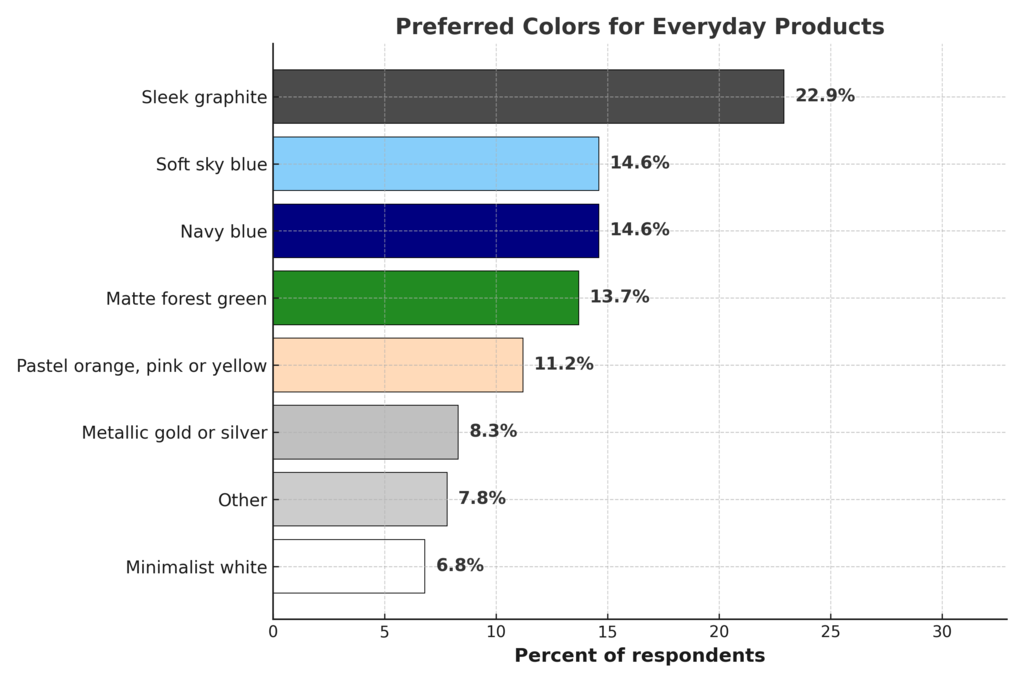
Graphite was especially popular with men, high earners, and East Coasters (big “urban tech bro” energy). But Soft Sky Blue and Navy still had their fans, especially in the South and Midwest, where lighter tones feel more approachable. Women were more likely than men to still stick with Ivory and Blue, blending practicality with elegance.
Key takeaways
- Blue is the MVP of the color palette. It dominates across contexts, whether soft and friendly or navy and commanding.
- Ivory = luxury. If you’re designing for premium in-store vibes, it’s your go-to. But generally, calming colors go hand-in-hand with thoughtful high-end purchases.
- Graphite = personal cool factor. People want their stuff to feel sleek, modern, and a little aloof.
- Regional quirks matter: The South loves warmth (gold, soft blue), the East Coast is graphite-heavy, the Midwest likes a classic white-and-blue palette, and the West Coast is a sucker for minimalist navy + ivory combos.
At the end of the day, color isn’t just about “pretty.” It’s psychology, branding, and trust all rolled into one palette. Whether you’re a designer, marketer, or just someone choosing a phone case, remember: that shade you pick might just close the deal, or lose it.