
How to write plain language for a better user experience

Good writing goes unnoticed. At least, that’s what we UX writers say to ourselves when all anyone tells us is “nobody reads.” Ideally, UX writing, or content design, should complement strong visual design, with the aim of guiding rather than directing a user through an experience.
If it’s done well, written information should feel like it has just come to the user, osmosis-like. It’s a great feeling when you achieve this kind of writing, but it’s often a difficult journey to get things just right.
Well, to keep this short, the golden rule is, and has been for a while, to use plain language. The simpler your content is, the wider your audience will be, and the less head-scratching your user will have to do.
Forget ROI. A reduction in scratched scalps is a strong metric I can put my name to. Here’s how to get there.
Table of contents
- What is plain language?
- How do I write in plain language?
- Putting plain language to the test
- Discovering the solution
What is plain language?
Nowadays, we have a (fairly) robust understanding of what makes writing readable. Thanks to internet sorcery, we can even take advantage of free tools to quickly gauge the reading level of our writing. Readability is a strong ally in the quest for plain language—the more common and less complex a word, phrase, or instruction is, the more “readable” it is.
In fact, most best-selling novels are written at a 7th-grade level, according to research on the topic of readability. So all those fancy words you’re plugging in to impress? They might just be driving readers away.
"Most people have a common vocabulary of around 15,000 terms… By using these words, you allow users to take in more information at a more rapid pace. This is often called ‘using plain English’." – Sarah Winters (formally Richards), Content Design
Writing in a way that’s easy to understand (“reducing cognitive load”) is a major part of plain language. But the real beauty of writing in this way is that more people are included, regardless of their education, background, language proficiency, identity, or level of ability.
It’s simple in that case, right? To write well for products and services, we just use words fished out of that pool of around 15,000 common terms.
Not quite. This tactic works if your intended audience is, literally, anyone and everyone—the general public at large. When Sarah Richards quoted this statistic, she was covering case studies from her time writing for the UK government’s labyrinth of public webpages. That’s one scenario where you do want to capture a broad audience.
Chances are that you have a specific market in mind, and that market is made up of specific personas. Your users have niche needs, and you need to speak to them in a way that resonates and will get them to respond. But that’s where it gets difficult: the balancing act between using common vocabulary and vocabulary that mimics your niche demographic.
While working on a new user experience at UserTesting, I ran into this very conundrum and had to ask myself, “How plain is too plain?”
Spoiler: the naysayers are right. Nobody reads. Well, nobody reads things they think they already know, anyway.
How do I write in plain language?
Not sure where to start? Here’s your quick checklist:
- Write in clear, conversational language
- Remember that every word matters
- Get to the good stuff first
- Keep forms short and simple
- Avoid distractions
- Make searching intuitive
Putting plain language to the test
UserTesting recently tested a new type of participant: a guest participant, someone who comes to our platform to take a test but doesn’t have an account and hasn’t been asked for their email address. Working closely with the design lead on the tests, I wrote effective welcome and onboarding flows. Things were looking good, initially. The content seemed to work…until we considered mobile app tests.
The gist of the problem was: how do we explain to a guest user that they must download the UserTesting app, then avoid opening it and instead return to a mobile browser page to start the test from there instead?
It was so atypical, in fact, that this one small problem kickstarted a month’s worth of iterating and unmoderated testing. Most of that research concerned the words that were being used.
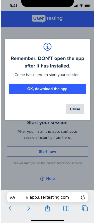
Prototype 1
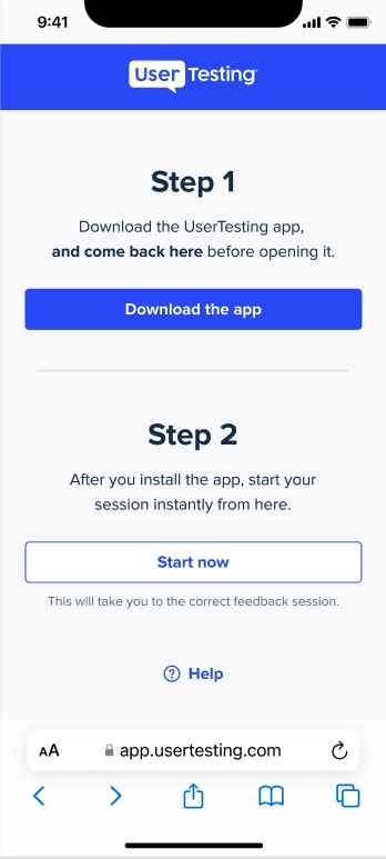
We started with the instructions split across two steps, both on one screen. The body copy aimed to be simple to understand, with a little bold emphasis to catch the eye.
However, understandably, when this design was tested, almost nobody remembered to return to this page after downloading the app.
There were many reasons for this (not least that it’s a very bizarre task), but I suspected that the common phrase “Download the app” was a major factor. As I played the video sessions back, I watched tester after tester skim-read this page with a glassy look to their eyes as soon as they saw the first primary button.
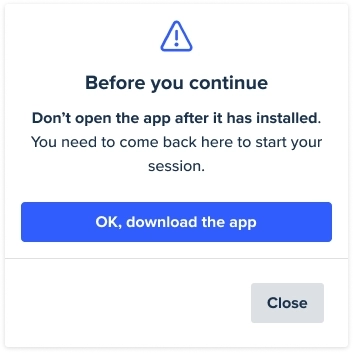
Prototype 2
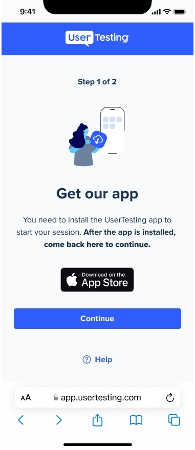
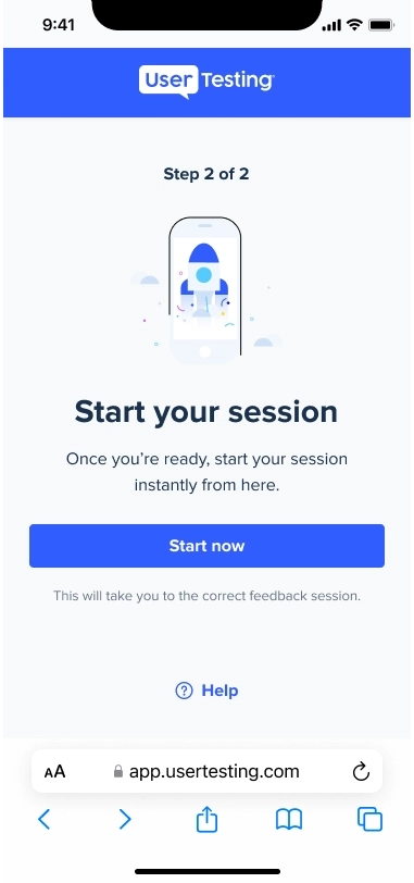
Spreading the steps across two screens gave us similar results. Users appeared to skim-read the descriptive headline “Get our app” and the all-too-common call-to-action (CTA) button, “Continue.” After all, these are instructions that are present on almost every other app and website on the internet. We’ve all seen them hundreds of times. Why waste time reading them?
Prototype 3
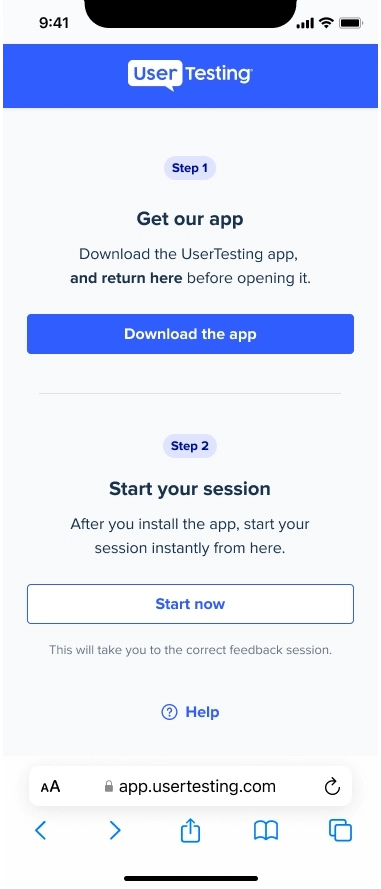
Still reluctant to stray too far from the principle of plain language, we decided to try a rogue move: adding friction to the experience and forcing the user to slow down to re-read the instructions before continuing.
Despite the repetition in button copy between the first screen and second screen, we finally had some measure of success. Users were pausing to read the instructions the second time they saw them.
Prototype 4
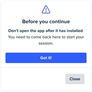
It seemed that a time delay would be added to this pop-up. The user would be forced to sit on this screen and read the copy for five seconds before the button would let them continue.
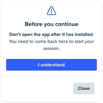
So, one final iteration on the content. How do we phrase this CTA button in a way that was plain, easy to understand, and yet didn’t cause the user to skim?
I tested three variations, all of which were framed as a response to something. The hope was that this would prompt a user to consider what they’re responding to, and re-read the body copy for more clarity.
Discovering the solution
Of all the CTAs tested, “Got it!” proved more effective than “I understand” and “OK, download the app.” Great.
But then, I had second thoughts. What if a user downloaded the app, then returned to this web browser as intended, but re-read, “Got it!” in the past tense? Would they potentially select the button again, reading it as a confirmation message rather than something that leads them to the app store as intended?
Then, simple, plain, but descriptive inspiration finally danced into view, “Go to app store”!
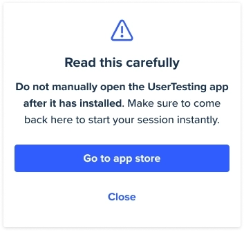
This button copy was simple enough to be easily understood and detailed enough to differentiate itself from common phrases like “Download app.” It was an accurate description of what the button does.
Finally, we cracked the strange user flow as best we could. The majority of our test participants were able to successfully download the UserTesting app and return to the web browser to begin their test.
Now what?
These tested examples aren’t to suggest that writing simple, short messaging is wrong, nor that plain language is something we shouldn’t strive for.
Instead, these tests showed me that what we mean when we speak of “plain” language isn’t always clear. It doesn’t mean always writing things in as few characters as possible, or always substituting a more descriptive, if longer, word for something more concise. Sometimes we make life easier by using more words and adding friction—slowing the reader down and helping them digest.
“Plain” in this case, meant making the instructions clear, almost automatic, and repeating them. Plain to see.
We regularly take these principles into account when writing error messages, for example, where it’s often to the user’s benefit to be slightly more formal and detailed in our writing. Yet, the path of least resistance for a lot of other user interface copy is to rely on ubiquitous terms (“Continue”, “Download app”, “Next”) without fully considering the user’s context or need for additional information.
So, next time you’re working on a tricky flow, trying to boil complex instructions down into bitesize content, consider asking yourself: should I serve a bigger bite?
On-Demand Webinar: How UXR Leaders Can Shape the Role of Research in the Age of AI
Explore how leading UX Research teams are evolving from a service model to becoming strategic insight leaders.


