
3 tips to effectively test your 404 error page

So you're digging through your analytics when you notice that, uh-oh, you're starting to pick up traffic to your 404 error page. But you're not too worried about it because you'll get the broken link fixed, and that's all you need to do to make everything fine and dandy...right?
If you've done an awesome job on your site with cleaning up dead links, you probably haven't put much thought into improving your 404 error page. But no matter how thorough you are with keeping your site up to date, there's always a chance that someone out there will link to your site and mistype a URL, or perhaps a universal script will get updated and pull down a few pages as a result.
Accidents happen, so view your 404 error page like you would an insurance policy. You might not need it often, but you'll want it to be awesome when you do.
Now, think of the last time you hit an error page on a site. Chances are you weren't very happy about it, even if it was a site you love. So what can you do to soften the blow when someone hits one of your error pages?
Should you try to go for something cute and funny, or go for a more serious approach to appeal to the business-minded folks on your site?
Would your users find it amusing if you embedded a game on your error page, or would they be more receptive to a page full of useful links and a means to contact you?
A simple search for "awesome 404 error pages" will bring up a ton of articles that will give you some great ideas on how to improve your error page, but before you channel your inner Ty Pennington and begin an extreme makeover, you'll need to understand what your users want to see should they hit this virtual dead end on your site.
Run a few tests with participants from your target market, and keep these tips in mind to get the most out of your results:
1. Give your participants a context before sending them to the error page
It sounds simple enough, but to get the best possible insights from your study, you have to help your participants understand your product or service. Ask your participant to visit your homepage first, and have them click around a bit to learn about your company. This will give your participant a context with which to view your error page, but sit tight. You don't want to send them to your error page just yet.
When your participant has had a chance to familiarize themselves with your site, ask them to describe their impression of your company. Do they see your company as professional and serious, or is their impression a bit more playful and lighthearted?
By understanding how your users view your site, you'll be able to craft an error page that's consistent with what your users would expect to see—and hopefully ease the pain of hitting a dead link.
2. Don't tell your participants you're running a 404 error test
Now that your participant has a context with which to view your error page, it's time to send them there. It seems like a no-brainer, but if you want your results to be as realistic as possible, don't set your participants up to anticipate an error page. Set your test up like any other study, and sequence your tasks to let your participants hit your error page without explicitly pushing them there.
Before you send them to the page, specify in your task that you want them to speak their opinion as soon as they hit the next page, even if it's not where they expected to land.
Make sure that you give them at least a minute to explain and set a time limit to complete this task. By specifying this, you'll be able to get an honest reaction to your error page, you'll give them a sense of urgency to find the intended page if it doesn't load up, and you'll give them an "out" to move on to their next task.
The most important thing you'll take away from this task is how they react once they hit the error page. After expressing their opinion of the error, what do they do immediately afterward? Are they going right for your search bar or do they try to navigate their way back through your header? Learning the answers to these questions will help take most of the guesswork out of your redesign and help guide you in the right direction.
3. Ask participants what they want to see
After your participant completes the task in the previous section, you can finally reveal that you're testing your error page. Ask your participants if the content of your error page was what they were expecting to see based on what they know about your site and your company. If it didn't meet their expectations, ask "why not?" and keep it open ended.
The user above would like to see a more prominent search bar, and he implies that it might be useful to have a simple means to inform support about the broken page.
If the 404 page didn't meet the user's expectations, was it because the tone didn't match the rest of your site, or was it because it didn't have any useful elements? These are the things you can expect to learn by asking this question.
Your participants' answers will also help you understand what your demographic is used to seeing when hitting these error pages and give you a bit more information on how you can improve on industry standards.
Need some more ideas?
No, we’re not going to turn this into a “Top 404 Error Pages We Absolutely Love!” post. Instead, here’s a quick look at how some of the web’s top desktop properties in 2013 approached their error pages:
AOL
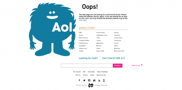
AOL took a bit of a lighthearted approach with a furry monster on their error page, but they score usability points for featuring both a directory and a search bar to help users find what they’re looking for. However, the automatic redirect to the homepage after a few seconds of inactivity could be frustrating to users.
Apple
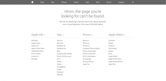
Apple’s error page is simple, yet functional. It features both intuitively categorized links and instructions on how you can search for the page you’re looking for.
Comcast
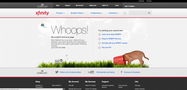
Comcast took a bit of a whimsical approach to their error page, with playful imagery and amusing copy. They also use the page as an opportunity to remind folks about their most popular products.
Yelp
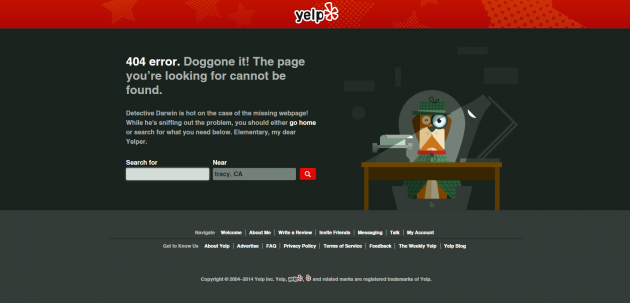
Yelp’s error page tries to score some cute points with the copy and illustration, but also shows an understanding of their users by including the most prominent feature of their site - the ability to search for a service near you.
Now that you’ve got a few more ideas on how to approach your 404 error page, it’s time to run a few tests on your own site. When you have a moment, let us know how your studies turned out in our comments section, and as always, feel free to include your own tips on testing error pages.
On-Demand Webinar: How UXR Leaders Can Shape the Role of Research in the Age of AI
Explore how leading UX Research teams are evolving from a service model to becoming strategic insight leaders.


