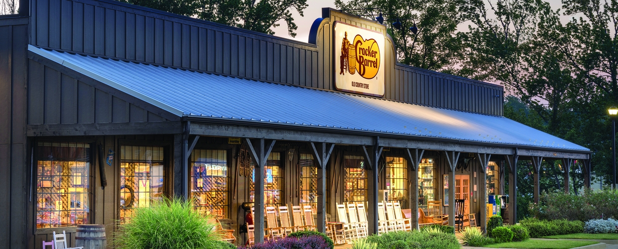
Did people really hate the new Cracker Barrel logo that much?

We surveyed 200 people in 24 hours to find out
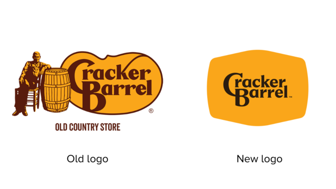
Cracker Barrel recently rolled out a new logo…and then rolled it right back up after what seemed like a huge public backlash. So we decided to investigate, did people really hate the new logo that much? And why?
We asked 200 people in the U.S. what they thought about the new logo, judging it purely from a brand and design point-of-view.. The results? Let’s just say… it wasn’t love at first sight.
Here’s what we learned, and what any brand can take away when thinking about a logo refresh.
People found the old logo more authentic for the Cracker Barrel brand
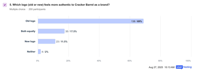
When asked which logo felt more authentic to the Cracker Barrel brand, it was no contest:
- 69% said the old logo felt more authentic.
- Only 11.5% picked the new one.
- The rest were split between “both” or “neither.”
Takeaway: The old Cracker Barrel logo carries serious brand equity. It’s tied to people’s memories of the brand, and the new version just doesn’t hit the same notes.
The top feeling after seeing the new logo? “Meh”
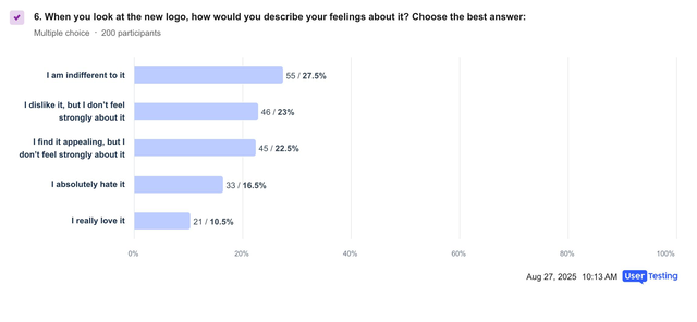
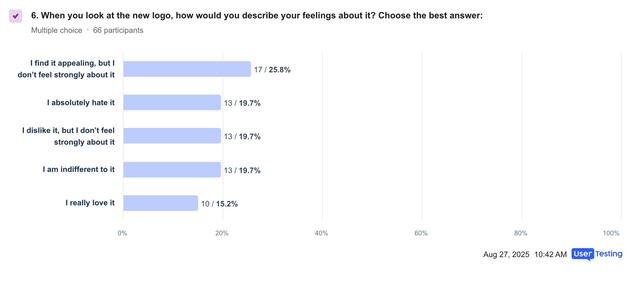
When asked about their feelings about the new logo, most people shrugged.
- 27.5% said they were indifferent.
- 39.5% leaned negative (either disliked it or hated it).
- 33% found it at least somewhat appealing.
- Only 10.5% really loved it.
Takeaway: The new logo doesn’t spark much excitement. Indifference is the dominant reaction. And when people did feel strongly, they tended to feel against it.
The worst part about the new logo? It was boring
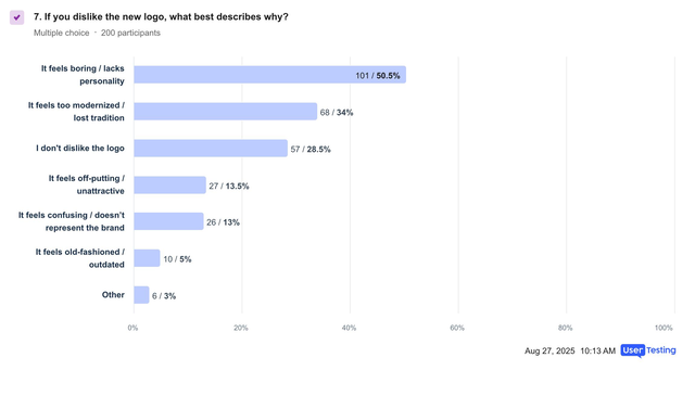
When we asked why they disliked the new logo, here’s what we heard:
- 50.5% said it felt boring, lacking personality.
- 34% thought it was too modernized, losing tradition.
- Smaller groups said it was unattractive (13.5%) or confusing (13%).
Takeaway: This isn’t just about aesthetics. People feel like the logo no longer represents what makes Cracker Barrel unique — its tradition, warmth, and personality.
ON-DEMAND WEBINAR
Pulse Report: Retail Q2 2025 overview
Trust, tech and tariffs - how shopper behavior is evolving in 2025
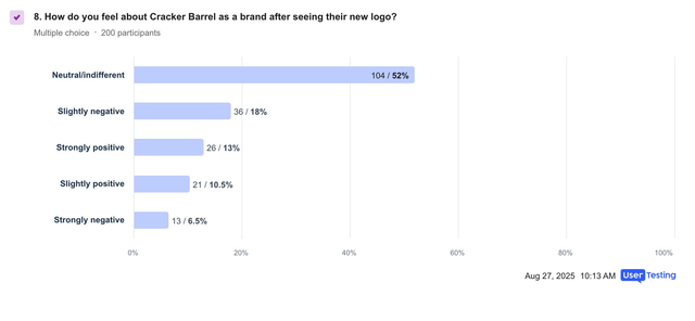
How does it impact brand perception?
- 52% felt neutral about Cracker Barrel after seeing the new logo.
- But 24.5% came away with a more negative view vs. only 23.5% who felt more positive.
Takeaway: The new design doesn’t really move the needle in a good way. If anything, it drags brand perception down a notch.
The only ones who liked it? High earners
One interesting nugget: people with household incomes over $100k were more likely to actually like the new logo. Most of these higher-earning respondents (25.8%) found the new logo at least slightly appealing, the only demographic that did.
But this underscores the fact that even if there’s some appeal to a more modern, upscale audience, the new logo doesn’t land with the broader base of loyal customers.
Upcoming Webinar
Seeing is understanding: how early adopters are using AI to buy
DATE: Sep 10, 2025 | TIME: 11:00 am PDT
In this webinar, you'll learn:
- How real consumers use ChatGPT and other AI tools to shop
- What AI means for discovery, product search, comparison, and conversion
- How to test and optimize for AI-first shopping journeys
So, what should Cracker Barrel (or any brand) have done?
Had Cracker Barrel had run this test (which took us 24 hours to do), we would have likely told them the following, based on the results:
1. Don’t throw out tradition
If your old logo is tied to brand identity, keep the heart of it alive. You can modernize without losing what people love. Think “refresh,” not “reinvention.”
2. Avoid the “generic” trap
The biggest complaint was that the new logo feels boring. Any redesign should bring back personality — whether that’s through unique typography, warm colors, or familiar symbols (in Cracker Barrel’s case, the rocking chair or barrel).
3. Tell the story
If you are updating, explain why. Customers are more open to change when they understand the reasoning — “we’re staying true to our roots, but we’re making things cleaner for the future.”
4. Test with different segments
Since higher-income audiences liked the new look more, there may be opportunities to tailor different applications: keep the heritage logo for mainstream use and test the modernized version in select markets or digital touchpoints.
5. Iterate, don’t guess
Before launching, test different variations and show them in context — menus, signage, apps. A logo can feel very different depending on where people see it.
A logo isn’t just decoration. It’s a symbol of heritage, trust, and everything customers associate with your brand. Cracker Barrel’s test shows how easy it is to tip the balance too far toward “modern” and away from “authentic.”
The safest path forward? Respect tradition, polish the details, and make sure your customers feel like they’re still looking at the brand they know and love.
On-Demand Product Tour
Unlocking smarter pricing and packaging decisions
In this session, you’ll see how the UserTesting Human Insight Engine helps uncover customer perceptions of pricing, pack sizes, product photography, and competitive positioning.


