
Engage and delight your users with empty states
A few years ago, I was midway through a trip around the globe and had a stopover in an airport I’d never visited before. I was about 20 hours into my journey, tired, hungry, and in desperate need of sleep. Unfortunately, my flights had all been delayed, and the airport had essentially shut down. My only option was to stay in one of the hotels supposedly attached to the airport. But finding one of these hotels was easier said than done. After asking around a few times, I finally found a sign that gave me hope. I followed the arrows until I was led into a large, empty room.
I looked around for more clues as to what I should do next but there were none. Just a few moments ago, I was sure I was headed in the right direction, only to end up in a place that offered me no information or assistance. I abandoned my quest for that hotel and backtracked until I was finally led in the right direction for a few hours of shut-eye.
This situation happens a lot when it comes to digital experiences. Sometimes a user will search for information that’s not there (or not available), and how that status is communicated can determine whether or not that user will continue to use the app or service.
They’re called empty states, and while its name may hint otherwise, they’re crucial to providing valuable information and engaging with your audience.
What are empty states?
Empty states are situations when there is no data to provide for the user. This could occur for a few reasons, such as:
- New users
- User has cleared all their data
- User has experienced an error
In each situation, users need to know what happened, why it happened, and how they can move forward. In today’s article, we’ll take a look at a few examples of empty states for each situation, and how they can benefit—or bewilder—your users.
1. New users
It’s no secret that effective new user onboarding is a key factor to retaining and engaging users. Yet many apps still struggle to connect with users right away. According to one study, the average app loses 77% of its daily active users (DAU) within the first three days of downloading an app.
When people experience your app or service for the first time, there won’t be much to show them at first. That means there will be lots of opportunities to use empty states to effectively engage with new users.
As people explore your app or service for the first time, they’re also learning how to use it. Take advantage of that by educating users as they encounter empty states. Let’s use Airbnb’s app as an example. When I use the app for the first time and don’t have any trips scheduled, I get this empty state:
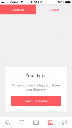
With just a tiny bit of copy, Airbnb quickly lets me know what this portion of the app is for (seeing my scheduled trips) and why I don’t have any data displayed (I haven’t booked any trips yet). And last but not least, it also shows me how to fix that with a big, colorful, prominent button that encourages me to start exploring to find a new place to visit.
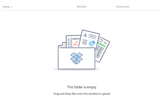
Here’s another example from Dropbox. It’s clean, simple, and quickly explains why you’re not seeing any information, and most importantly, how to add new files.
2. User has cleared all their data
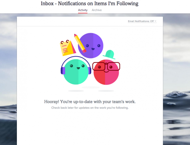
Depending on the nature of your product or service, your users may eventually clear their data. But no data isn’t necessarily a bad thing. In fact, in the case of a task list or in our perpetual quest for inbox zero, an empty state may, in fact, be quite the achievement. If that’s the case, use this opportunity to congratulate your users on a job well done! Asana’s empty state for my task list inbox is a favorite:
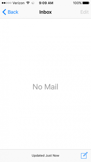
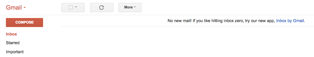
Now let’s take a look at my recent achievement of inbox zero in one of my Gmail accounts. Not quite as inspiring, is it? Yes, the mobile app tells me that I don’t have any mail. But is that because there’s a problem with the app, or because I’ve cleared them all out? As a user, I’m not quite sure if I’ve accomplished something great here, or encountered an error.
Gmail’s desktop app, however, does a slightly better job making it clear I’m an email rock star (despite their sneaking in an upsell to their new app, Inbox), but it doesn’t give me the warm fuzzies or a feeling of accomplishment like I do with the Asana app:
For empty states triggered by user-cleared data, it’s important to remind your user that there’s nothing strange about the missing information and provide them with guidance on what will happen next or when they’ll expect to see new information populated. And as always, use the opportunity to inject your brand’s personality into the message to help engage and delight your users so they’ll keep coming back for more.
3. User has experienced an error
Nobody likes getting error messages, but they’re going to happen so you might as well try to make them palatable. An error message, like the other empty states, should inform your user of what happened, why it happened, and how they can move forward.
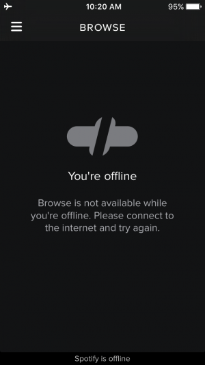
Spotify’s error empty state is a great example of how to do this right. It doesn’t make me feel silly for forgetting that I’m in airplane mode, it simply tells me it can’t connect to the internet and politely suggests I try connecting again.
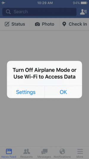
Facebook almost hits the mark but doesn’t do quite as good of a job with the empty state itself. Instead of providing the necessary information in the empty state, the app has added a notification prior to showing the empty state that offers some suggestions. While this is better than nothing at all, it still runs the risk of someone breezing by the error message and making it to the empty state without any guidance on what happened or what to do next.
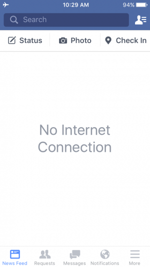
There is plenty of space to add a few lines of microcopy to help guide folks that may have missed the initial notification. Adding just a bit more information (and personality) would improve this empty state significantly.
Whatever you do, just make sure the information you provide in an error empty state provides some value to users. Here’s an example of what not to do from Windows’ famous Windows 10 error message:
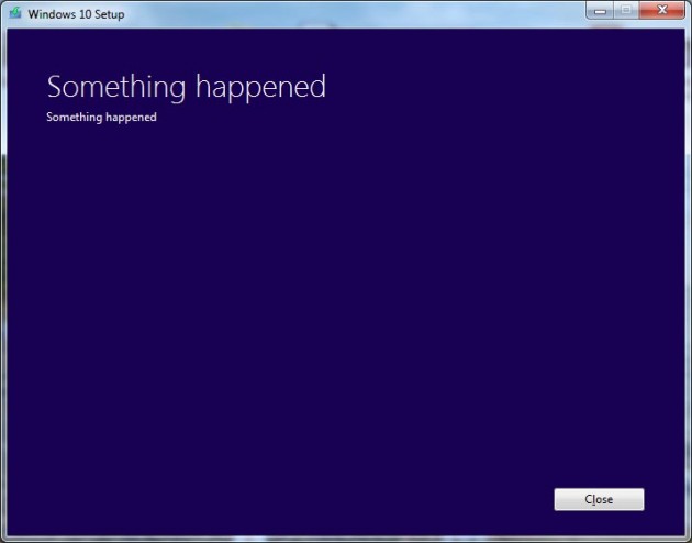
This error message feels almost purposely unhelpful. It leaves the user wondering, “Ok, something happened, but what was it? How do I fix it? What do I do now?” Empty states (and error messages) should avoid this type of interaction whenever possible.
The value of nothing
While it may be easy to overlook empty states as “nice-to-have” rather than a necessity, don’t let the name fool you. Empty states are full of opportunity to delight and engage your users. As you’re developing your app, be sure to keep in mind what you can provide to users through empty states:
- Education and guidance - For both new and seasoned users, empty states are a great opportunity to guide users on next steps or educate them on how to interact with your app.
- Reward and delight - Consider what your users are trying to accomplish and design your empty states to recognize users for accomplishments when appropriate. If a task list is completed or an inbox is empty, use that empty state to make them feel good about their success!
- Reassure and assist - Things won’t always go according to plan, but that shouldn’t stop your users from interacting with your app. If an error occurs, use that empty state to reassure your users it’s not their fault, and give them clear, easy steps on getting back on track.
People have many choices when it comes to the apps they use. Help make it easy for them to choose yours by designing empty states that are clear, helpful, and in line with your brand’s voice and tone.


