
What happened? How to write a better error message

It was on my commute home from work when I was deep in the throes of an intense game of Two Dots. I’d been stuck on a level for basically forever and had two clear choices: break down and buy the special bonus things that would magically make the level go away, or quit playing the game forever.
My Two Dots addiction is pretty severe, so I opted for door number one. It’s not often that I make in-app purchases, so I took this $4.99 purchase seriously. I tapped the “Buy” button and eagerly awaited my bounty. And was met with this:
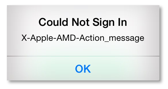
“What the @#%%&# does that mean?” I blurted a bit too loudly to my fellow train passengers. It was an obnoxiously vague error message and the one thing keeping me from my dream of passing level 357. And it was preventing Two Dots from finally getting me to pay for something.
Nobody likes to get an error message. And getting one as confusing and unhelpful as this one just adds insult to injury. But things do go wrong, and error messages are necessary—but they don’t have to be evil.
In this post, I’ll share a few tips on crafting error message UX that will help your users and hopefully keep them from shouting profanities at strangers on the train.
1. Tell me what went wrong
When something goes wrong, it’s helpful to know exactly what happened. But if you aren’t explicit about the error, your users are going to have a hard time figuring out how to fix it. Take this error for example:
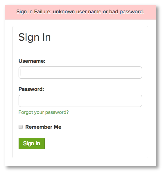
I either goofed my username or password. Well, which is it? Most of us have multiple usernames and passwords floating around out there, so telling me that one or the other (or both!) is incorrect doesn’t help me much. Now I’m forced to run through all the permutations of possible usernames and passwords until I get lucky and land on the right combination or get locked out of my account. Not exactly a smooth user experience.
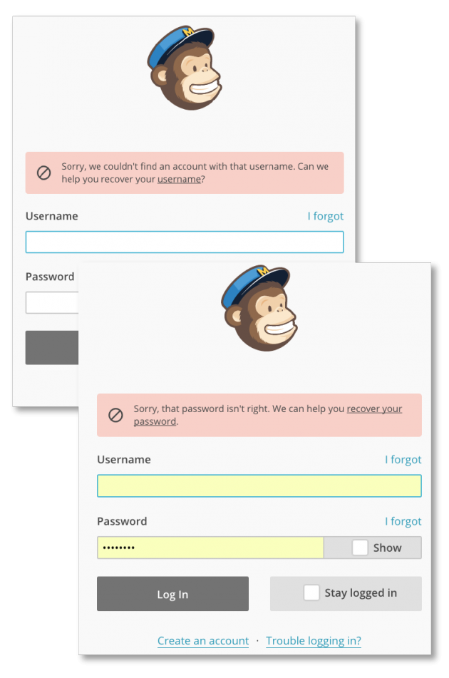
If your users encounter an error, the first thing you should do is tell them what triggered the error. In most cases, you’ll know what prompted an error, so don’t make your users guess. Here’s how Mailchimp handles the same problem:
2. Tell me how to fix it
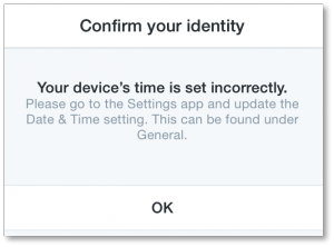
Knowing what went wrong is super helpful, but that won’t always be enough information to solve the problem. Sometimes your users will need some guidance on how to fix it. This error message from Twitter does a great job of not only telling me exactly what went wrong but how to fix it as well.
3. Say it like a human being
Getting an error message is frustrating enough. There’s no reason to make it worse by making your users feel completely disconnected from your product or service. Take a look at this error message I occasionally get when using Adobe Illustrator:
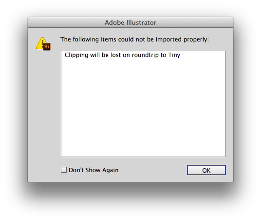
What does this even mean? Who or what is Tiny? And what did he/she/it do with my clipping? You probably wouldn’t speak to another human being like that, right? So it stands to reason that an error message, which is intended solely for the eyes of a human, should be written with them in mind. While the code in this example probably means something to a developer, it means zip to me.
Instead, use the same care in crafting your error and notification copy as you do the rest of the copy on your site or app. Remember that the user is your audience, so the copy you write should be for them, not for you.
4. Have fun
A little levity can go a long way when it comes to error messages. Sure, it’s not fun when something goes wrong. But if you do it right, you can use that opportunity to have a little fun and share your personality with your users.
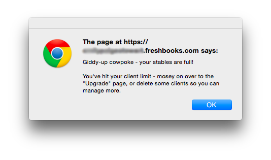
This error message from Freshbooks does a great job of telling you not only what went wrong and how to fix it, but doing it in a relatable and fun way that just might make you smile.
Here’s another one from Trello. The cute illustration of the company’s mascot, Taco, immediately makes me a little less annoyed I can’t get what I’m looking for and makes me feel like they appreciate me enough to put some effort into such a small but important bit of copy.
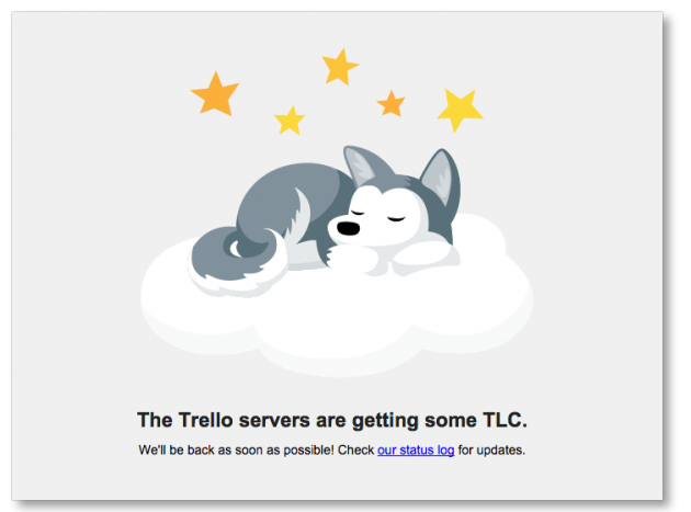
A note on using humor in error messages: While it’s great to lighten things up when you can, remember that your users are still encountering an issue. You can still be empathic while showing your personality, but be sure not to get overly cute or dismissive. The last thing you want is for users to feel like you aren’t taking their situation seriously.
Error messages are a part of digital life. We need them. But that doesn’t mean they have to be robotic or boring. Craft your error messages with these tips in mind, and your users will be much more likely to smile rather than swear when they get an error.

Get actionable insights today
Uncover human insights that make an impact. Book a meeting with our Sales team today to learn more.


