
To err is human: how to humanize error messages for good UX

If you've read content guidelines from start to finish, you probably wrote them—whether you’re a writer, editor, or content creator. In most cases, content guidelines contain too much jargon and complicated rules, making them unhelpful for people who aren't writers.
At UserTesting, empathy is at the forefront of our culture and mission. Creating a great customer experience is much more than just empathizing with your customers. In this how-to, you’ll see how developing good error messages and usable writing guidelines begins with empathy for both your customers and the people you work with.
Importance of good error messages
Error messages play a critical role in user experience, and must equally uphold content guidelines as much as copy on a homepage or an advertisement. All of us have had run-ins with error messages, whether it was a website that's under maintenance or an incorrect login attempt.
A usable and delightful product has consistent error messages that explain the problem, the cause, and the next steps in a clear and helpful manner. Imagine an engineer is given a short deadline to write an error message. What would make it easier for them to do so? As UX writers, how might we design content that helps people make consistent content design decisions?
Why the golden formula for messages isn't always right
When I started out as UX writer, I couldn't find resources to help me write error messages that were aligned with our brand voice and language, like a list of recurring error messages. So UserTesting’s UX writing team conducted a content audit and discovered many inconsistencies in language, terminology, and tone of voice. For example, the generic "something went wrong" message had at least seven variations, ranging from concise and matter-of-fact to overly apologetic. Having inconsistent error messages create a disjointed user experience within the platform.
When writing error messages, UX professionals know to use the "golden formula,” which is telling the user what happened, why it happened, how to fix it, and what to do next.
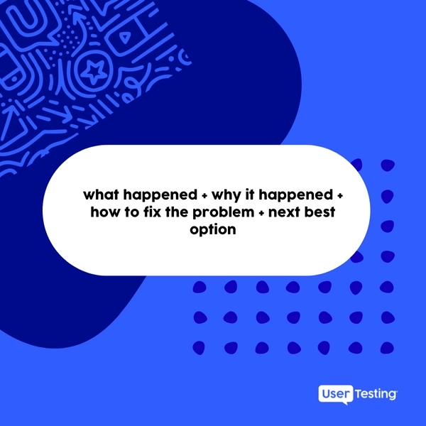
While this is a nice outline of the anatomy of an error message, it doesn’t help us decide what information to include. This approach also fails to factor in design constraints, like where the message will appear and how much space we have in the UI for it, as well as whether we want to communicate the cause of an error.
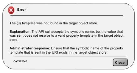
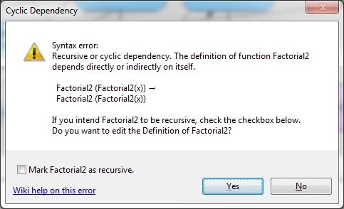
We've all seen those error messages filled with too much technical jargon and not enough actionable guidance. Most users don’t care about the technical details of what happened, and if we apply the “golden formula” to all errors, we could end up with something like the below messages, which should teach us what not to do.
So, how can you empathize more with both your users and those who’re writing error messages?
Step 1: Categorizing error messages
The first step is categorizing the error messages that occur in your platform. Using the UserTesting Human Insight Platform, I performed a card sort and grouped the error messages into three main categories and seven sub-categories:
- User-caused errors
- Incompatible input error
- Empty input error
- Account limitation error
- Authorization error
- Platform-related errors
- General app error
- Server error
- External errors
- External errors (such as connectivity errors)
Step 2: Exploration of tones
Following the card sort, I then took inspiration from Nielsen Norman Group’s Four Dimensions of Tones, and developed our own dimensions of tones specifically for UserTesting error messages— applying that to the categories of errors.
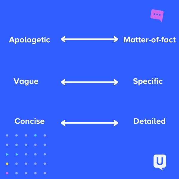
The problem with looking at words on a spreadsheet, however, is that you’re looking at messages out of context. As you can see, mapping these dimensions of tones to the errors made them too arbitrary and assumption-based. They don’t provide actionable guidance for writing the actual message.
How you communicate to your users should be customized depending on:
- The error type
- If you know why the error occurred
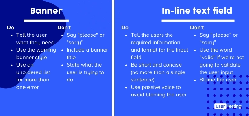
- If you want to tell the user why the error occurred (due to complexity or security reasons)
- How the error message will be presented to the user (i.e. inline, banner, or page-level error)
Shift your focus to finding how you might develop tools that will:
- Write fast and consistent error messages
- Be comprehensive of all different scenarios, triggers, edge cases, and constraints
Step 3: Decision tree and the pilot study
Next, consider making an error messages decision tree. A decision tree is a tree-like model that visually represents rules and related outcomes around decisions. An error message decision tree can help you develop guidelines for errors in various scenarios by using three branching points: who caused the error (user, platform, or external), if you know or want to communicate the cause, and where the message will be placed on the interface.
To avoid developing assumption-based guidelines without real-life application, I identified a part of the product that drives users to seek support from our support team and put the decision tree to work. In this section of the decision tree, we identify errors that
- are caused by users, like empty inputs
- have known causes, from account limitations to incompatible media uploads
- we're trying to communicate the cause
Step 4: Iterations and end results
As the last step, consider interviewing folks on the engineering and UX writing teams to identify guidelines needs and iterate on a working decision tree. You can do that using the Live Conversation test feature on the UserTesting platform. After pinpointing what people need help with, I was able to break the “golden formula” down into building blocks of content components. In each scenario, the inclusion of these content components varies, making this formula dynamic and each message feel bespoke.
Writing guidelines are now organized in layers, with the content components at the top, then general best practices, and lastly, the dimensions of tones. Organizing guidelines in layers makes it easier for people with different guidance to pick and choose which sections to read.
Whether you’re an engineer who needs a quick reference for what information to include, a designer who needs a quick reminder of the do’s and don’ts of error messages for a placeholder copy, or a writer who wants to dig into the dimensions of tones for a specific message, this decision tree is helpful for all types of roles.
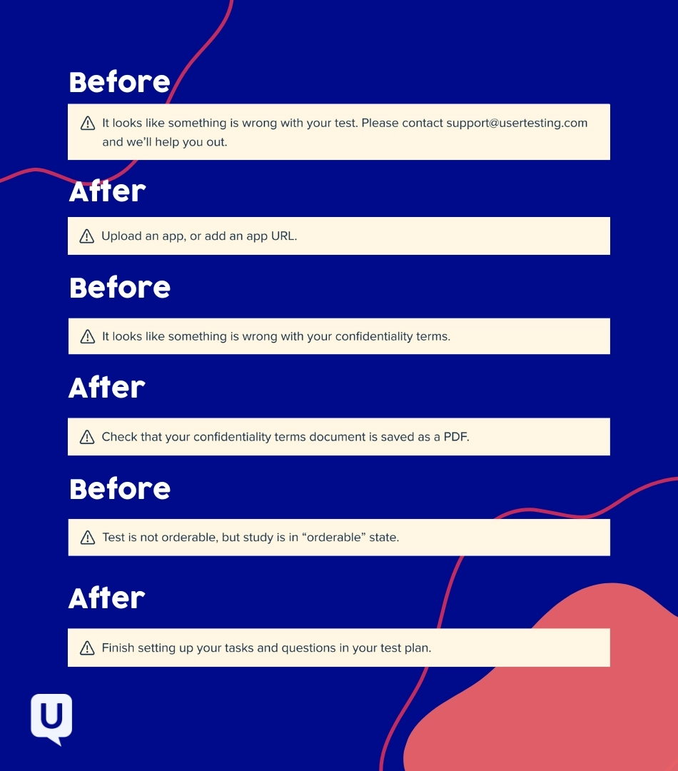
Error message before-and-afters
Let’s take a look at some error message improvements. With the decision tree, we were able to quickly rewrite unhelpful error messages and pinpoint what information to include for each scenario.
Good writing doesn't just improve error messages for your users, it can have an impact on your entire team. Great content can be a powerful tool for your organization and your own professional career.
This project received a lot of positive feedback from our Product, Design, and Engineer teams who all found it useful for their own work. So if you're unsure how much of an impact a few lines of copy can have, take it from me, it can make a difference.
Error messages are opportunities for empathy
Besides improving your error message writing process, these examples also spare those who write error messages the tedious task of searching through long sections of content guidelines for a static formula with ambiguous instructions.
Error messages are opportunities for empathy. So, empathize with both the users and the people you work with! You’ll discover new ways of collaboration and content design, and gain a better understanding of those behind and in front of error messages.
As a bonus, it’s not a bad way to re-demonstrate the value of good content design to the wider team and gain yourself the reputation as “the error message keeper."

Unlock customer insights
Stop guessing and start understanding your customers with UserTesting's quarterly industry reports


