
Mobile Checkout: What Works and What Doesn't?

Is it easier for you to make a purchase on your desktop or on your phone? Which would you prefer doing?
Over the last few years, we’ve been relying on our smartphones more and more, yet the e-commerce conversion rates on phones are still lower than conversion rates on desktop computers. Of course, this is partly due to poor checkout processes, but what exactly about mobile checkout processes turns customers away?
The study
In order to determine which mobile checkout practices customers prefer, we conducted a remote usability study on the checkout process of three different websites. We recruited six participants to go through the mobile checkout processes of Sephora, Big 5 Sporting Goods, and Bed Bath and Beyond.
They were assigned an item to purchase at each store, and then at the end of the study, they were asked to compare the three checkout processes.
The results
Sephora
Users visited the product page for Sephora’s Urban Decay Naked3 Palette and were asked to check it out. All of the users enjoyed the Sephora checkout process a lot and described the overall experience to be “very smooth.” Users enjoyed the large input boxes, autofilled information, and a numerical keyboard that popped up when the website asked for information such as zip code and phone number. Users could tell that the whole site had been designed with mobile in mind.
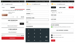
“Everything autofilled and showed up really quickly and bold. The layout was the easiest and didn't feel like I was having to do a whole bunch of things to buy.” – Female test participant, 37, United States
Big 5 Sporting Goods
The website for Big 5 Sporting Goods is optimized for mobile when on the product page, where users checked out the Speedo Short Sleeve Men’s Tee.
However, once users went to pay for their item, the website changed from a layout that was optimized for mobile to one that wasn’t. Users had to zoom in and out to see the necessary information and move the page around---all the while wishing that each page could be viewed on one screen.
Bed Bath and Beyond
For the final part of the test, we asked our test participants to buy towels from Bed Bath and Beyond. Users thought the process was relatively easy, with the only small complaint being that there were too many pages to go through during the checkout process. Two users remarked that they thought Bed Bath and Beyond had the most visually appealing interface, and it was easy for them to tell what they were looking at.
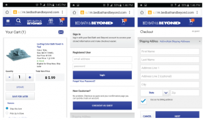
“Big, bright and bold lettering. The screen was well laid out and very functional.” - Female test participant, 39, United States
Mobile checkout preferences
Overall, users’ main concern was that they wanted checkout processes that were quick and easy to use.
All six users said they’ve bought items on their phones before, and different payment options such as PayPal make the process faster and easier.
Users stated that they like it when websites have large text and when you are able to view everything on the same screen so that they don’t have to zoom in and move the page around.
Another bonus was if the website had an autofill option where the city and state would automatically be filled in once the zip code was entered.
They say bigger is better, but in this age of mobile technology, we tend to spend a majority of our time on small screens. Providing the path of least resistance is key if you want to improve your mobile conversion rates.


