

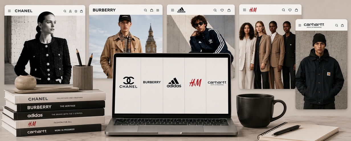
We asked UK consumers to review 5 iconic fashion brand sites. Here’s what they noticed.
What happens when you ask consumers to spend just a few minutes on a fashion brand’s website?
Not to complete a complex checkout journey. Not to evaluate a full redesign. Just to browse with a simple prompt:
"Find a jacket that best represents this brand."
That was the setup for a rapid UserTesting study across five apparel brands: Chanel, Burberry, Adidas, H&M, and Carhartt WIP.
The goal was simple: understand how quickly consumers could read each brand’s identity through its digital experience. We wanted to hear what people noticed first, what signals felt distinctive, what created confidence, and how each brand’s online presence shaped perceptions of quality, relevance, and belonging.
Because in fashion, a website is never just a website. It is a brand environment. It communicates who the brand is for, what it values, how premium it feels, and whether its codes are still meaningful to consumers today.
What we hoped to learn
We designed the study around a practical question for brand, research, and digital teams:
After just a few minutes on your website, what would consumers say your brand stands for?
To explore that question, we ran five separate unmoderated think-aloud studies with UK consumers. Each participant visited one brand’s website and looked for a jacket they felt best represented that brand.
As they browsed, participants described their impressions in their own words. They reacted to the visual design, the product presentation, the shopping experience, the models, the imagery, the navigation, and the overall feeling of the brand.
We were looking for three things:
- Brand perception: What kind of brand do consumers think this is?
- Aesthetic execution: What visual cues, codes, or design elements shape that perception?
- Digital experience quality: Does the website make the brand easier to understand, explore, and trust?
The result was a compact but revealing look at how brand meaning forms in real time.
Topline results
Participants rated each experience (from 1-5) across several dimensions: visual appeal, ease of shopping, purchase confidence, and clear identity.
Brand | Visual Appeal | Easy to Shop | Purchase Confidence | Clear Identity |
Burberry | 4.67 | 4.83 | 5.00 | 4.83 |
Adidas | 4.67 | 4.83 | 5.00 | 4.50 |
H&M | 4.80 | 4.40 | 4.80 | 4.80 |
Carhartt WIP | 4.40 | 4.80 | 4.20 | 4.80 |
Chanel | 3.50 | 1.75 | 2.50 | 3.00 |
The table gives us the directional read. But the real story is in the videos.
The strongest moments came when participants explained why something felt recognisable, modern, inclusive, premium, confusing, specific, or trustworthy. Those comments showed that consumers were not just assessing usability. They were interpreting the brand.
Chanel: iconic codes still do real work
Chanel’s story was about recognition.
Even in a short session, participants quickly picked up on the cues that make Chanel feel like Chanel: jacket silhouettes, buttons, pockets, fabrics, texture, runway associations, and the broader sense of high-end fashion.

One respondent described the visual shorthand clearly:
“The jackets that have the pockets on the top and the bottom, the distinctive buttons, the detail… that just feels classic Chanel.”
Another focused on the material and silhouette cues:
“The thicker fabrics, the bouclé-type finish… this feels like it’s classic, distinctive Chanel.”
And another summed up the immediate premium impression:
“You can tell that it’s a high-end fashion brand just by going onto the website.”
Those reactions are important because they show the strength of established brand codes. Participants were not only saying “this feels expensive.” They were identifying specific details that carried brand meaning.
At the same time, Chanel surfaced an interesting distinction between brand recognition and shopping ease. Some participants found the experience less straightforward as a product-finding journey. But that does not necessarily mean the site failed at brand expression. For luxury, the website may be doing a different job: creating desire, reinforcing identity, and motivating deeper engagement beyond the website itself.
One respondent made that point directly:
“I don’t think people are going to buy on the website. This is going to be motivation to get into the store, book an appointment with a sales associate.”
That is a more nuanced read than simply saying the site was easy or hard to shop. Chanel’s digital experience appeared to function as a brand world as much as a commerce environment.
What Chanel shows: When brand codes are strong, consumers can recognise them almost instantly. The strategic question is what role the digital experience is meant to play: transaction, inspiration, storytelling, appointment-setting, or all of the above.
Burberry: heritage felt modern, not frozen
Burberry produced one of the clearest narratives in the study: heritage that still feels current.

Participants immediately recognised the familiar signals, especially the check pattern.
“It’s always that kind of beige checked pattern that just says Burberry.”
But what made Burberry stand out was that participants did not describe it as only traditional. They saw the brand as classic, but not stuck. Premium, but not inaccessible. Familiar, but still evolving.
One respondent put it this way:
“It’s classic, timeless… but the video gives a contemporary feel to it. It’s not stuffy.”
Another described the brand as moving forward while retaining its roots:
“It has rich culture and heritage, but it’s moving forward rather than being stuck in the past.”
That balance matters. Heritage brands often face a tension between protecting codes and staying relevant. Burberry’s experience gave participants both: the familiar cues they expected and enough freshness to make the brand feel alive.
The website experience also supported that perception. Participants described the site as premium, clean, easy to navigate, and straightforward.
“The website screams luxury and premium… really easy and straightforward to understand.”
Burberry’s strength was not just having recognisable codes. It was making those codes feel usable, current, and emotionally open.
What Burberry shows: Heritage works best when it feels active. Consumers want to see continuity, but they also need evidence that the brand belongs in the present.
Adidas: breadth without losing the core
Adidas presented a different challenge: how to stay coherent when the brand covers so much territory.
Participants saw a wide range of possibilities: sport, performance, casual wear, lifestyle, retro styling, fashion, and outdoor use. But that breadth did not erase the brand’s core meaning.

One respondent captured the balance well:
“There’s something for everyone on there… but it still feels like a sports brand.”
Another pointed to the power of recognisable visual cues:
“The signature three stripes… it looks like it’s definitely from this brand.”
Those cues helped respondents make sense of the range. Adidas could offer many different products and styles because participants still had clear anchors: sport, stripes, logo, performance, and everyday wearability.
The experience also performed well from a practical standpoint. Participants described the site as easy to use, easy to navigate, and helpful in presenting product details.
“It’s easy to navigate, easy to find what you want, easy to find sizes… images, videos of the product.”
That combination matters for a broad brand. Range can become overwhelming if the site does not provide coherence. But when the brand signals are strong and the experience is clear, breadth can feel like accessibility rather than dilution.
What Adidas shows: Broad brands need strong mental shortcuts. The more categories and audiences a brand serves, the more important it becomes to reinforce the signals that make the brand recognisable.
DOWNLOAD NOW
The 2026 State of AI in Retail Experiences
We surveyed 89 retailers and 1100 shoppers to understand what good AI-powered shopping looks like. Read on to get the most comprehensive benchmarks, trends and insights on the future of retail.
H&M: inclusive, accessible, easy to understand
H&M’s story was about clarity and accessibility.
Participants described the brand as simple, stylish, trendy, approachable, and easy to understand. The experience was not always described as the most unique, but it was highly legible.

One respondent said:
“Very plain, simple, but stylish at the same time.”
Another described the brand as fashion-forward and broad in appeal:
“It communicates its brand well… high energy, high fashion in terms of fashion trends, and it appeals to a broad section of people.”
The most compelling comments, though, came around representation. Participants noticed the people in the imagery and connected that directly to what the brand seemed to stand for.
“They use people from all different races, all different colors… people that represent everybody.”
Another respondent said the models felt relatable rather than unrealistic:
“The models used are attractive, but not ridiculously slim… they feel quite normal. That’s what stands out as distinctive.”
That is a powerful reminder that brand meaning often comes from choices that may seem ordinary: who appears in the imagery, how products are styled, how aspirational or relatable the presentation feels, and whether people can see themselves in the brand.
H&M’s strength was not exclusivity. It was accessibility. Consumers understood the brand as current, inclusive, and easy to shop.
What H&M shows: Mass-market does not mean brand-neutral. Accessibility, representation, simplicity, and trend relevance can all function as powerful brand signals.
Carhartt WIP: specificity made the brand easier to read
Carhartt WIP showed the value of a sharply defined identity.
Participants described the brand in specific terms: urban, streetwear, utilitarian, baggy, casual, hard-wearing, young, skater-influenced, and culturally specific. Not every respondent personally identified with the style, but many understood who the brand was for.

One respondent said:
“Branding-wise, it seemed clear who the target audience was. Everything was aligned.”
Another put it even more simply:
“It showed exactly what sort of style it was. It wasn’t too vague.”
That clarity is valuable. A brand does not need to appeal to everyone in order to be understood. In fact, trying to appeal to everyone can sometimes make a brand harder to read.
Carhartt WIP’s specificity gave participants a clear sense of audience and attitude. One respondent said:
“It’s young, baggy, casual, sort of utilitarian wear.”
Another acknowledged that they were not personally the target customer, while still recognising the brand’s intent:
“I wouldn’t buy, but I could imagine my daughter, who’s 22, would buy from it. So yeah, it felt intentional.”
That may be one of the most useful insights in the study: personal relevance and brand clarity are not the same thing. A consumer can say, “This is not for me,” while still understanding the brand and respecting that it is doing something deliberate.
What Carhartt WIP shows: Specificity can be a strength. The goal is not always universal appeal; sometimes the goal is to be immediately understood by the right audience.
Get the guide
Designing AI-powered shopping experiences for the next generation of commerce
Our comprehensive guide to designing and testing AI-driven shopping experiences that help shoppers find what they need, trust the guidance they receive, and feel confident taking the next step.
What the study tells us
Across the five brands, consumers were doing more than judging websites. They were reading signals.
They noticed product details. They interpreted models and imagery. They reacted to logos and visual codes. They inferred who the brand was for. They evaluated whether the experience felt premium, inclusive, easy, contemporary, or culturally specific.
The most useful insight was not simply which brand scored highest. It was that each brand communicated meaning in a different way.
Chanel showed the power of iconic codes.
Burberry showed how heritage can feel modern.
Adidas showed how breadth can remain coherent.
H&M showed how accessibility and inclusivity become brand signals.
Carhartt WIP showed how specificity can sharpen identity.
Together, those findings point to a broader lesson: digital experiences shape brand meaning whether teams intend them to or not.
Key takeaways for brand and research teams
1. Consumers interpret brand identity quickly
Within minutes, participants formed impressions about quality, relevance, audience, and intent. That means every element of a digital experience — navigation, imagery, copy, product organization, and visual design — contributes to brand perception.
2. Brand codes need to be visible and usable
Recognisable cues matter, but they need to be supported by an experience that helps people explore, understand, and trust the brand.
3. Heritage needs movement
Classic codes remain powerful when they are connected to a current context. Consumers respond when heritage feels alive rather than preserved behind glass.
4. Breadth needs coherence
For large brands, product range is not a weakness if consumers can still identify the core signals that tie everything together.
5. Representation communicates strategy
Consumers notice who appears in the experience. Models, styling, and imagery can signal accessibility, aspiration, inclusivity, or exclusivity almost immediately.
6. Specificity can be more useful than broad appeal
Not every brand needs to feel personally relevant to everyone. A clear sense of audience can make a brand feel more intentional and distinctive.
How UserTesting helps teams see what consumers really understand
The central question for any brand team is simple:
What would consumers say your brand stands for after five minutes on your website?
UserTesting helps answer that question quickly by letting teams watch real people experience, interpret, and explain the brand in their own words.
Teams can use this kind of study to evaluate:
- Brand positioning
- Campaign landing pages
- Product detail pages
- Category experiences
- Site redesigns
- Competitive sets
- Luxury, premium, or mass-market positioning
- Rebrands or visual identity updates
- Seasonal launches
The value is not only in the scores. It is in the language, reactions, and video evidence that show how consumers actually make meaning from a digital experience.
Analytics can show where people click. UserTesting can show what they think, feel, and understand while they do it.