
The 7 best UX infographics

Designing for great user experience is hard. And communicating your design process can be even harder. That's why high quality infographics can be so helpful. They illustrate complex processes and abstract relationships that can be difficult to express concisely with words.
In this post I'm going to share the 7 best infographics that will help advance your understanding of user experience design. This is by no means a comprehensive list, so if you're still curious for more check out Luke Wroblewski's collections of diagrams about user experience fundamentals.
1. The User Experience Wheel
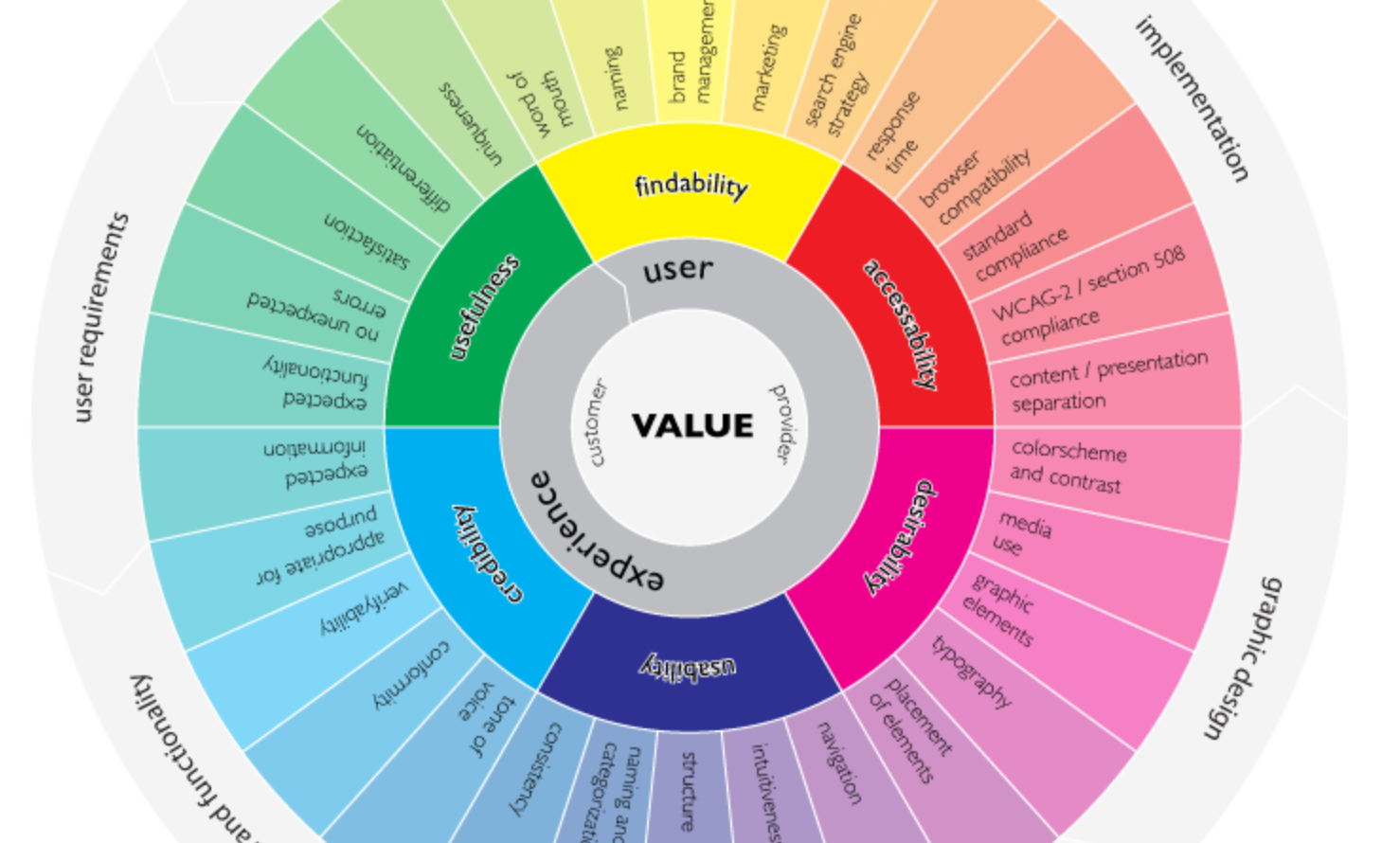
The User Experience Wheel was originally designed by Magnus Revang for his own personal use. It tries to answer the question, "What is user experience?" This infographic breaks down a design process within a series of phases, and the most common deliverables that are produced in each stage of that process.
2. The Elements of User Experience
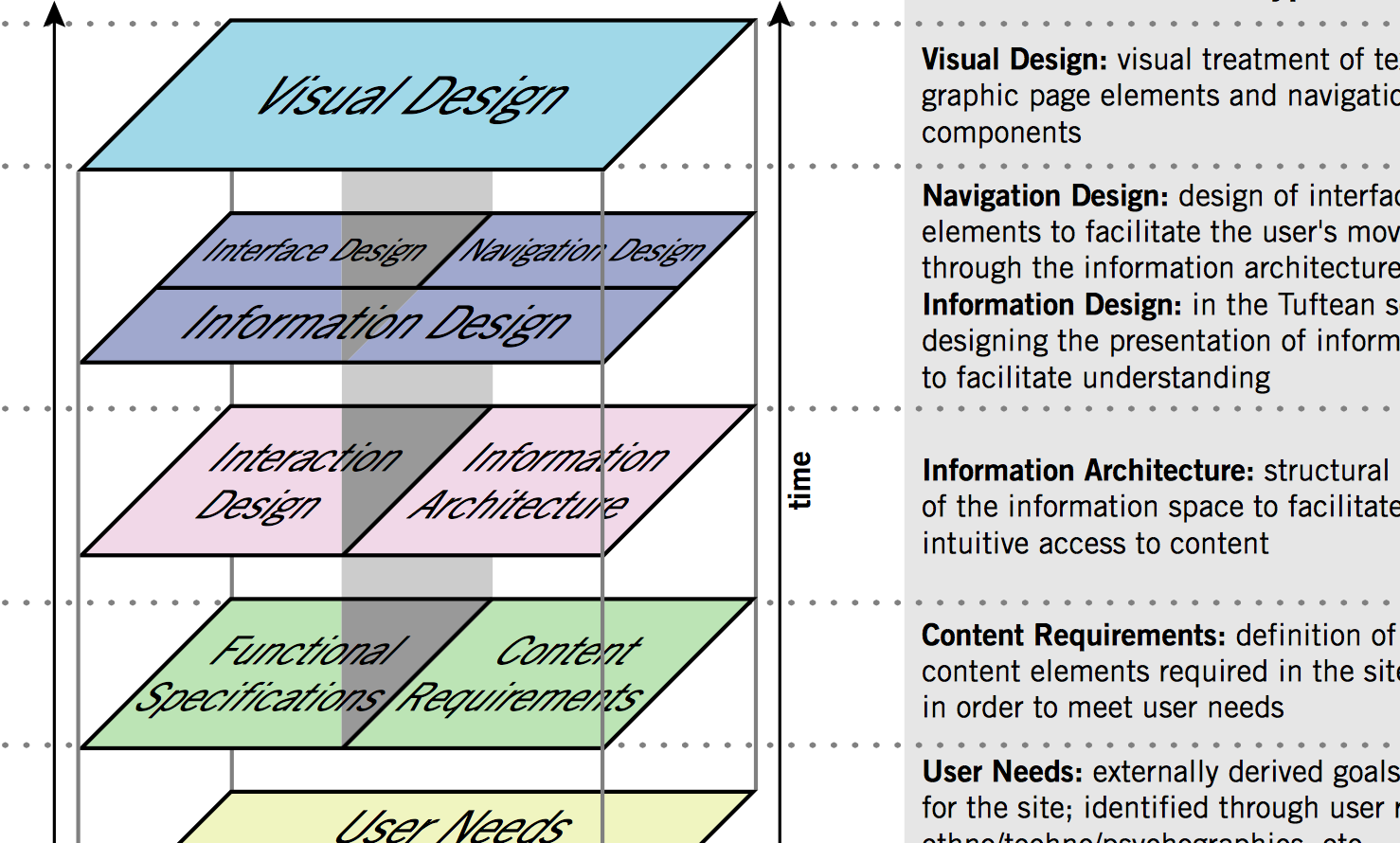
Even though Jesse Garrett created The Elements of User Experience back in 2000, it's still one of the most comprehensive infographics describing the key considerations that go into user experience design. It defines UX terminology such as interface design and interaction design, and illustrates the underlying relationships between these various practices.
3. User Centered Design
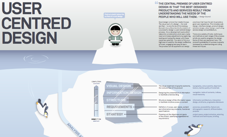
This beautiful illustration—created by the designer Pascal Raabe—explains that the foundation of a successful design is about more than just visuals. Great design comes from working within a user-centered design process. He shares the steps of a development cycle which "takes into consideration what users really need and makes adjustments by exploring, testing and tuning the design until these needs are satisfied." It also breaks down which methods and techniques to use during each step of the development cycle: analysis, planning, concept, design, implementation, and launch.
4. The Many Facets of UX Design
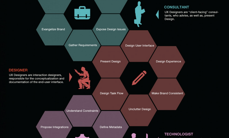
This next infographic was designed by Jonathan Lupo, VP of Experience Design at the EPAM Empathy Lab. It breaks down all the different hats that a UX designer might have to wear, including:
- Research — Conducting primary research to understand the end-user
- Taxonomy — Identifying behavior trends uncovered in the research
- Consulting — Advising and presenting designs to clients
- And more
5. The Disciplines of User Experience Design
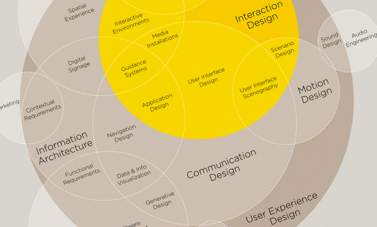
Originally created by Dan Saffer, this massive Venn diagram was re-designed by Thomas Gläser. We often throw around terms like user interface design and user experience design, but how do they really interact with each other? This infographic explores the relationship between user experience and other fields like information architecture, interaction design, and human factors.
6. The Unfair Design Advantage
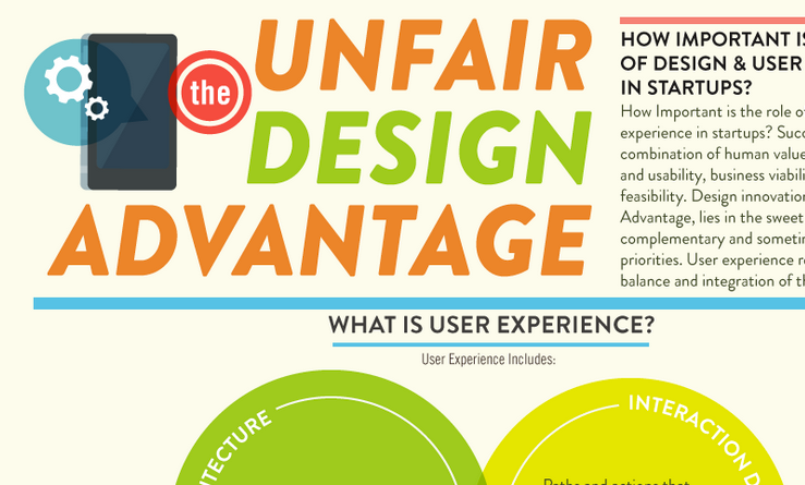
The Unfair Design Advantage is the result of collaboration between Venture 51 and Designer Fund. It shows how information architecture, interaction design, and visual design come together to influence user behavior and emotional experience. Although it's geared towards startups, it's mainly focused on how UX relates to business goals. My favorite parts are the mini-case-studies and the mobile statistics at the very end.
7. A Guide to UX Careers
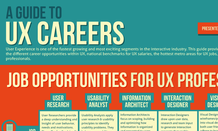
Onward Search designed this Guide to UX Careers for anyone interested in learning about the job descriptions and responsibilities for different positions within the UX field. It also provides national benchmarks for UX salaries, metro areas with the most UX job opportunity, and some of the skills and tools you'll need to be successful.
Bonus: Proving the ROI of UX research

Check out our guide on proving the ROI of UX research.
On-Demand Webinar: How UXR Leaders Can Shape the Role of Research in the Age of AI
Explore how leading UX Research teams are evolving from a service model to becoming strategic insight leaders.


