How to use affinity mapping for user research

When it comes to categorizing information, nothing is obvious. The way you perceive one bit of information can (and often will) differ from the next person. Why? Well, explaining that is difficult because it’s a bit like trying to explain how your brain works. Rather than getting to the bottom of neurons and synapses, UX researchers came up with a method for categorizing and sorting information using an affinity diagram, called affinity mapping.
What is affinity mapping?
Affinity mapping, sometimes also known as affinity diagramming, snowballing, or collaborative sorting, is the process of creating an affinity diagram. Simply, it’s when you gather qualitative information about your users and group it by category.
To get started with affinity mapping, you need to gather information about your users through usability testing, surveys, observation, or any other method for collecting feedback. Once garnered, you’ll need to write out each idea or finding on movable cards, like sticky notes. Then, you’ll need a large space (or a real-time online whiteboard) where you can stick, organize, and rearrange the ideas.
But what exactly are you trying to create by rearranging all these sticky notes? An affinity diagram, of course.
What is an affinity diagram?
An affinity diagram, sometimes also known as a cluster map, is used to organize information and is the output of affinity mapping. Affinity diagrams help organize information into groups of similar items—particularly useful when analyzing qualitative data or observations.
When it comes to UX, understanding your users’ needs can be complicated. You have multiple sources for collecting customer insights or feedback beyond usability tests, like support tickets, customer service chats, interviews, and much more. But all of this information doesn’t reduce down to a number or statistic that can be measured against a KPI. That’s why making qualitative data actionable can be difficult, not to mention ambiguous.
With the use of an affinity diagram, design, research, and product teams are one step closer to synthesizing qualitative data—from multiple sources—into one, actionable visual.
On-Demand Webinar
From insights to impact: making research stick
How to use affinity diagrams to analyze user research
User research is used to understand the needs, behaviors, and motivations of users in order to deliver an exceptional user experience. While monitoring click-paths, conversions, and other forms of quantitative data is useful, truly delighting your user requires you to pay attention to the things only uncovered during qualitative discovery. However, this information isn’t as easily synthesized as quantitative data, as mentioned earlier.
Commonly, user research is digested through thematic analysis. During thematic analysis, you aim to make sense of all the notes, observations, and discoveries you’ve documented across all your information sources, by creating themes to organize the information and build throughlines across every individual idea. If you haven’t guessed it already, an affinity diagram is an excellent tool for thematic analysis.
Depending on your role and the type of research you conduct, the themes you create for your affinity diagram can vary. Here are some examples of affinity groups that you could form from your UX research:
- User sentiment and facial expressions when completing certain tasks
- Frequently used words or phrases when describing a product or experience
- Suggestions for improving your product or experience
How to create a traditional affinity diagram in five easy steps
- Record all notes or observations on individual cards or sticky notes
- Look for patterns in notes or observations that are related and group them
- Create a group for each pattern or theme
- Give each theme or group a name
- Create a statement of what you learned about each group (provide your analysis or key insight)
Now that you’ve completed your affinity diagram, it’s likely time for you to share your findings with the larger group. This could include key stakeholders within your team or even the c-suite. So, surely, you want to make a good impression that tells a strong story. Unfortunately, the traditional method for affinity mapping isn’t very shareable—as whiteboards and office walls aren’t easily transported.
How to create a virtual affinity map template
We’re excited to announce that we’ve partnered with InVision to create an affinity diagram template for teams to organize ideas and data to collaborate remotely in real-time. The template is available in InVision’s online whiteboard, Freehand, and is completely free to use.
How to use the affinity diagram template
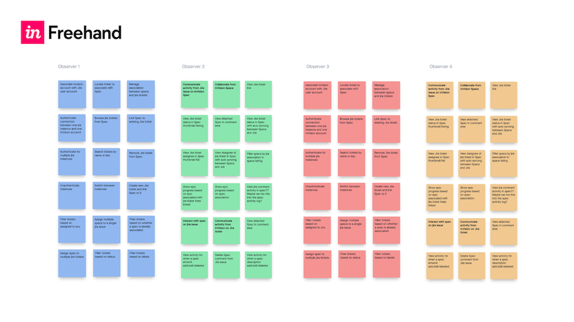
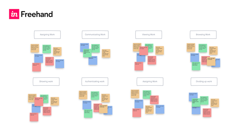
Step 1: Import your data from UX research
Bring your ideas to the table by creating a virtual sticky for each data point. If multiple people are collaborating on research, work synchronously and allow each person a place to record their observations.
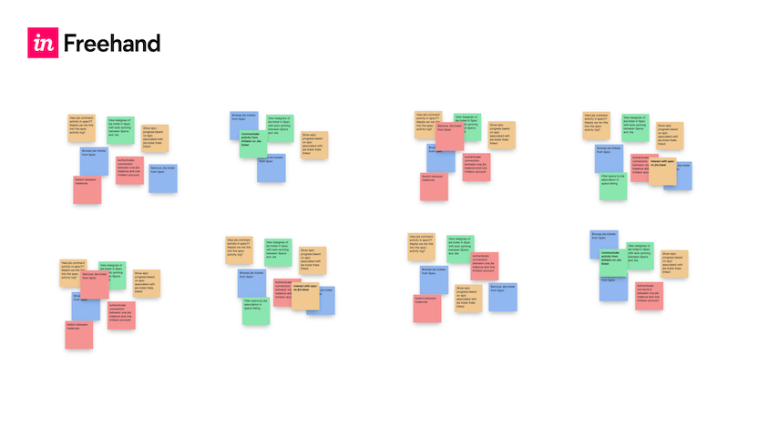
Step 2: Look for patterns and sort by theme
Ask your team to help organize your stickies into groups. Watch each member of the team make their own connections between the data points.
Step 3: Name the groups
When every sticky has a spot, discuss what makes them similar and name each group.
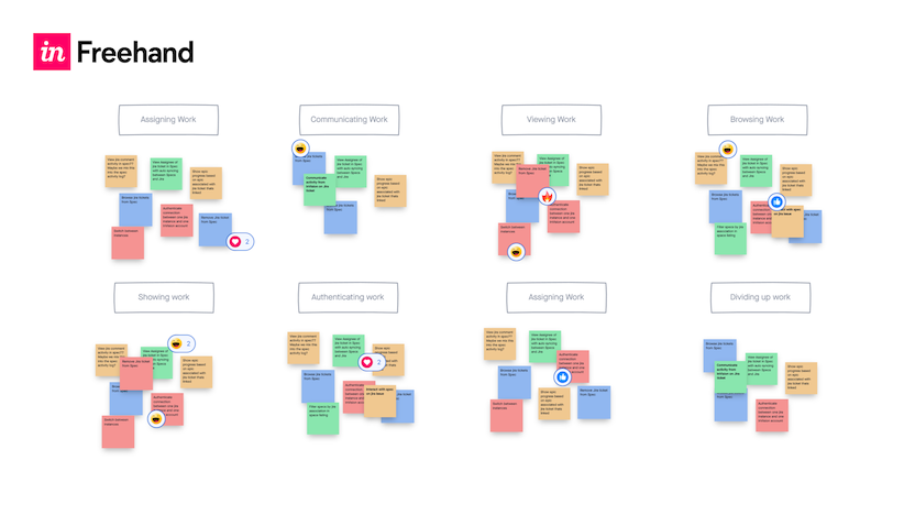
Step 4: Speak up Use Freehand reactions (animated emojis to provide feedback in real-time) to vote on each category’s priority, value, and impact on the business.
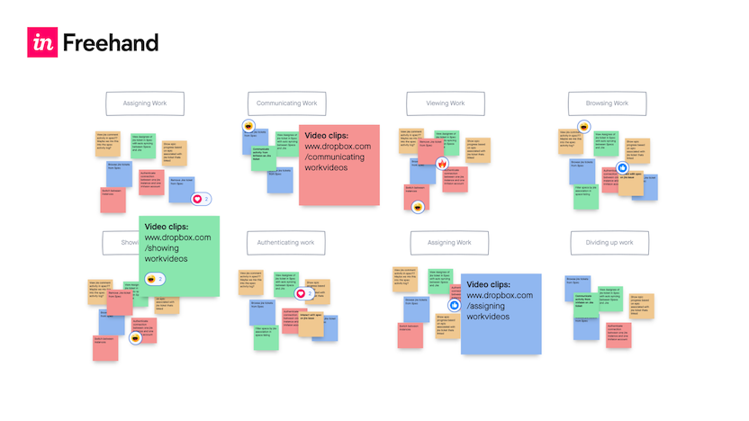
Step 5: Add content
Drop in any video, photo, or other content that can reinforce each group’s theme. Add each piece of content to the Freehand for reference after your mapping session is complete.
At the end of your session, your team will be better able to synthesize your UX research methods into a more thorough understanding of your data with an easy-to-use affinity diagram template.
Are there any drawbacks to affinity mapping?
As we've seen, creating an affinity diagram is a robust method for organizing complex data into a visual structure, but if you want to be sure your efforts are effective, there are a few common pitfalls to be aware of. :
- Lack of preparation: Proper prep is vital. Be as clear as possible when you define your objectives, choose the right participants, and ensure all necessary materials are prepared. This helps avoid a disorganized session, which is sure to lead to poor quality results.
- Ignoring group dynamics: The session's dynamics can significantly influence the outcome. Ensure that every participant, regardless of how dominant or reserved they are, has their voice heard. This might involve breaking larger groups into smaller teams or using round-robin sessions to make sure everyone is involved.
- Inadequate categorization: Categories that are too broad or too narrow can make the diagram less insightful. Make sure they're meaningful and reflect the relationships within the data. It’s also a good idea to revisit and adjust categories as the session progresses.
- Rigidity in structure: Affinity diagrams should evolve. Being too rigid and not allowing for adjustments based on new insights can limit their utility. Be flexible and ready to rearrange, merge, or divide groups as new patterns emerge.
- Skipping iterations: The initial diagram is rarely perfect. Avoid treating any version as final without revisiting and refining it based on new data and feedback. Schedule follow-up sessions to continually refine the diagram.
- Neglecting documentation and follow-up: Without proper documentation and follow-up, insights gained during the session can be lost. Document the results thoroughly and distribute summaries to relevant stakeholders. Clearly outline next steps and assign responsibilities to ensure insights lead to actionable outcomes.
- Failing to measure impact: After implementing changes based on the diagram, establish metrics to assess their effectiveness and conduct follow-up studies to evaluate the outcomes. This confirms the value of the affinity diagram process and guides further improvements.
How to present affinity maps to stakeholders
Finally, remember that UX research is useless if no one acts on it–and affinity mapping sessions are no exception. Here are a few points to remember when you are presenting your data and findings:
- Prepare thoroughly: Know your audience's interests and goals. Prepare your affinity diagram to be neat and visually engaging, using tools they're familiar with for digital presentations if possible. Readers will be much more engaged if they aren't spending time working out how to navigate the data. .
- Develop a narrative: It sounds obvious, but it's always worth reiterating: Tell a story. Start with the objectives, describe the data collection, and explain how you organized the information. This narrative should naturally lead to the insights and conclusions.
- Outline the big picture first: Introduce the overall structure and main themes of the diagram to set the context.
- Detail the specifics: Dive into the individual clusters. Describe how items were grouped and what these groups reveal about user behavior or project specifics.
- Highlight key insights: Point out significant or unexpected findings. Explain their implications for the project or product development.
- Facilitate interaction: Encourage stakeholders to ask questions and engage in discussions. This helps validate findings and fosters a sense of ownership.
- Offer actionable insights: Provide clear, actionable recommendations based on the diagram's insights. Discuss potential strategies to address user needs or issues highlighted by the diagram.
- Ensure continuous access and follow-up: Distribute documentation summarizing the presentation and insights. Arrange follow-up meetings to integrate the affinity diagram’s insights into the project continuously and discuss any revisions or new data.
By following these simple guidelines, you'll present your affinity diagram in a manner that maximizes its strategic value, translating complex data into actionable decisions that makes sure stakeholders are motivated.
On-Demand Webinar: How UXR Leaders Can Shape the Role of Research in the Age of AI
Explore how leading UX Research teams are evolving from a service model to becoming strategic insight leaders.