
5 Digital Experiences That Drive Users Crazy

Many of us spend a good portion of our day on the web. And thankfully, as UX has become the cornerstone of good design, our experiences online have improved significantly over the years. But there will always be a few holdouts that get in the way of a great experience. While there may be legitimate reasons some companies still use these tactics, when it comes to the user, they’re not ideal. (Think CAPTCHA, parallax scrolling, and deceptive patterns.)
Here are five experiences we encounter regularly that users would love to see eliminated:
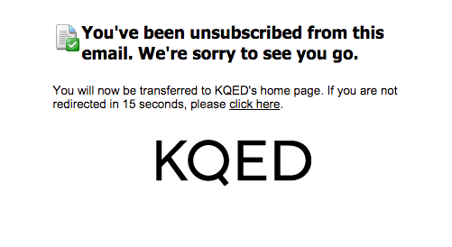
1. Redirecting to homepage after unsubscribe
A few weeks ago I was doing a little fall cleaning of my inbox. I was getting way too much email I wasn’t reading, so I carved out some “unsubscribe” time to clear out anything I wasn’t religiously reading every week. For most mailing lists the process was simple. Find the “unsubscribe” link hiding at the bottom of the email, click it, and get a typical “we’re sorry to see you go” confirmation.
Easy, right? When I click that link, I expect the matter to be closed. If I want to interact with the site again, I’ll do it when I’m good and ready. So when this unsubscribe confirmation automatically pointed me to its homepage, I was a little annoyed. I just told them I didn’t want their newsletter anymore. What makes them think I’d want to visit their homepage?
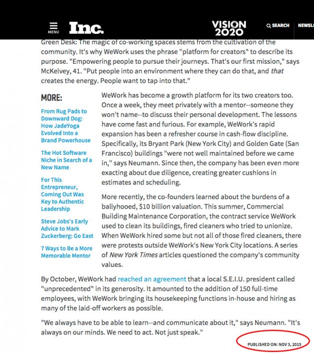
2. Omitting (or burying) the published date
There seems to be a running debate on whether or not it’s advisable to include a date with content. On the one hand, older content may get overlooked if a date is included and therefore impact your stats. But for the user, that date can be an important—if not crucial—detail. If I’m researching a topic that’s continually evolving (you know, like UX…) then the information on the same topic may vary drastically from year to year.
I had to look through this article three times before I found the published date buried three scrolls down at the very end of the article.
3. Using galleries for content
When it comes to content, I don’t want to click or tap, wait, read, and repeat. I want it all and I want it now. It’s more forgivable if it’s a short list, but if I have to tap or click more than a couple of times, I’m not sticking around. This was especially frustrating to me when I was looking up the top Sci-Fi movies ever made before taking a long international flight. One site had an exhaustive, 100-film list that I was particularly interested in. But when I got there, I was forced to click through each individual move. 100 times. Nobody has time for that. And I’m happy to report, after about a zillion angry comments from readers on the post, the publication revised the article to show it in a scrollable list form. There’s an easy fix to this, though. Flavorwire, one of my go-to publications I read for fun, has great lists.
And while I love the inclusion of a visual component with the commentary, I’m not interested in clicking through a gallery to get to it.
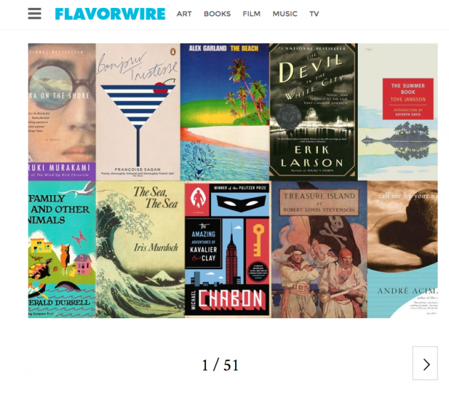
But, just a quick scroll down, and I see that there’s an option to see the entire gallery. Whew! (Although putting this option at the top of the post would make it an even better experience.)

4. Autoplay
I’ve lost track of how many times I’ve been invaded by autoplay. Whether it’s after I’ve watched a video, or simply navigated to a page that has an embedded video, it’s never a welcome experience. Most of the time it’s content I’m not even interested in, and in the case of salacious news stories, ones that are often disturbing or inappropriate.
While it’s easy to find instructions to turn off autoplay, it seems the general consensus is that most people don’t like it. So if the option is useful for just a few, perhaps it would be better to default to autoplay being off, and let users decide if they want this “helpful” feature enabled.
5. Unnecessary steps
Just about every video player has an option to watch full screen. When you select that button, it does exactly what you asked it to. So it can be surprising when you see a message like this one, after your video has already begun to play:
![]()
While this interaction is born of good intentions—it’s used to help prevent phishing attacks that surprise users by launching them into a full screen mode unintentionally—it’s super distracting for the user. In most cases, a modal window opens up, and requires the user to take action before the notification will disappear.
Since the user has presumably already requested to use the full-screen view, there’s no need for this additional message. If, however, a user has not explicitly requested this, a modal notification with microcopy warning of a possible phishing attack would be appropriate (and appreciated).
Creating a great experience that meets the user’s needs—and that of your business—is a balancing act. To get it right you’ll need to constantly evaluate what your users like—and don’t—about your site. As the market grows more competitive, the user experience becomes a defining competitive advantage. Understanding what experiences irritate your users—big and small—will help establish the trust and loyalty you’ll need to cultivate a positive customer experience.


