Empathy map: a guide for better digital experiences

Digital experiences are increasingly becoming the norm—especially now, in the midst of a global pandemic. Because of this shift to digital, businesses have pivoted to provide their customers the tools they need to be successful in this digital-first world. But if the tools needed to build digital experiences continue to become more and more user-friendly, how do you break through the noise to earn engagement and adoption? One option is by way of an empathy map.
“When people talk, listen completely. Most people never listen.” ― Ernest Hemingway
At Tadpull, a NetSuite eCommerce software and services firm, we’ve found that the best thing you can do when developing your product or experience is to talk with your users and build empathy for their needs and desires. While this certainly isn’t a new idea, finding a way to capture those conversations and turn them into tangible deliverables is where many teams fall short.
Capturing user feedback can often feel like drinking out of a firehose:
- Engineering asks, “Did they like that feature?”
- Design asks, “Did they like the fade-in on a scroll?”
- Marketing asks, “Will they convert?”
To handle this chaos, we use a framework called empathy mapping. This exercise comes from the field of design thinking or human-centered design and results in an empathy map.
What is an empathy map?
While the name may sound complex, an empathy map is really just a tool that aids your active listening when speaking with users or customers. By using it to map your conversation, you’re more easily able to organize feedback using a four-quadrant system—categorizing what people say, think, feel, and do.
Nielsen Norman Group sums it up nicely with their definition: an empathy map is a collaborative visualization used to articulate what we know about a particular type of user. It externalizes knowledge about users in order to 1) create a shared understanding of user needs, and 2) aid in decision making.
Why is an empathy map important?
Somewhere between the inspiration, development, and launch of a new product or experience, the user’s emotional hooks are often garbled, lost, or even ignored during the process.
But with an empathy map, there’s a way for those of us who have to research, design, code, and go to market to align around a single framework that helps us organize customer insights into specific buckets. From this, teams are able to distill coherent goals that get to the heart of the logic and emotion of why users are willing to engage with a brand.
Ultimately, an empathy map not only helps teams build more people-centric products and experiences, but they ensure teams across an organization understand their customer and prioritize their needs.
How to create an empathy map
Let’s say that you’re testing a new mobile app prototype for online banking that targets mature users. Now, you’ll likely come to this design challenge with a host of assumptions and biases on what these people want and need.
On top of that, you also have a limited budget for marketing and code. In other words, you need to make sure you suss out the key features your customers need and work those into your next sprint. In order to make sure you’re building a new feature your customers need, as well as gain buy-in from internal stakeholders, you decide to build an empathy map.
Here’s how to do it.
Step 1: Define the key question
Sit down with your team and identify one or two key questions you’d like to solve for right now. While everyone will likely have a different agenda, your goal should be to get everyone to vote on the areas in which they feel most strongly. These might not be obvious. In fact, they should be the murkiest (and thus carry the most risk for blowing up your budget or timeline).
For example, “What are the three things a user between the age of 50-65 would want to do—with one hand—on our mobile banking app while they’re standing in line at a coffee shop?”
A real-life scenario might look something like this: a user aged 55 with arthritis wants to shop our eCommerce store using their thumb and checkout for payment while standing in line for coffee.
Note: Stating the context in which this experience will occur is actually a subtle detail that has big implications. A coffee line is filled with distractions and people jostling, but it’s often where most of us fit in our small tasks throughout the day like shopping or banking.
Having a solid question with parameters will help you focus and ensure buy-in from everyone on the team.
Pro Tip: If you have a stakeholder with strong opinions and biases, be sure to get their buy-in at this early stage for what the one crucial question needs to be. Come to this conversation with any analytics data you can find, like shopping cart abandonment on mobile by age—it will instantly build your credibility. If done right, they will feel engaged in the process, and getting this one crucial step correct ensures everything else flows efficiently and prevents you from having to redo the user interviews because they don’t trust your work
Step 2: Assemble your script
If you’re using a customer research solution like UserTesting’s Human Insight Platform or running UX studies in person, it’s absolutely critical to have a tight script written out in advance.
You’ll want to think through:
- Who you want to test (age, gender, or other demographics)—in this case, users 55+
- What you want to know (completing a task or reacting to a design)—testing their dexterity and flow through the shopping experience
- Why they answer (include prompts why did you do this? Why do you feel that way?)—understanding a hierarchy of what features to be laid out and refined for the user experience to ensure a smooth shopping and checkout experience
Pro tip: Be extra explicit in your instructions here. If you were running a user test for the example above, you might want to remind users in the first step that you don’t want to observe their personal brand preferences.
Instead, remind them that you’re just testing ideas and want to learn what they feel is broken or could be easier about the experience. Reassure them that there are no wrong answers and you are highly interested in observing their experience at specific points in the journey.
If you’re not sure how to convey this, “we need your help making this better” is a great line to get them invested and participating in earnest.
Step 3: Run a pilot and then a full test
We recommend running a minimum of one or two pilot tests prior to running a full study to eliminate waste. This can often be done offline with a casual friend or family member. Just make sure they fit your demographic and technology savviness for your target market to ensure consistency. A Millennial will likely approach mobile shopping very differently than a Baby Boomer.
Conduct the test exactly as you would with any other participant, and remember to avoid bias and resist your urge to coach your participants. Any friction you encounter is where you’re failing in the script, so you should make a note to refine this.
You’ll likely be surprised by what parts of your test script you feel are straightforward, yet to a participant, are slightly confusing. Often as a result of confusion, participants begin going down the wrong path with their feedback and muddy up your data.
Be sure to find the kinks and blind spots and adjust your script accordingly. Always refer back to your one big question to make sure you are getting at the information you need to make product feature or design decisions.
Step 4: Synthesize the data
Here’s where most people lose their steam with qualitative research in user testing. Quite a bit of work can go into Steps 1-3, and many people tend to think that once they’re done, they’ve checked the box for testing and they’re ready to dive into design or code. Yet, there’s a bit more work to be done to mine the data for key insights.
This can feel daunting, and you might be tempted to quickly flip to specific parts of your tests and not take in the whole experience. Or even focus on a particularly charismatic or passionate user who gave great feedback which skews the average.
However, it’s by listening to the feedback and synthesizing the data that you come up with that wil help you move the needle and prioritize resources.
Here’s where the art of active listening comes in. Empathy mapping provides a framework for synthesizing the data post interviews, and this is where your true signals lie for clustering patterns—between emotion and logic. Our goal is to separate this from the noise of “I don’t like that image of the product” to the real gems of “Oh, I love feature X and use a similar feature every day in shopping with another brand.”
To achieve these patterns, we need a systematic approach to organizing all the comments from our user interviews.
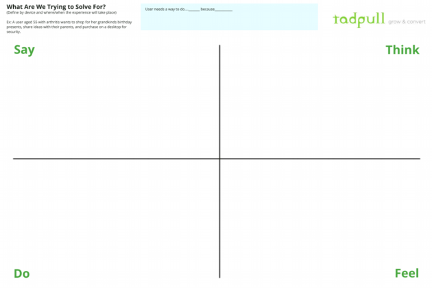
Step 5: Create your empathy map template
An empathy map walks you through a handy framework for organizing all your users’ feedback into four simple squares: say, think, do, and feel.
Before moving forward, take a moment to refresh your team on your objectives, and what outcomes would be considered a success.
In our example, this might be something like this: A user with arthritis can shop our store using their thumb, checkout on mobile, and do it all while standing in line for coffee.
Empathy mapping exercise
Grab a pack of Post-It notes and off to the side of the canvas give each of your test participants their own color. Each participant will have a corresponding color code on the map which makes it much easier to attribute and understand who said what.
I’d also suggest printing out a large copy of the empathy map and hanging it up in a conference room or even against a window. You can get your own copy of Tadpull’s empathy map for user feedback here.
Get you and your team up and moving as you watch the tests and organize the feedback. It makes for a much more fun experience to synthesize the qualitative data this way.
The four buckets of say, think, feel, and do mirror what users do when they go through an experience. This simple rubric becomes quite powerful because it gives you a system to organize all their behavior and comments in a highly visual way.
Say
This is where we capture the feedback like “I don’t like that product image.” Consider this a place to park feedback and tidbits from the user’s stream of consciousness as you observe them. Not everything has to go here but if you think it’s interesting jot it down on a Post-It.
Think
The “Think” part tends to reveal a bit about a user’s beliefs and the logic they employ when approaching the experience. For example, say one participant has security concerns and doesn’t want to shop on mobile for fear of getting their credit card hacked. We’d capture “security issues for mobile payments.” That could be a key insight—especially if other participants also express this concern. Think of this information as a clue about whether or not this market is ready for such an experience.
This line of thinking will show up as a cluster on the empathy map—physically via Post-It notes—if enough users think it. Instantly, you’ll be able to see if it’s something to address.
Do
This quadrant focuses on how users experience the app or website directly. You might notice how many times a participant attempted to log in, as well as remarks like, “Ugh, I can never remember my password and hate resetting it on mobile.” Or they try and check out as a guest and end up in the wrong part of the site.
For this quadrant, you’re trying to capture their specific behaviors and actions impartially. Make notes like “Guest checkout -> settings -> user would bail at this point,” to capture their actions.
Bonus points for sketching these interactions in a wireframe to better communicate with developers and designers. A picture of the patterns you observe is worth a thousand words (and 10X in time savings).
Feel
Here’s where the real listening happens, and the magic unfolds for designing a remarkable experience. Your goal is to read between the lines and empathize with how your users’ emotions fluctuate throughout their time in your property. If the app surprises them with its ease-of-use or remarkable utility, you know you’re onto something. “Wow, I can add to cart and checkout with just two taps and don’t have to put on my glasses to do it? I love this!”
Remember, people will buy on emotion and backfill with logic. The empathy map helps you zero in on this. No emotion = no logic = no adoption.
Put your empathy map to work
At the end of all the empathy mapping, take a step back and observe the colors. Did one participant provide tremendous insights as evidenced by a ton of lime-green Post-It notes plastered all over the map? If so, she might be someone you can rely on going forward as a power user.
Next, step away for a day or two and let all this percolate in your mind. Your subconscious mind will chew away on the feedback, and the rest will make distilling your key insights a bit easier.
Finally, return to the map and begin the distillation process. While every comment may not be relevant, you might notice a few trends where users are constantly saying, “I hate logging into mobile financial apps,” and you can begin to see where your experience could improve.
Support your empathy map with analytics
An emerging technique to efficiently gather additional insights is to seek out online reviews and add that feedback to your empathy map as well. At Tadpull, our data science team will often look for datasets that exist online around where users congregate and leave feedback. In eCommerce, this can include sources like onsite product reviews which we can collect and collate and begin classifying using techniques like sentiment analysis.
Here, we’re mining for the tone of words and setting up filters that match that specific brand and age group. We can assign a ranking factor of 5 for a word like “love” and a -5 for words like “difficult.” Running the text blocks through these nets helps us objectively get at how a brand or even an individual product is perceived. Next, we’ll compare this to the brand’s messaging or value propositions in the marketing mix to see if they align and where the gaps occur.
But I’m not a data scientist!
While this does require a fairly sophisticated team to pull off, there’s a great hack for non-coders to use free tools online and build a basic word cloud that shows the frequency of terms used. We’ve found key stakeholders love this type of information as it represents an easy way to visualize the voice of their customers.Here’s an example from the user feedback from our annual Mountains & Metrics eCommerce conference in Bozeman, Montana:
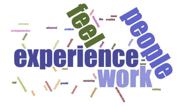
Note: One of our core values at Tadpull is empathy. Another is to design remarkable experiences for people, so it’s great to see the dominant themes in the text reviews post-conference.
In another example, one of our clients in the luxury resort space has a ton of feedback on TripAdvisor (as do their competitors). We can grab all this data and pull it into a database for analysis on the frequency of the words used and corresponding tone.
From this dataset, patterns emerge on what users are saying about their experience at the resort in a quantitative way. For example, they might comment frequently on the check-in experience or seasonal recreation opportunities.
Similar to the analog way, we’re looking for clustering of signals for what our users say, and this can be a fun exercise to see how your qualitative user research lines up with the quantitative results. All this can then be fed back into the online and even offline experience design exercise for the next sprint.
Executing quickly on empathy mapping
At this point, you might be thinking “Wow, that’s a lot of work” and you’re correct. But don’t let the options overwhelm you. We’ve found that after running as few as five tests, we have enough insight to answer 80% of the original question we posed at the start of the process with our stakeholder's buy-in.
Picking the right question to focus your efforts on is what makes this work though.
In an agile world, this is usually enough of a signal to run another sprint for improving the experience. It’s easy to get fixated on getting perfect clarity on an issue before iterating, but over time this approach has diminishing returns with a real cost to time and budget.
So instead, return to the key question you defined in step 1. In our case, it was: What are the three things a user age 55+ would want to do for shopping with one hand while standing in line at a coffee shop?
The empathy map will help you zero in on the following:
- Are we solving the right problem? (Ex: Does this user group even shop on mobile very much?)
- Does our current experience elicit positive emotions? (Ex: Sighs, squinting, “ums” are clues you are not)
- How do people perceive the value? (Ex: Is our mobile shopping experience even worthy of their time?)
While talking with humans is often a messy and confusing experience, using this kind of methodology helps tremendously with active listening—especially if you’ve never been trained in qualitative research methods. Instead of sifting through hours of video or transcripts and dumping the findings into a PowerPoint deck, you actively create a visual representation that captures actionable data and reveals the key insights directly from the users themselves.
The beauty in this approach is that you can see a cluster of comments on the empathy map from the Post-It notes so you know there’s a strong signal for emotion or logic.
Also, synthesizing this data suddenly becomes something you’ll look forward to and that the team can enjoy together. You’ll find yourself speaking in terms of the users themselves. For example, “Test participant X is nervous about mobile security. We need a way to assure him his data is safe when entering his credit card info during the checkout process.”
Teams advocate on behalf of the people they feel they have a personal connection with. And that’s what great digital experiences are all about: designing and building technology with heart. It’s at the core of today’s best brands, not to mention it makes your job infinitely easier.
A parting note on “faster horses”
Henry Ford famously said:
If I’d asked people what they wanted they would have said a faster horse.
Those who doubt human-centered design often believe that true innovation happens independently of users through a sole visionary founder like Steve Jobs or Henry Ford. They claim ordinary people cannot articulate what’s possible with technology nor define it for useful purposes within their daily lives. To them, we’re all just wasting our time trying to spend time with users if we truly want to develop leapfrog innovations.
But if we rewind the clock to the experience Henry Ford was designing for, it comes down to one simple thing: users said they wanted to go faster. And while they might not have envisioned a Model T, they certainly knew the challenges of the horse and buggy and could speak to the pain points around that experience.
The same is true for the iPhone. People carried an iPod, a GPS for driving, a laptop for computing tasks, and a clunky flip phone for calling or texting. Not to discredit Apple’s engineering and design prowess, but observing and speaking with users helps you imagine what they need. The problem was clearly defined by their behaviors and habits. Users don’t care how we build these experiences. They just want to accomplish their goals.
Gathering feedback will only get you so far. Having empathy for your users and using that to guide your design decisions empowers you to truly listen to what your users want and need.
Frequently Asked Questions about Empathy Maps
1. What is an empathy map?
An empathy map is a visual tool that teams use to gain a deeper insight into their customers. It helps in understanding what users say, think, feel, and do, which provides a holistic view of their needs and behaviors.
2. Who should use an empathy map?
Empathy maps are beneficial for anyone involved in the development and improvement of products or services. This includes UX/UI designers, product managers, marketers, and customer experience teams.
3. When should an empathy map be created during the product development process?
Empathy maps are most effective when created early in the design process to inform the development strategy, and can be updated throughout the project as new user insights are gained.
4. What are the key components of an empathy map?
An empathy map consists of four quadrants: Say, Think, Feel, and Do. Each section helps capture different aspects of user interaction and perception related to a product or service.
5. How do you gather data for an empathy map?
Data for empathy maps can be collected through user interviews, direct observations, user testing sessions, and through feedback from customer service channels.
6. Can empathy maps be used for existing products or only new developments?
While often used in new product development, empathy maps can also be a valuable tool for refining and improving existing products by understanding current user experiences and expectations.
7. What are common mistakes to avoid when creating an empathy map?
Common mistakes include not using a diverse range of user data, leading to biased insights, over-generalizing user statements, and failing to update the map as new data becomes available.
8. How do you translate an empathy map into actionable items?
Use the insights from the empathy map to identify user needs and pain points, which can then be translated into design modifications, new features, or enhancements in user interaction.
9. Can empathy maps evolve over time?
Yes, empathy maps should be dynamic tools that evolve as you gather more user data and as your understanding of the user deepens. Updating the map regularly ensures it remains relevant and useful.
10. Are there any tools or software recommended for creating empathy maps?
Digital tools like Miro, Lucidchart, or Microsoft Whiteboard offer platforms for creating and sharing empathy maps. These tools allow for collaborative editing and can integrate with other data sources.
11. What are examples of successful outcomes from using empathy maps?
Successful outcomes include improved product usability, higher user satisfaction, and more effective marketing strategies, all stemming from a deeper understanding of the user's experience.
12. How does an empathy map integrate with other user research methods?
Empathy maps complement other research methods by providing a focused framework to analyze qualitative data. They work well alongside personas, journey maps, and usability tests to build a comprehensive view of user experiences.

Unlock your customer insight ROI
Discover the hidden ROI of your customers' insights. Book a demo today to learn more.