
13 fascinating and functional brutalist websites
As part of one of our articles on UI design trends, we mentioned brutalist UI as being at the extreme end of current graphical user interface (GUI) design. Rob Whiting, Head of Product Design at The Spencer Group, believes the future of UI is in “subdued colors, large, easy-to-read typography and simple, task-focused interactions.”
Brutalist websites take this design theory to the very limits.
Brutalist websites are designed using a style that prioritizes functionality over aesthetics and form. It is designed using a raw minimalist style.
You’ve likely already heard of brutalism before in the architectural world, but it’s a wildly misinterpreted term. According to Dezeen, “Brutalism’s etymology actually lies in the French term 'béton-brut'—literally 'raw concrete'—the movement’s signature material. But Brutalism was concerned with far more than materials.”
From the 1950s onwards, designers grew tired of a watered down version of modernist architecture, which was intended to replace traditional, neo-classical styles with something entirely functional—created from brand new building materials, such as concrete and steel.
Brutalist architects developed a style that didn’t care for comfort or easy-on-the eye aesthetics—instead these buildings are stark and minimalist, and perhaps more importantly—you can see exactly what materials they’re made from and often the inner workings are exposed. Their "confrontational" appearance is a byproduct of these materials and their form.
This brings us back to brutalist websites.
On the comprehensive Brutalist Websites directory, the "about us" is basically adapted from the Wikipedia description of brutalism.
“In its ruggedness and lack of concern to look comfortable or easy, Brutalism can be seen as a reaction by a younger generation to the lightness, optimism, and frivolity of today’s web design.”
However many of the examples (of which they apparently receive hundreds of every day) fall more into the modern, skewed example of brutalism: displeasing to the eye, unpopular and purposefully antagonistic.
But that’s not what we’re looking for here, we're interested in the original definition of brutalism: functional, transparent and minimal. Sites that won’t be receiving an award any time soon, but do offer something close to what we mentioned earlier in terms of “large, easy-to-read typography and simple, task-focused interactions.”
And much like their architectural counterparts, it’s an incidental byproduct that these may appear so unwelcoming. Let’s take a look at a few examples from BrutalistWebsites.com and a few others I’ve found along the way.
13 fascinating brutalist websites
Brutalist redesigns
Pierre Buttin’s brutalist reworks of existing apps and their swipable-pinchable-zoomable interfaces is an effective and immediate way to get the message of brutalism across.

Exposure
A single webpage payment service that allows any artist who has been promised the currency of "exposure" in exchange for their work, to generate an invoice for their generous client. The exchange rate is 1 Exposure = 1 unit of your chosen PayPal currency.

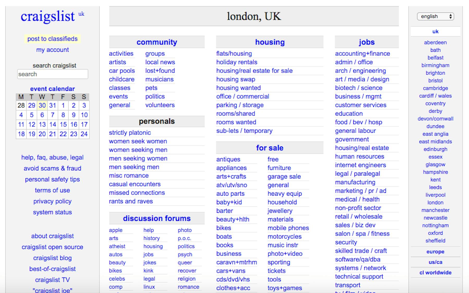
Craigslist
Nathaniel Smith of tilde.town (itself a stripped-down experience marooned in a lost age) stated in the Washington Post that brutalist websites are more common than you think. “Look at Craigslist. This is totally a brutalist website… and commercially, very successful.”
Freecycle
Similar to Craigslist, but with remarkably even fewer bells and whistles.

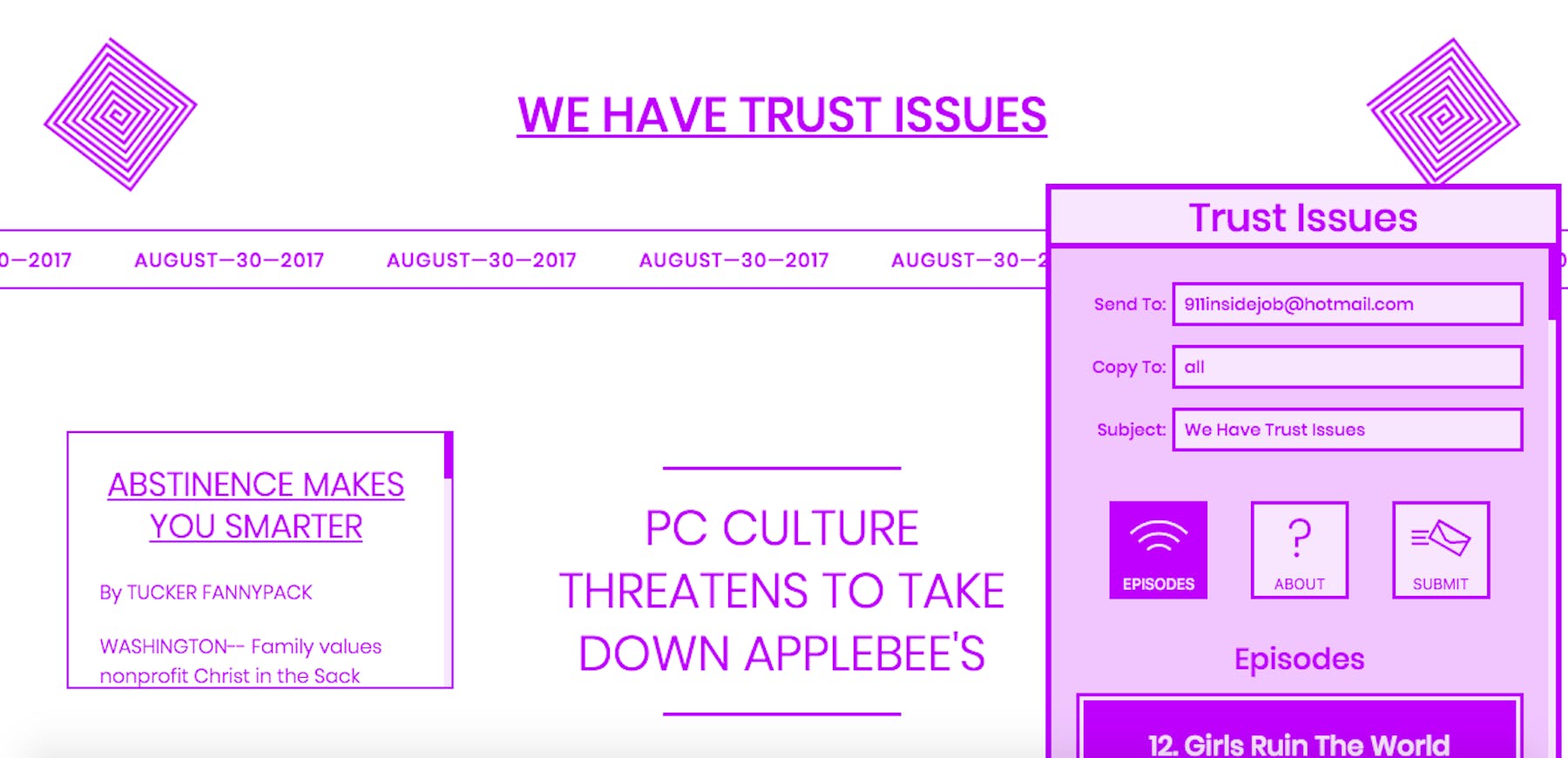
Trust Issues
The Trust Issues podcast, which tackles the wildest conspiracy theories, has a gloriously minimalist, purple-lined online home, replete with a draggable, easy to use media player/contact form.
W.A.S.T.E.
W.A.S.T.E. is Radiohead’s online home, and it’s a world away from the complex melancholia and multi-textured artistry of their last couple of albums. Instead this is perfunctory, stark and wilfully antagonistic towards modern "acceptable" website design.

You should have seen this
When the world has moved on from the internet to a new plain of existence and/or time-wastery beyond our imagination, this will be the definitive document of our current time.

Work Week
Light a fire beneath your working week (or in fact any period of time you wish to set) with this helpful tool.

Are you eating dinner with your father?
Delivers a simple message that bears repeating once in a while… with hammers.
Update: This website is sadly no longer live

The Juice Box
It’s a juice bar, what else do you need to know? Also check out the very satisfying ‘divider’ style navigation.

Aint Wet
Potentially the most idiot-proof ecommerce site ever built.

Click here to save the world
Click here to save the world…

👏 👏 👏 👏 👏 👏
ChrisBolin.co
And perhaps the ultimate brutalist webpage. You even have to go offline to see it…


