How to test your website’s iconography

What does this icon mean?

If you're like most people, you're thinking "search." And you're right. This icon, or variations of it, tends to be used by companies all over the world because users recognize it. This allows designers to do away with text and use something that, at a very quick glance, tells the user this is where you can search in one way or another.
But what about when you're trying to signify to users something that there isn’t a globally accepted icon for, or something that is specific to your journey or user-base?
Take a look at these icons below from the car configurator on Ford’s website. Here you can customize the car you are buying in various ways.
Each of these icons represents a section of this configurator. Looking at the icons try and decide what you think each of these could represent.

In instances like the above, you may design your own icons, but without testing them you could be causing users problems or influencing their behavior in ways you don’t want to.
Ford has recently relabelled each of these icons with text, so the icons really just act as something to signify to the user that there are options to select. But in many cases, you will want the icon to stand alone.
When you’re testing icon suitability, you generally want to gauge:
- Recognition and understanding— do users know what it is and what do they understand by it?
- That it represents what you actually want it to represent— How good does it do the job in the users’ eyes?
- Information scent—What will happen if they click it? Where does it go and what is expected to happen?
To do the above, you’re likely going to do a few different tests in different ways and collate these findings together to determine each of the above. In addition to this, context is important to think about.
How to test your iconography
Here are some examples of questions, or types of question formats, to ask in an icon usability test:
What do you think this icon represents?

Don’t provide any context (or very limited context), just present the icon with a free text box and ask the question of what they think the icon represents.
If your icon needs to be very recognizable but there isn’t much other context to help, then this is a good question type to follow. It should help unearth any associations or expectations from users that you may not have considered when designing it for the context you want it to represent.
Which icon best represents the action you want a user to take?
For example: “Which of the following icons do you think best represents ‘pay by card’?”

This is great for picking different icons from a selection. It’s good practice to follow up with a free text question of why they picked the one they did.
If you're wanting to narrow down your options or explore which of your options could possibly work, you may want to go for a ranking style question instead. For instance: “Please rank the icons in order of most suitable (1) to least suitable (4) for indicating to ‘pay by card’”
What would you expect to happen in a particular context?
Adding context to your questions can help you determine how much knowledge or understanding is needed for your icon to be effective at doing its job. Think about your own site and the context and knowledge your users are likely to have when you are constructing your questions.
Here you could ask your user, “What would you expect to happen if you were browsing your list of studies in your account and clicked on this icon that appears next to each study?”

This is another one to see how easy your users can guess what an icon can do with only a certain amount of context.
Specific feature context
Imagine you have been asked various questions about your current living status. What would you expect to happen if you clicked on this icon next to the question: “What is your current relationship status?”

Full visual context
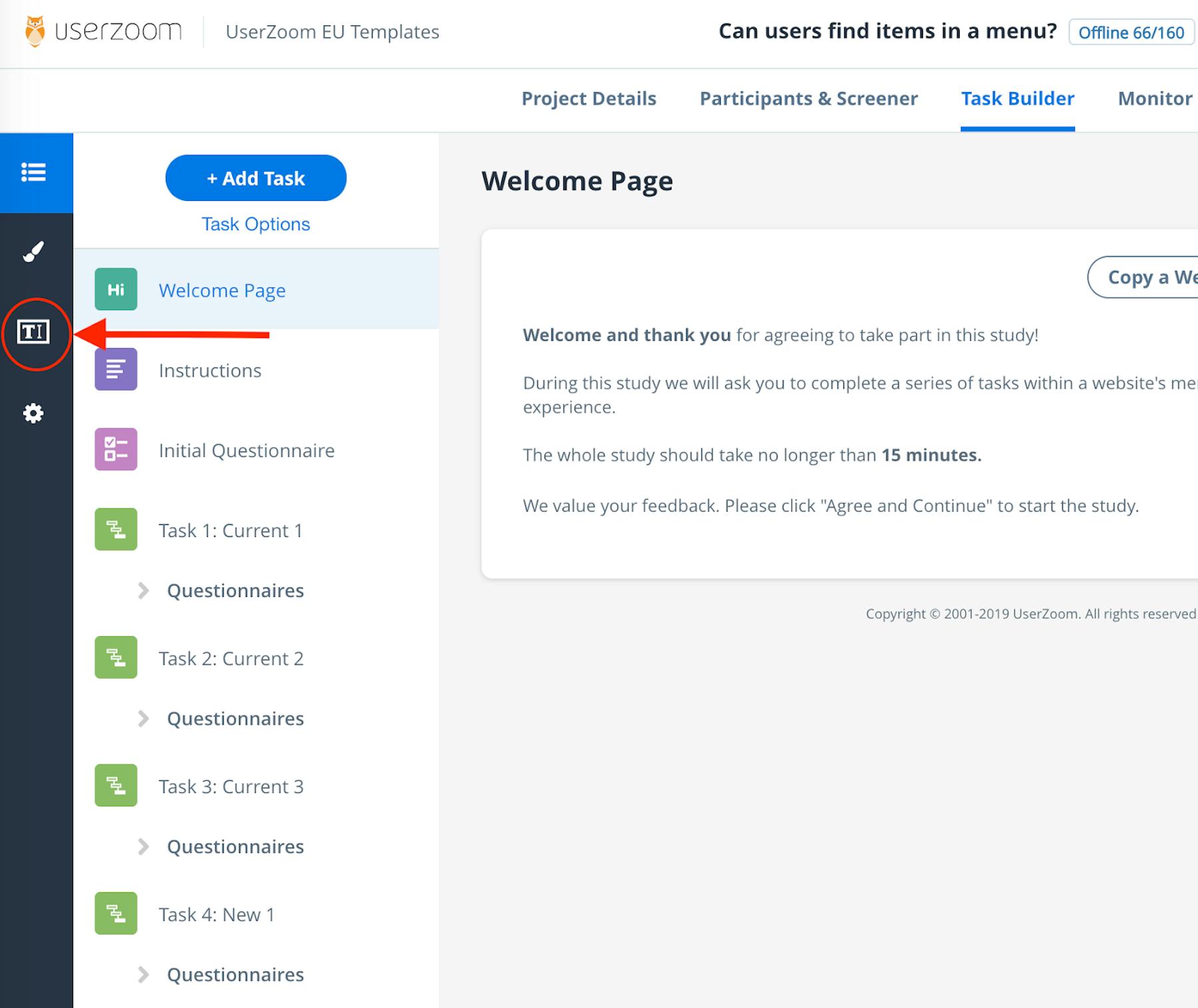
Often it’s important to test your icons with full visuals to see how they work alongside other aspects of the visual design. In this instance you can show an image and highlight the appropriate icon.
“What would you expect to happen if you were creating a study in UserTesting and clicked on the icon highlight by the circle and arrow below?”

Rating the effectiveness of an icon (or image)
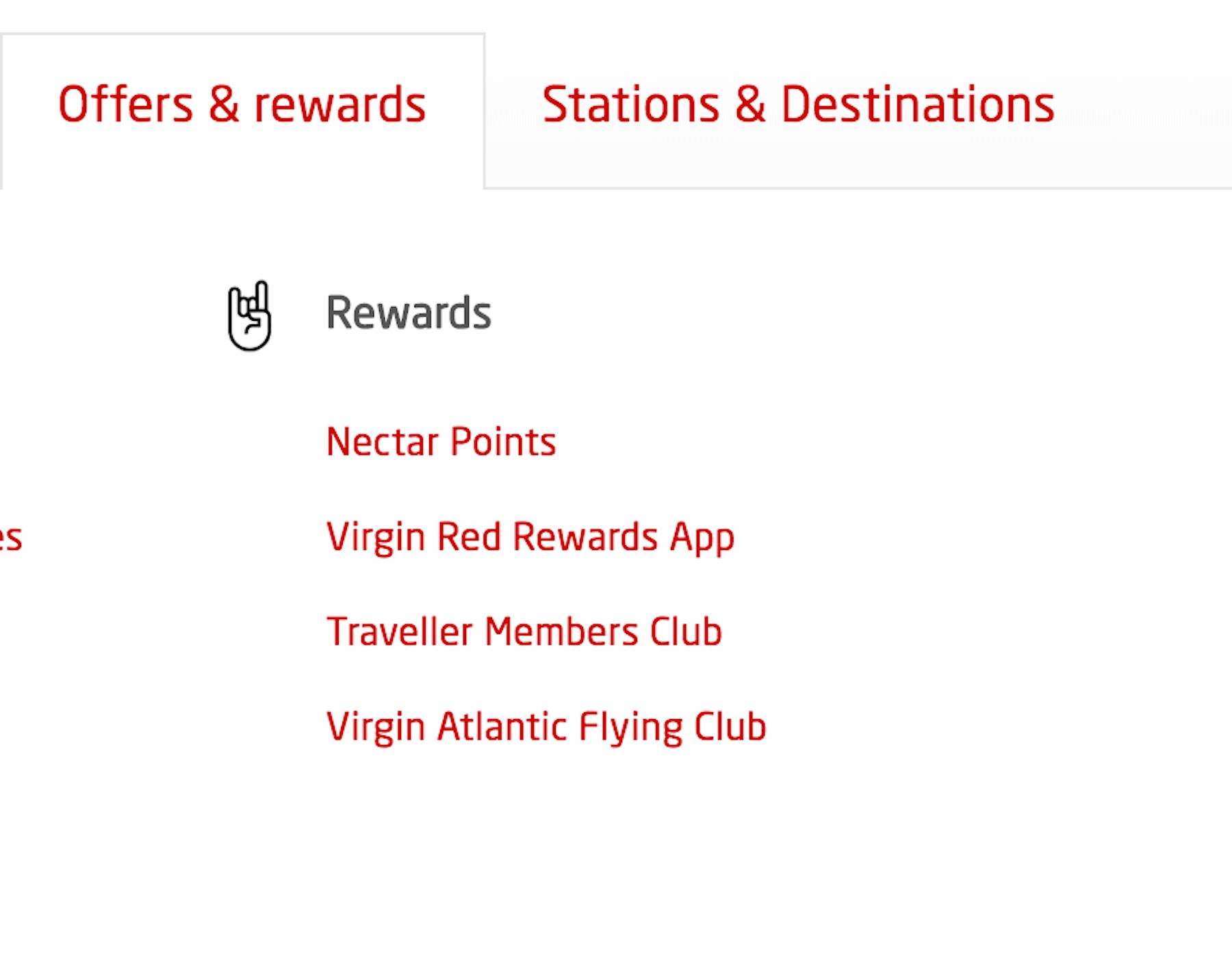
Please indicate on a ranking of 1-7 how well the icon reflects “exciting rewards” for you personally (1 is not effective and 7 is very effective).

Sometimes icons need to be more than a functional aspect but also represent a feeling or a company’s branding. The above example is from the Virgin train website and is used to suggest their rewards are worth getting excited about.
It would be interesting to see how many people actually understand and relate this to suggesting these rewards will “rock their world”.
Outcome or task-first approach
Which of these tasks do you think the icon most appropriately represents?

- Being able to search for a missing payment
- Finding the nearest payment center
- Searching what services in your area are available for you
- Searching the type of benefits available
When you want quantitative results for understanding the information scent, having a multiple-choice option can be a good solution. You may have done some quick guerrilla testing, some usability testing or even a lab session to come up with your shortlist of options.
Fully open-ended
“Please describe what icon you would use to represent ‘go to checkout’ on a retail website?”
There may be an icon that you haven’t thought of using when none of your suggestions seem to be getting good results. In that case, an open-ended question to your users may help spur an idea.

Spotlight your great work
Apply for a 2026 illumi Award and showcase how your team is pushing boundaries, driving impact, and shaping what’s next with human insight.


