
Mastering mobile design: focus vs. expand
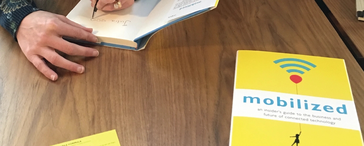
Today’s post is an excerpt from SC Moatti’s new book, Mobilized: An Insider's Guide to the Business and Future of Connected Technology. Enjoy!
The best mobile products feel so obvious that it seems anyone could make them. Of course, nothing could be farther from the truth: it takes a lot of work to make something beautiful. There are two types of design elements designers use to create beauty on mobile: focusing and expanding.
Focusing design elements are about efficiency
Companies have five types of focusing design elements at their disposal:
1. Onboarding
Onboarding design elements aim to deliver value to a user before they even sign up. Think of a recent situation when you met someone interesting and fun, someone who could be a friend. Did you immediately ask them personal information such as their age or email address? Likely not. It’s the same on mobile. Before anyone commits to using a mobile product, they need to know it will be worth their while. They want to understand what it will do for them and how. Optimizing app store descriptions, ad copy, screenshots, video tutorials, by focusing on value first, before asking people to invest by sharing personal information is important. When someone commits to becoming a user, after they have been convinced by the onboarding design elements, their expectations are set and needs to be met or surpassed. This is where single-task design elements come into play.
2. Single-task
Single-task design elements keep a user focused on what they need to accomplish. Reflect on your own interactions with others for a moment. What do you do to convey that you are paying attention? When do you know they’re not? How does that make you feel? Mobile products mimic our behavior. When they offer too many choices or irrelevant options, they cause hesitation, confusion, and eventually, we stop using them. The easier it is for a user to complete a task, the more likely they are to come back and therefore the more familiar they become with the app and the more helpful it becomes. It’s hard to get rid of things that make our lives easier. On the other hand, great mobile products need to allow users to effortlessly navigate from one task to the next. That’s the role navigation design elements play.
3. Navigation
Navigation design elements are often hidden or positioned out of the way to make room for the single-task design elements to take center stage. In most cases when it comes to navigation, less is more. In some rare cases, it’s necessary to have multiple levels of navigation. Airbnb is a good example of that because the experience of a guest is very different from the experience of a host. Designers often spend a lot of time polishing navigation elements because they drive how effective a user will judge their product to be. Reviews stating that something is hard to use generally comes from a poorly designed navigation. Worse than hard to use are reviews complaining about crashes and other malfunctions. Efficiency design elements can never be ignored.
4. Efficiency
When people discover they’ve invested time in a product that doesn’t work, they feel that their time is not being valued and they vent their frustrations and stop using the product. Teams that are new to mobile will often underestimate the importance of efficiency design elements because they assume that mobile works just like the web. If it breaks, it can be fixed within a few hours with a so-called patch. Not so on mobile: fixing something broken can take weeks, if not months due to the constraints of the ecosystem, such as app store approvals. The cost to a company of a product that would be broken for weeks ranges from negative reviews to disengagement, lost sales and more.
5. Gesture
On rare occasions, innovative gestures can be disruptive. Double-tap on a picture in Instagram to automatically “love” it. Swipe right on someone’s picture in dating app Tinder to express romantic interest. Swipe left to rule them off. However, we have come to expect something very specific out of gestures on mobile: one tap is like pressing a button, two is for zooming, a right swipe on an item deletes it, pulling down a list refreshes it, etc. Imagine for a moment that you’re browsing for flight in a new travel app, you see a return ticket that fits your criteria and tap on it. What do you expect to happen? What if it doesn’t? What if something else happen?
Expanding design elements are about context
Whether onboarding, single-task, navigation, efficiency or gesture, focusing design elements are meant to be efficient. They establish simple and predictable rules of communication. They build trust. As trust builds, users start to expect more. This requires access to personal information, which is where expanding design elements come in. They come in two types:
1. Pull
Pull design elements grant permission to access users’ personal data, such as a contact, photos, or location. Because of how private that information is, designers need to very transparent about when and why they need it. Context is key. Take the example of Instagram. The service could not function without the ability to take and store photos. So getting access to a user’s photos is required for every user and one of the very first steps for every new user. On the other hand, sharing photos and videos with friends is not something everyone using Instagram wishes to do. So the permission to access a user’s address book is only requested when that user is about to share. Obtaining permission to access a user’s personal data is a huge step, getting the green light to send them so-called push notifications is an even bigger one.
2. Push
When done right, push notifications keep a design so simple that users no longer need to use the product itself. Take Facebook. The push notifications reminding people of a friend’s birthday helps everyone remember to celebrate. On top of this, users no longer need to open the Facebook mobile app to find out when their friends’ birthdays are. Push notifications tell us when we should use our mobile products. In fact, they are so powerful that companies like Leanplum, Mixpanel, and others have created service offering specifically to help brands optimize their push notification strategy.
What does this mean for you
If you’re working on a mobile product, here’s what you can do with that information.
- Describe a typical user of your product.
- Go through the most important task you want your users to accomplish. Did something distract you even for a split second?
- Navigate through every key feature of your service. Did you have to tap more than once or twice to switch context?
- Go back and forth between features as fast as you can. Are you experiencing any discomfort?
Maybe because the screens take a long time to load, or maybe your app crashed. Congratulations if not!
- List 2-3 permissions you need to get from your users in order to personalize their experience.
- When would be the best place and time to ask for these permissions?
- Picture what the user is doing immediately before these permissions are required. Can you associate it with a couple of focusing design elements, such as the onboarding flow, or the completion of a simple task?
To learn more about the formula for mobile success, including how to apply it to your own company, read my book, Mobilized: An Insider’s Guide to the Business and Future of Connected Technology or visit scmoatti.com.

