
How to Use Popups Without Ruining Your User Experience

This is a guest post from Csaba Zajdo, e-commerce expert and founder of OptiMonk. Enjoy!
The goal of every online business is to turn visitors into leads or customers, and popups are very effective at capturing attention and achieving conversion goals. However, many people refuse to use popups because of the complaints they receive from visitors.
The challenge is to use popups in a way that doesn’t ruin the user experience or lead to too many complaints. You can’t please everyone, but there are ways to use popups to boost your conversions without destroying the user experience of your site.
Here’s a good example from Booking.com of how to retain abandoning visitors with a popup without being too intrusive or distracting your visitors too much.
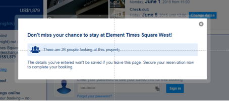
The popup matches the style of the site, there’s a clear and compelling offer that’s relevant for the visitor, it’s triggered by specific behavior on the site, and it builds a sense of urgency to compel the visitor to act. Well done.
Let’s take a closer look at four ways you can use popups to increase conversions without hurting the user experience of your site.
1. Forget entry popups
Perhaps the most annoying popup is the entry popup that appears when a visitor first enters your website. They’re extremely disturbing and really degrade the user experience because they interrupt the typical browsing and reading flow. Entry popups kill the visitors’ experience right when they enter your site.
That’s why almost all of us hate them.
Let’s look at the flip side. Instead of using entry popups, use exit popups. Exit-intent popups appear only when a visitor is leaving your site, so they won’t interrupt their browsing and reading flow.
When a visitor’s behavior shows they are about to abandon your site, exit-intent popups show up at just the right moment. It’s the timing that’s key to prevent the popup from annoying your visitors. It’s also worth limiting the number of popup appearances. A particular popup should appear only once to unique visitors. This way, your visitors won’t feel like they are being harassed with an offer.
In addition, a tasteful, beautiful, and most importantly, simple popup is much less annoying than a flashy or incomprehensible one. So make every effort to design elegant overlays.
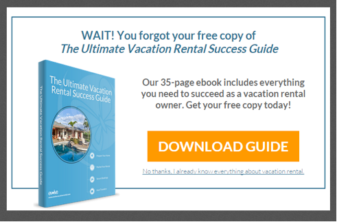
Evolve, a company that provides guidance for vacation rental owners, shows how an exit-intent popup is used to retain abandoning customers. Evolve offers a free ebook in a clean and tastefully-designed popup that only shows when a visitor tries to leave the website.
2. Display relevant and valuable content
Visitors hate popups that present irrelevant content. If the content helps the visitor solve their problem, find the right solution, or get answers to their questions, the popup won’t be perceived as annoying. Instead, it will be seen as helpful, or at least as intending to help, not disturb.
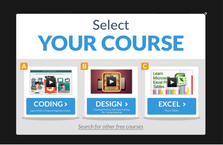
Another way to improve user experience by displaying a popup is to use it as an extra navigation tool. Instead of promoting an offer or subscription, you can use the popup to redirect traffic. Forwarding visitors to your best-performing content can really help boost your conversions and provide a better user experience at the same time.
Here’s a good example of how to promote valuable and related content to keep visitors browsing on your site, or to direct them toward your best-performing content or hot selling products.
3. Personalize your messages
The visitors to your website arrive from different sources with different needs and goals in mind. They may be interested in different products and topics, and they may respond differently to your primary and secondary marketing messages.
To improve the user experience when you use popups on your site, tailor your messages for different audience segments and customer groups.
Compose your popup campaigns carefully and promote your most relevant giveaway to each visitor group. When your message fits your visitors’ specific needs, you can achieve your conversion goals more effectively.
Highly customized messaging is the core of digital marketing. In the same way that you tailor different web pages for different groups of visitors, you should do the same with your popup campaigns to make them as relevant as possible to each segment.
Take a look at the example from Digital Marketer below. They promote the most relevant and personalized giveaway to their visitors based on their behavior. If a visitor shows interest in Facebook advertising, they’ll show them Facebook-related content:
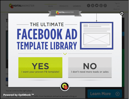
If the visitor is interested in social media more generally, Digital Marketer shows them a social media-related offer:
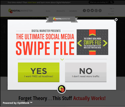
By tuning the messages in your popups for different segments, you can improve conversions and preserve the user experience by providing the most relevant message for each visitor.
4. A/B test your messages
When you want to see which popups are helpful and which could be hurting your site, it’s worth taking the time to optimize your messages through A/B testing. The same improvements as traditional A/B testing are available for popup campaigns, and you can boost your conversions by as much as 40% while improving the user experience for your visitors.
Using A/B testing, you’ll see firsthand which messages and design elements work and which don’t, what should be removed and what should stay.
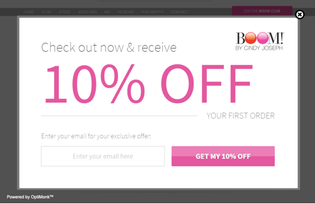
For instance, BOOM! by Cindy Joseph has used A/B testing to fine-tune their popup campaign. Once they knew which popup was favored by their visitors, they could remove the underperforming popups and see greater conversions overall.
Summary
Many site owners struggle with displaying enough information to their visitors without distracting them. Concerned with ruining the user experience, many people simply avoid using popups. However, when used correctly, you’ll be able to convert more visitors into leads, sales and signups without destroying the user experience of your site.
With these tips, you can use popups to improve your conversions and still maintain a user-friendly site.
- First of all, use exit-intent popups instead of annoying entry popups.
- Create simple and beautiful popups that match the style of your site.
- Make sure your offer is relevant and the content is fully customized to your audience’s needs.
- Boost your conversions and continue to measure and improve the efficiency of your campaigns with A/B testing.
When you use all these tips together, you can build popup campaigns that will make you happy with the results and keep your visitors happy too!


