5 UX issues retailers still struggle with

As companies invest more resources in creating better experiences, customers have grown to expect excellence in their digital interactions. This drives demand for more investment in UX research, fueling a continuous cycle of customer feedback, research, and innovation.
Fortunately for online shoppers, that means that most of their buying experiences are smoother, faster, and more engaging than they were several years ago. However, even among top retailers, there’s still a long way to go before we can expect consistently amazing online shopping experiences.
Here are five common issues that continue to vex online shoppers, leading to lower conversions and abandoned carts for retailers.
1. Confusing navigation and categories
Even though we’re mostly past the days of overwhelming multi-level drop-down menus, navigation can still be a pain point for online shoppers. When there are more menu categories than the shopper can take in at a glance, it’s easy for them to navigate to the first category that looks close, rather than spending time looking for the best match. This is especially true for categories that can overlap.
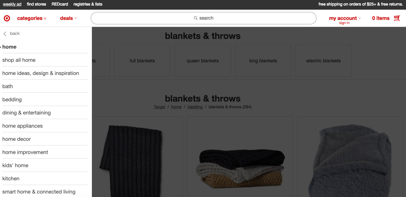
To make matters trickier, these categories can vary dramatically from one retailer to the next, leading to a world of confusion for comparison shoppers. For example, a shopper looking for a blanket might visit the Home section of Target.com, the Textiles section of Ikea.com, the Bed and Bath section of Macys.com, and the Home, Garden, and Tools section of Amazon.com. While none of these category designations are necessarily right or wrong, they can quickly become confusing to someone who’s shopping around.

On Target's site, shoppers can find blankets under the Bedding subsection of the Home category.
Some retailers have done a wonderful job of placing items into multiple categories, making it possible for customers to take different paths to get to the same item. However, that’s not always the case, and customers can find themselves navigating down many paths before finding what they were looking for.
2. Inconsistent search results
Since navigation can be overwhelming, many shoppers rely exclusively on the search bar to find the items they need. However, this isn’t a foolproof method for finding the right item. In our back-to-school study, users frequently turned up irrelevant search results. In the best case, the shopper will suspect that their desired item is somewhere on the site and try a different search term or use the menu to browse for it instead. However, it’s more likely that customers will assume that the site doesn’t have what they’re looking for and turn to a competitor instead.
3. Unclear shipping expectations
One of the most common complaints in our back-to-school study was uncertainty about shipping costs and delivery times. Many sites don’t display shipping information until checkout is nearly complete, leaving customers wondering if they’ll get their order in time and how much it will cost. If they encounter shipping surprises, such as higher rates or longer delivery times than they expected, they’re likely to abandon their carts—which is frustrating for both the retailer (who missed out on the sale) and the shopper (who wasted their time and didn’t get the items they wanted).
In our back-to-school study, we also found that customers also wanted the option to easily toggle between shipping and in-store pickup (if available) before spending time entering shipping information.
4. Difficulty editing and navigating away from the cart
Once customers open their shopping cart, the pressure is on. In some shopping carts, it’s difficult or even impossible to edit or delete items without navigating back to a product page. However, on some sites, navigating away can mean losing the items in the cart and having to start all over again. Prior experience with this means customers are likely to be timid about navigating away from their cart out of fear of losing their items—and that means they’re not making add-on purchases.
5. Poor attention to detail on mobile
Mike Mace, VP of Product Marketing here at UserTesting, describes mobile as a “death of a thousand cuts” for retailers. While mobile shopping experiences have come a long way in recent years, they still often suffer from less attention than their desktop counterparts.
Simple irritations can quickly add up for mobile shoppers, turning an average shopping experience into a frustrating one. For example, numerical form fields (such as zip code) that don’t automatically bring up the numerical keypad require users to go through the additional step of switching keypads before they can enter their information. While this may be a minor inconvenience, if it occurs multiple times, it can become infuriating for users who just want to make a quick purchase.

Manually switching to the numerical keypad is one of the small annoyances that add up for mobile shoppers.
These poor experiences lead to abandoned shopping carts and low conversions. Seeing this data, retailers unfortunately conclude that “mobile doesn’t convert” and decide to invest fewer resources in improving the mobile experience—perpetuating the cycle of frustrated shoppers and low conversions.
Resolving UX issues is a win-win for retailers
Researching how customers shop online isn’t only beneficial for the customer experience—it’s also the first step toward increasing conversion rates and boosting revenue for retailers.


