Blog
Stop shipping guesswork: How prelaunch testing cut 25% of iterations
Every product team knows the frustration of rework: revisiting features that didn’t land, redesigning...
Blog
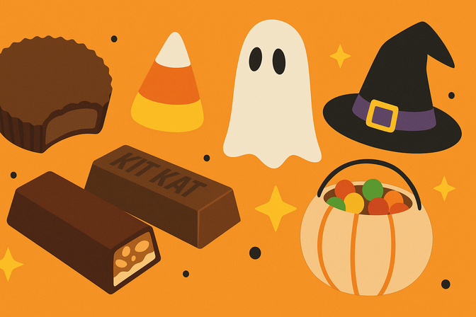
Here are America’s favorite Halloween candy and costumes in 2025
Every October, store shelves fill with sugar, sequins, and storytelling. Halloween is more than...
Blog
Friction to flow: lessons from the Total Economic Impact™ study
Every digital team is chasing the same goal: deliver better experiences faster. But there’s...
Blog
Which color sells the best?
Walk into a store and you’ll probably notice the price tags, the layout, maybe...
Blog
Customer journey optimization: 5 KPIs to reduce bounce and convert
Marketing does not end with a click. It begins there. Digital marketing teams spend...
Blog
Stop guessing, start knowing: Lessons from Content Marketing
Walking into Content Marketing World this year, I expected wall-to-wall conversations about AI. Instead...
Blog
The Labubu hype is real, but it’s not who you think
Why are people going nuts over Labubus? The viral, collectible dolls raked in $418M...
Blog
Analytics show the sequence, not the story: add human insight to your martech stack
Your customer experience optimization efforts are built on a foundation of data. Heat maps...
Blog
AI-assisted shopping: The new customer journey is emerging
Summary Generative AI chatbots are changing the ways people work, so it shouldn’t be...