
How top financial services organizations create great experiences

To uncover the best practices of retail banking customer experiences, we ran a competitor study, in which 90 participants evaluated the mobile app and ATM experiences of Chase, Wells Fargo, and Bank of America.
Our study revealed four key components top-scoring retail banks shared when it came to customer experience:
1. Clarity: Label menu items and links so their contents align with expectations
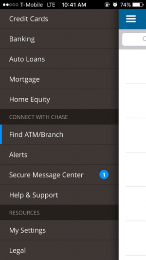
Participants immediately gravitated toward the menu when asked to find a branch location near them. Completing this task on the Chase app was easy—their menu contained a menu item Find ATM/Branch. The clear naming aligned with expectations, allowing participants to be quickly successful.
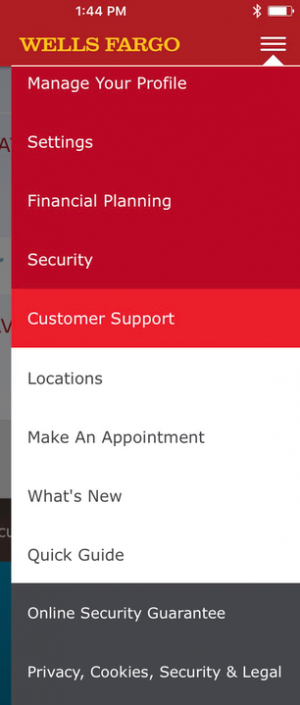
Conversely, The Wells Fargo app proved to be the most challenging to use to find a branch. After expanding the menu, none of the menu items was the clear choice. Many participants navigated the menu hierarchy multiple times before successfully finding a branch near their location.

2. Options: Provide more than one way to find information or complete a task
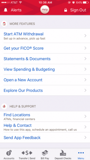
Bank of America presented a clear Help button on the top of the screen, as well as a clear menu item Help & Contact. This provided users with two means of finding contact information.
This task was the most challenging to complete on the Wells Fargo app. Many participants abandoned the task without finding methods to contact Wells Fargo. The Customer Support menu item insinuated information like a phone number or email. But, it only contained an option to make an appointment.
This is far more difficult than it should be . . . I'm shocked there isn't a Help section, or Call us here.
3. Low friction: Allow access to features without unnecessary interference
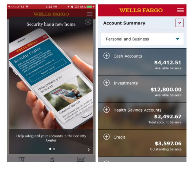
Placing the account balance(s) on the main screen of the app allowed participants to view the information immediately upon signing in, without any additional navigation. When this experience was blocked by an advertisement, as some participants encountered on the Wells Fargo app, the ease of the experience was rated lower.
Via Google Play
4. Intuitive: Make common actions easily accessible
On all three apps, recent transactions of an account were only viewable by tapping on the account on the main screen. Participants who have used the app before to complete this activity were immediately successful in this task.
However, the lack of a CTA on the main screen of all three apps hindered new users from completing the task. Without a CTA, new users were unaware recent transactions were accessed through the main Accountsscreen. As a result, they “stumbled around” the navigation menu, expecting to find this information under a menu item. The main Accounts screen was only explored when the menu failed to provide new users a means to find this information.
Great experiences build loyalty
Keep these key insights, and current consumer expectations below, in mind as you refine your retail banking experience. Create a great experience to build trust and loyalty with your customers.
Want to learn more?
If you’d like to learn how UserTesting can help you understand your customers through on-demand human insight, contact us here.


