
How to use the paradox of choice in UX design to increase conversions

Have you ever stood in front of a candy aisle and been overwhelmed by the number of choices in front of you? Or browsing your favorite streaming media service struggling to pick something to watch because the possibilities are seemingly endless? You’re not alone. This internal struggle, when presented with many options to choose from, is called the paradox of choice.
What is the paradox of choice?
The paradox of choice is defined as an observation that having many options to choose from can cause people to stress and problematize decision-making.
The notion here is that many options should mean that people could ultimately make a choice that satisfies them. However, that’s not typically the case.
Providing too many options can have its drawbacks. From feelings of anxiety when trying to make a decision to feelings of regret or worry that they may have made the wrong decision afterward. Let’s look at how the paradox of choice works in an example.
How the paradox of choice works
There’s a common belief that more choice is better. But when it comes to aiding decision-making and driving conversions, is that actually the case? Researchers Sheena Iyengar and Mark Lepper challenged this notion and conducted a study to understand the paradox of choice and the psychology behind it. Their study provided evidence about how people are influenced by the number of options they have to choose from.
In their study, they set up a jam tasting booth in Draeger’s, an upscale grocery store in Menlo Park, California. Half of the time, they displayed 24 different flavors of jam, and the rest of the time, they only displayed six.
They observed two things in particular during their research. In which scenario were people more likely to:
- Stop and sample some jam
- Buy a jar of jam
The results were counter-intuitive to what many would guess. When researchers displayed 24 flavors of jam, 60% of people stopped to sample them, and 3% of those who stopped converted and purchased a jar. On the other hand, when they displayed six flavors of jam, 40% of people stopped, but 30% bought a jar.
ON-DEMAND WEBINAR
Winning repeat customers: How retailers can optimize every digital touchpoint for more conversions
In this webinar, you'll learn:
- How to uncover hidden obstacles driving bounce rates
- Common customer frustrations crushing loyalty and repeat purchases
- Actionable strategies to reduce friction and enhance trust during online purchases
In this example, we can see that the larger display was appealing to the eye but overwhelming to the mind. Attracting shoppers' attention is essential but not very valuable if they don’t make a purchase.
When it came down to deciding to purchase a jar, consumers were at least six times more likely to convert when they encountered fewer options. But why is that?
The paradox of choice asserts that fewer options are easier to process
When people are presented with an exhaustive list of options, many find it difficult to be decisive. To take it a step further, the more choices you offer, the more likely people will delay their decision—even if it goes against their best interest. Psychologists call this choice overload.
Understanding all the information, evaluating the options, comparing them to competitors, and deciding whether or not to buy takes so much mental effort that it’s easier not to make a decision.
The paradox of choice can cause analysis paralysis
In another study, the mutual fund Vanguard gave Iyengar access to the 401(k) retirement plan records of 739,749 employees at about 2,000 companies.
Her team of researchers found that for every ten mutual funds an employer offered, the participation rate decreased by 2%. That means if a company only offered five funds, 10% more employees would participate than when they offered 50.
When you give people 50 choices of mutual funds—or 24 types of jams—they become paralyzed and choose nothing instead. This means that you may increase the chance of purchase by reducing the number of options.
How UX design can help avoid too many choices
In UX design, offering too many choices can lead to what psychologists call choice overload—a state where users become so overwhelmed by the number of available options that they hesitate, delay, or abandon decisions entirely. When every button, link, or product category competes equally for attention, cognitive load spikes, and satisfaction declines.
Reducing the total number of visible options doesn’t mean limiting value—it means guiding focus. Effective UX design helps users narrow attention to what matters most in their context. Research on the paradox of choice shows that simplifying navigation menus, limiting filter sets, or progressively revealing options can significantly improve conversions and perceived usability.
Why is choice important in UX design?
The paradox of choice UX plays a significant role in UX design because websites are often places where users are offered a large amount of choice—think e-commerce or streaming media.
If you hadn’t read this post, you might think that offering as many options as possible makes the user more likely to find something they need and purchase it from your website. However, all the choices are distracting to your user and may cause analysis paralysis—resulting in no purchase at all.
This excess choice may cause stress for the user that could ultimately be associated with your brand.
Let’s take a look at a few ways UX design can lead to the paradox of choice.
How UX design impacts the paradox of choice
CTA explosion
When there are too many CTAs on any one section of a website, the user may become confused about where to click. Additionally, too many CTA buttons can pull the user’s attention away from the main (or important) content on the page.
Content overload
Too many concepts being displayed or explained at once can make it difficult for a user to focus on just one piece of content. Instead of processing all the intended information, a user will likely lose focus and miss the idea or product you’re trying to sell.
CTA chain
An endless chain of CTAs is not only confusing, but it’s frustrating for users who just want to get to where they need to be. Plus, it makes your site feel spammy and less trustworthy.
Picking your choice of design
The phrase “choice of design” refers to the deliberate decisions designers make to structure, limit, or present user choices. Every design element—from the number of pricing tiers to how many links appear in a menu—is itself a design choice that shapes how users perceive freedom and control.
Good design balances autonomy and simplicity: too few options risk alienating users with narrow pathways, while too many can paralyze them. The key is to provide meaningful choice—options that differ in value or outcome rather than redundancy. This aligns with principles from behavioral economics such as choice architecture, where designers nudge users toward optimal outcomes by arranging information clearly, using defaults, and highlighting recommended actions.
See it in action, watch this on-demand webinar, "Winning repeat customers: How retailers can optimize every digital touchpoint."
Keep the paradox of choice UX in mind to increase conversions: less is more
Fewer options lead to more sales in grocery stores and higher participation in 401(k) plans, but does the same framework apply to digital experiences? The paradox of choice, paralysis analysis, and choice overload influence how users navigate websites and apps.
If you’re willing to eliminate extraneous, redundant, and unnecessary options, you’ll likely see more sales, lower costs, and a better user experience.
Now, let’s look at some examples of companies in different industries benefitting from considering the paradox of choice in their UX.
Examples of the paradox of choice in UX design
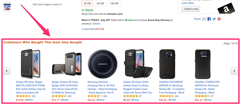
Ecommerce (Amazon)
Even though Amazon offers millions of products, they avoid choice overload by tailoring their recommendations to the types of things you search for and purchase. They even reduce stress from too many options by only highlighting 4-7 different options (depending on your screen size and device).
They also apply this principle on product pages by offering suggestions in the “Customers Who Bought This Item Also Bought” section (again, depending on your screen size).
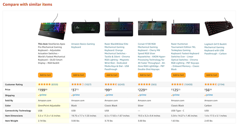
As a final effort to reduce anxiety when making a purchase, Amazon provides a section that helps you compare similar items at a glance. This helps reduce the cognitive load and motivates confident decisions.
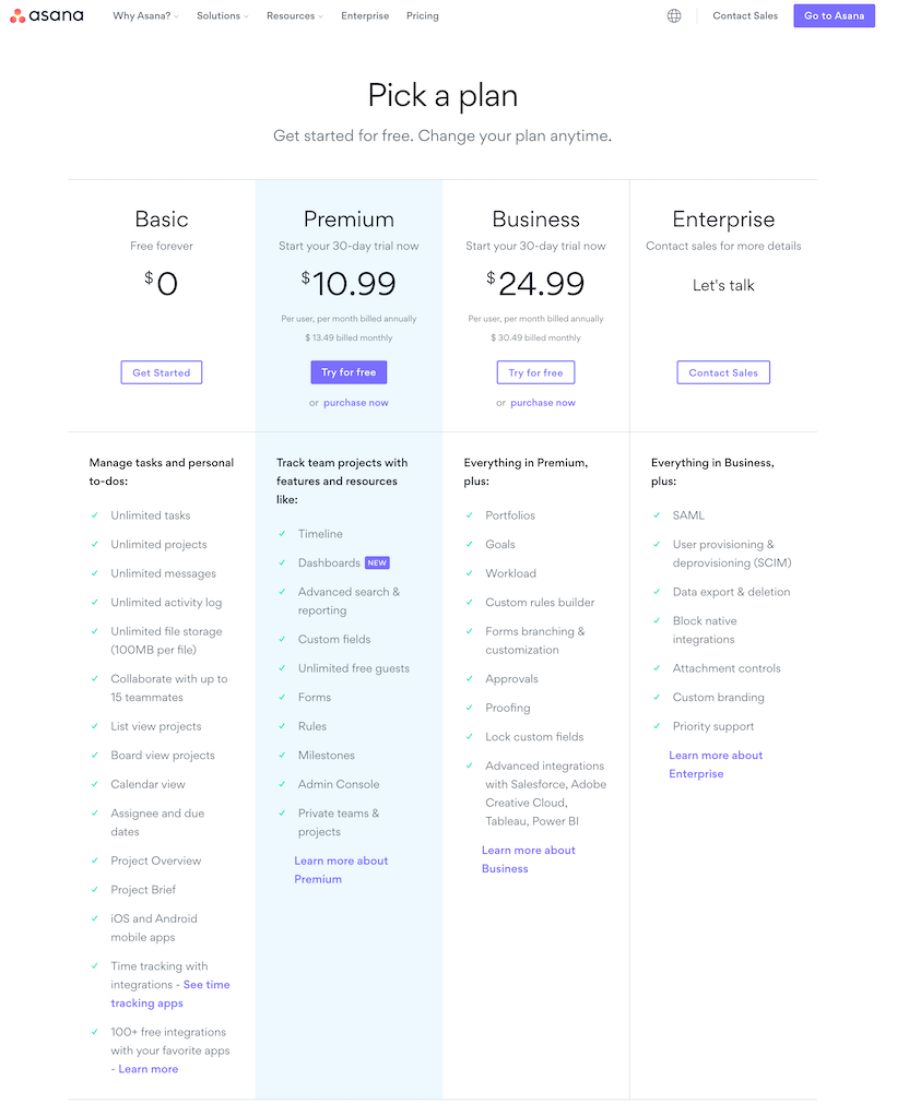
Pricing pages
When purchasing a product—especially a SaaS product—people want to be sure they’re buying the product that best suits their needs. By limiting choices and providing clear information about each package, people are more likely to make a selection.
The categorization technique
Finally, another technique will help you eliminate choice overload and increase conversions. It turns out people can handle more categories than they can handle choices.
People don’t get as overwhelmed by categories because they intuitively help them organize their thoughts.
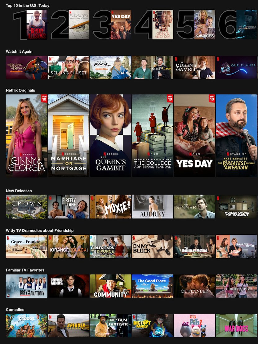
Netflix uses categories to make it easy for users to tell things apart. Because they have a wide variety of content, putting it into categories makes it easier for the user to make a selection.
You might think it will take forever to make a selection on Netflix, but imagine how long it would take without any categories.
The importance of your design choice
A design choice is any intentional decision that shapes the user’s experience—ranging from layout and color to hierarchy, content density, and interaction flow. Each choice should be rooted in an understanding of user goals, cognitive behavior, and emotional context.
In the context of the paradox of choice, design choices are not just visual—they are psychological interventions. For example, deciding whether to use a single primary call-to-action (CTA) versus multiple competing CTAs affects attention and perceived simplicity. Similarly, the decision to categorize information (as Netflix does with genres) is a design choice that eases cognitive effort and builds confidence.
Test your experiences to avoid paralysis analysis
When it comes to online sales, the old adage is true: less is more. And people are more likely to convert when they encounter a limited number of options than when they encounter an exhaustive number of options.
While you don’t need to be an expert in design psychology in order to be a proficient UX designer, understanding the basic principles of choice will help you build better products and experiences for your users.
In the end, there isn’t a magic number of choices for driving conversions, but testing your experiences with your users will help you fine-tune your design.

Improve your design teams' efficiency with user feedback
Learn how to incorporate user feedback throughout the design process to improve efficiency and drive impact.


