
Bridging quantitative and qualitative insights with Interactive Path Flows

Since its founding in 2007, UserTesting has established itself as the market leader in on-demand human insights. With UserTesting’s Human Insights Platform, teams can launch tests, and in a matter of hours, watch videos capturing how audiences interact with their digital experiences and what they think of them. This qualitative data is central to building customer empathy and improving user experience.
Quantitative methods complement qualitative ones. Companies often leverage analytics data to identify product usage patterns at scale, while targeted qualitative testing helps them understand why those behaviors occurred. While behavioral data takes time to parse and understand—especially when there are many participants—analytics dashboards make it easy to aggregate and visualize findings.
Introducing Interactive Path Flows
Interactive Path Flows represents UserTesting’s first step in bridging quantitative and qualitative experience testing, building on recent research in design mining at the University of Illinois at Urbana-Champaign. Leveraging patent-pending technology, Interactive Path Flows aggregate interaction data across multiple participant sessions into a flow visualization, surfacing unexpected behaviors, and linking to their corresponding video segments. Instead of watching videos sequentially, researchers can use the flow visualization to navigate directly to the moments worth watching—increasing speed to insight.
Accelerating the speed to insight
At the heart of Interactive Path Flows is a visualization that aggregates participant paths for a given task. The vertical bars represent screens visited by participants along their journeys.
As an example, let’s see how Interactive Path Flows work on a task where users were asked to find the educational requirements for a job posted on UserTesting.com.
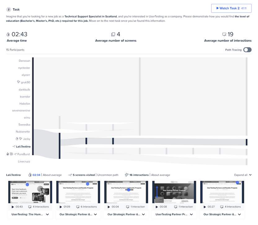
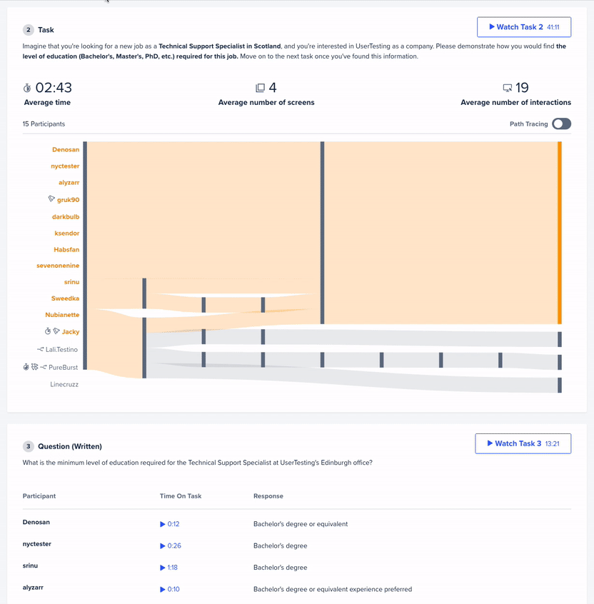
At a glance, the largest bars reveal that most participants completed this task in three steps: navigating from the homepage to the careers page and finally to the job posting—or the success screen considered for this task.
Highlighting the paths that reach this success state exposes three behavior groups: participants who took the quick, three-step path; the ones who got sidetracked along the way (but were still ultimately successful); and the ones who were unable to complete the task at all.
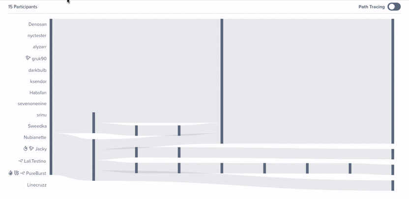
Digging into the interactions on the first screen surfaces that three of the four users who initially clicked on "Partners" were ultimately unsuccessful. Listening to these participants think out loud at this moment in their journeys could illuminate why this navigation link caused confusion.
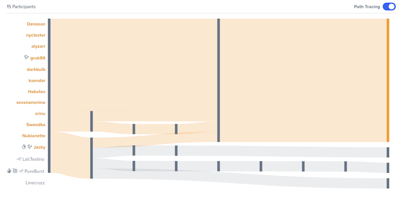
The Interactive Path Flows interface also automatically identifies outliers, including participants who took uncommon paths, spent the most time on the task, or exerted the most effort. Visually scanning through an outlier’s journey for our example task reveals that the participant eventually ended up on UserTesting’s site search and still wasn’t able to find the job posting from there. Watching the video clip corresponding to this part of the journey could explain why this participant struggled so much.
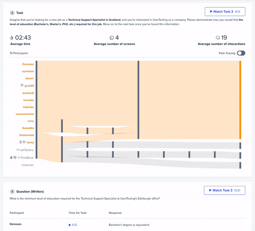
This example illustrates how—with minimal effort—Interactive Path Flows can distill hours of video from 15 participants into actionable insights for improving a website’s user experience.
“The what” and “the why” in one feature
Quantitative methods are often used to identify “the what” and qualitative methods, “the why”. With Interactive Path Flows, you can identify “the what” and then drill down to understand “the why” all within one feature without spending hours analyzing videos.
Customers who participated in our beta were excited by the possibilities, with one UX researcher noting, “I was impressed with how I was able to understand what each user went through without having to take the time to actually watch them go through it.” This feature is now available to accelerate your post-test analysis, and ultimately help you to build better customer experiences, using the power of human insights.
For more insight into qualitative data visualization, check out our article Qualitative heatmaps: how to visualize the frequency of usability issues.


