How a product designer at USA TODAY leverages unexpected user feedback

UX Unfiltered is our series where we hear from UX, CX, design, and research professionals on tips for success at top organizations and their real-life examples to inspire your teams. Below, read our Q&A with USA TODAY NETWORK’s Kate Thacker, principal product designer, on the benefits of unexpected feedback, how to better work with stakeholders, and pivotal project examples.
1. Tell me more about Gannett’s Product Design team. How long has the team done testing for feedback, and what sparked it to begin with? Has the process or attitudes changed over time?
I started at Gannett as a UX designer in September 2018, and the team at that time was already running small, iterative tests to validate the design direction of projects. At that time, we were still split into a UX and a UI team. So you’d have a UI designer translate the project requirements into a prototype and then pass it to a UX designer who would write and analyze the usability test.
Our team was restructured after the 2019 merger, and team members were renamed as product designers. This shift was a huge step towards democratizing our user testing process and empowering everyone to test their own work. Building a culture of user testing requires more than a few designers or researchers doing the work—you need to get everyone involved.
2. How did your reactions to unexpected feedback evolve over time (if at all)?
When I first started using the UserTesting platform, my instinct was to dismiss any feedback that wasn’t directly related to the project. For example, we often receive negative user testing feedback about ads, and I wouldn’t even note that input as it didn’t seem pertinent to the task at hand.
The reality is that people don’t use your product in a vacuum.
But, if someone is distracted by ads, they’re less likely to notice the shiny new feature you’ve added to the page. I’ve learned to note anything a user focuses on during the task so I can reference it later if it begins to feel like a theme.
3. How does the team incorporate unexpected feedback into the design process?
We anticipate unexpected feedback and plan accordingly!
We encourage product managers to pose questions and “how might we” statements in project briefs instead of leading with answers or assumptions about what will work.
We get these same product managers involved early in our testing process so they understand how the project evolves and help promote the work to other stakeholders. For major projects, we typically devote an entire quarter to research and early design ideations before we move into implementation mode. Sometimes unexpected feedback is relatively minor, and other times it’s a complete showstopper that changes the course of a project. For example, last year, our Data Insights team identified that many of our news subscribers who chose to cancel didn’t understand their subscription benefits beyond access to content. A product manager proposed creating a subscriber homepage in our account management system to educate subscribers about their benefits and continue to promote our high-quality, evergreen news content.
To test our assumptions, we started with a study determining how people who pay for all types of subscriptions learn about and engage with their benefits. We realized that most people never access account management tools unless they’re experiencing a problem. They only learn about new features or benefits if they’re discoverable through day-to-day use or if they hear about them through a friend or social media.
With four weeks of work, we were able to show subscription benefits aren’t one-size-fits-all, and a page within account management wasn’t going to move the needle on retention. We’ve since pivoted and have spent most of this year working on an onboarding initiative that helps subscribers engage with their benefits through small, contextual reminders.
4. What advice do you have for leveraging feedback to bring to stakeholders? What words of wisdom do you have for design teams that may struggle in this area?
Include direct quotes and videos of users giving feedback because it’s more powerful when it’s not coming from you directly. Be clear about what you know and what you don’t know. If an insight is directional rather than conclusive, say so. Discuss your findings with a teammate to ensure they’re clear to someone who doesn’t have the context you have. Consider what additional testing is needed and your next steps before you share feedback more widely.
Also, remember to take a deep breath and not to take negative responses to unexpected feedback personally. In a corporate environment, everyone has deadlines and KPIs and goals they’re trying to meet. Sometimes as designers, we feel like we’re under the most pressure because our work is highly visible, but other people feel that pressure too!
Start by pushing for the smallest change that feedback indicates will lead to the biggest impact and build from there.
5. How do you differentiate between feedback that can be leveraged or let go of?
The tricky part about feedback is you often don’t know if it’s a one-off or a broader insight the first time you hear it. You must document and track your feedback across tests to find the themes. The size of your design team and the number of projects you work on will determine how you do this.
A simple spreadsheet will work, but personally, I’ve found Airtable easier to use. I start by putting all tests into a "sources" tab, then add my micro and macro insights to their respective columns. Those insights columns populate individual tabs that allow you to see all insights in a list rather than at the project level.
Other times, something seems minor until you keep hearing it across usability tests and seemingly disconnected projects. This situation is when tagging the micro insights comes in handy. If you have a bunch of “micro” insights documenting the same problem, it’s time to test further and figure out what that macro insight is.
6. How do you define macro and micro insights?
Micro insights are themes or learnings from user testing and research that shape the direction of that project. This type of feedback is helpful when you need to retrace your steps about what you learned and why certain design decisions were made, especially if it’s been a few years since you last worked on it. I also use simple tags like “icons,” “labels,” or “language” to help track learnings across tests.
Macro insights are themes or learnings from user testing and research that are more high-level and shape the direction of all projects. Sometimes it’s immediately obvious when something is a major insight—“personalization increases loyalty” is a real example from that subscriber retention study I discussed earlier. We knew it was macro because it came up so frequently in the research.
7. What tips do you have for validating design feedback?
Think about other projects you or your team have worked on. Have you heard similar feedback before? Connecting this unexpected feedback to previous insights will help you determine if this is a new insight, a divergent insight that contradicts previous research, or a known problem that has not yet been addressed.
If you think this is a new or divergent insight, change one variable at a time and re-test to see how feedback changes (or doesn’t). What happens if you shorten the copy, change the color, or reword your test question? You’ll need to do a little legwork to see if a minor change leads to a solution before you blow up an entire project with unexpected feedback.
8. Tell me about working on local subscription offer pages and launching the digital USA TODAY subscriptions.
The local offer page project started off as unexpected feedback on a much smaller test. Our local news sites include two subscription messaging units above the desktop navigation. We wanted to test whether small design changes like background color or imagery affected how often users noticed them. We user tested various designs and had users click through the existing offer page to see if it matched their expectations. While language and design had no observable impact on how likely a user was to notice the message, 50% of users said they would hesitate to subscribe specifically because the offer page didn’t include the subscription price after the promotional period or a cancellation policy.
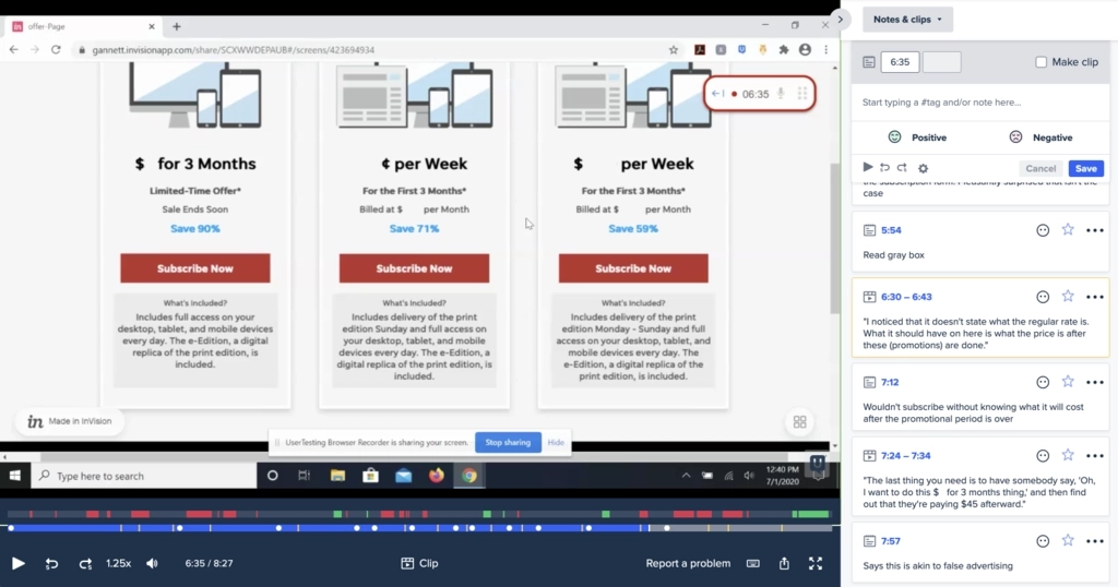
Courtesy of Katelyn Thacker
As we continued to iterate and re-test minor offer page revisions based on this feedback, we got the green light to redesign the entire checkout experience, including a major overhaul of the offer page. The checkout and offer pages became part of a bigger, multi-year initiative where we could share learnings between projects as we continued refining how we positioned subscriptions and discussed pricing.
That initiative included designing the new offer page for the launch of USA TODAY digital subscriptions in less than a month, which is always a fun challenge. Thankfully, we had a bundle of user insights from these other projects to build on, as we only had time for one round of dedicated user testing. We quickly mocked up and tested four different designs on UserTesting, made small updates to the two best-performing designs, and launched an A/B test to pick the winner.
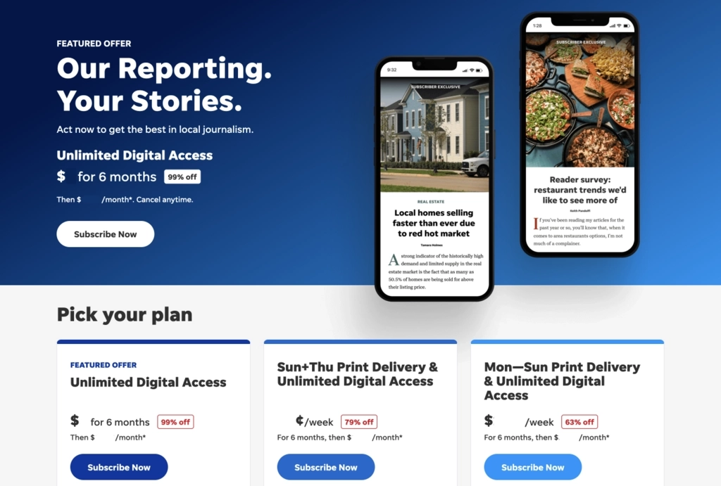
Courtesy of Katelyn Thacker
Building off the USA TODAY offer page work, we pivoted back to the local landing page. We tested local versions of the winning USA TODAY copy and design, then moved into testing several variations in-market. The in-market tests led to a 24% increase in click-through to checkout overall, but different messages performed better on various devices. While this unexpected feedback resulted in an unusual approach for us, we ran a pilot on IndyStar and saw consistent results on desktop and even better results on mobile. These local pages are now live in all markets, and we’re tracking conversions from now on.
9. Tell me more about other project examples—the crossword redesign and testing subscription pricing.
Redesigning the crossword happened in the middle of the offer page and checkout work. We wanted to work fast, but there were a lot of unknowns. We started with a qualitative study of current players of the USA TODAY crossword and two competitors that matched behaviors of our target demographic—habitual players who did a crossword at least once a week, but were more casual than competitive about their crosswords. Even though we consistently rank in the top three crosswords in search, people who complete the Saturday New York Times crossword for bragging rights are unlikely to be converted. That study helped us identify the core feature set we needed for MVP and led us to start with a freemium experience rather than a hard paywall.

Courtesy of Katelyn Thacker
We moved into several rounds of usability testing with existing USA TODAY Crossword players, primarily to test site navigation and subscription messaging. When we asked about their interest in subscribing based on what they saw in testing, 40% of users said they wouldn’t subscribe because it was too expensive and compared the cost with what they were paying for streaming sites. The feedback was unexpected because we hadn’t heard that comparison before. We deemed it directional rather than conclusive and launched the MVP with that price point.
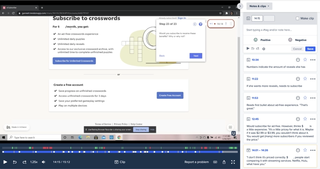
Courtesy of Katelyn Thacker
As you may have predicted, we learned soon after that the comparison was a macro insight. We ran tests for multiple projects that summer that involved subscription pricing, and comparisons to the cost of streaming services kept coming up. We reduced the price by 50% as we started to look at subscription pricing more holistically across the company, and daily crossword subscription starts tripled. The combination of user testing feedback and on-site analytics powered the success of this project.
10. What have you learned about the absence of feedback?
Sometimes the absence of feedback is an insight!
I launched a qualitative study about subscriber onboarding earlier this year, where we set up new and existing readers with a digital subscription to their local paper. Our goal was to see what they learned about their benefits through organic site/app use and dedicated onboarding emails after one week. Knowing that new subscribers can receive multiple emails from us per day, they were instructed to record themselves reading the one that most interested them—and the existing onboarding emails were not their first pick.
After the initial panic that I had ruined this study by not giving more specific instructions, I talked about it with the team, and we realized this was an insight. If people aren’t reading onboarding emails in a research study where they’re being paid to do so, they’re unlikely to do it in real life, either. We found that new subscribers expected the daily news digest emails to include this information and recommended a new, subscriber-only version of the daily digest because of this insight. We also collaborated with the marketing team to rework our onboarding emails to be shorter, more specific, and promote actionable benefits.
Reading between the lines can be tricky, so verify your assumptions.
In the case of this study, I reached out to each person individually to ask them to provide feedback on additional onboarding emails. We verified the insight at that point because testers told us they preferred to read the daily digest while providing additional information about what would make onboarding emails more useful.
11. What does user feedback mean to you, your team, or your work? What has been its impact?
I used to joke that I’m not a good designer, but I am a good listener. But over time, you start to develop this muscle where you can anticipate the types of feedback you might receive and solve for them before you even begin usability testing. Listening and learning from previous projects allows you to solve problems in three rounds of testing when it might have taken six rounds before. It enables you to work more quickly and efficiently, delivering a better user experience.
As a team, maturing our user testing process allows us to work on more projects and amplify the importance of talking to real users before launching something into the wild. We have other teams reaching out because they want to user test language and accessibility. Now, we're a part of projects we would previously never be involved with, like winback emails, for instance.
It’s really a best-case scenario when your team’s work has demonstrated enough value, causing people to actively seek out your expertise.
Parts of this Q&A have been edited and condensed for clarity.
In this Article