
How UX can improve the onboarding process for fintech brands

One of the challenges when creating new digital products or services is the process of onboarding new users.
It’s an area where the importance of user experience can't be overestimated. If onboarding becomes a hassle, then users won’t devote the time and effort to learn about your product and begin to use it.
The challenges of onboarding multiply as a product grows more complex. This can make things difficult for fintech brands looking to find new ways for customers to use their financial products.
In this post, we’ll look at some great examples from finance brands, showing how they can attract and educate customers through great UX.
Onboarding examples from finance brands
ClearScore
ClearScore provides free credit checks, summaries of balances, and advice on applying for mortgages, credit cards, and other financial products.
It starts simple, with the homepage asking for an email address to begin the process.
![]()
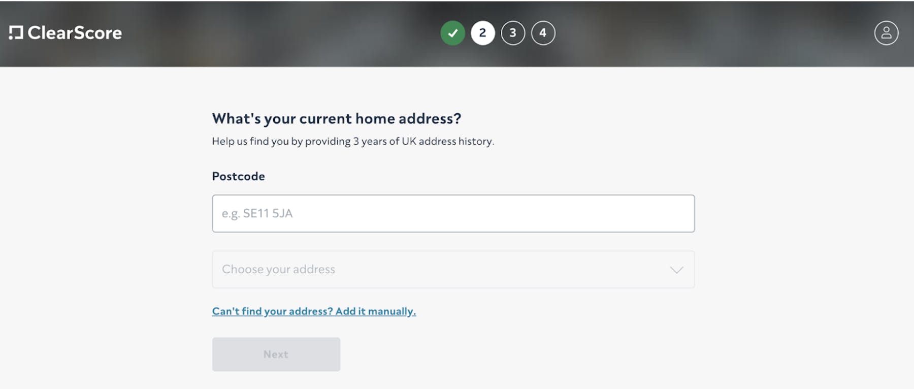
The onboarding process is split into four stages, beginning with the home address, which is easy to find with a postcode lookup tool. Each step is relatively small to avoid deterring potential customers with too much effort.
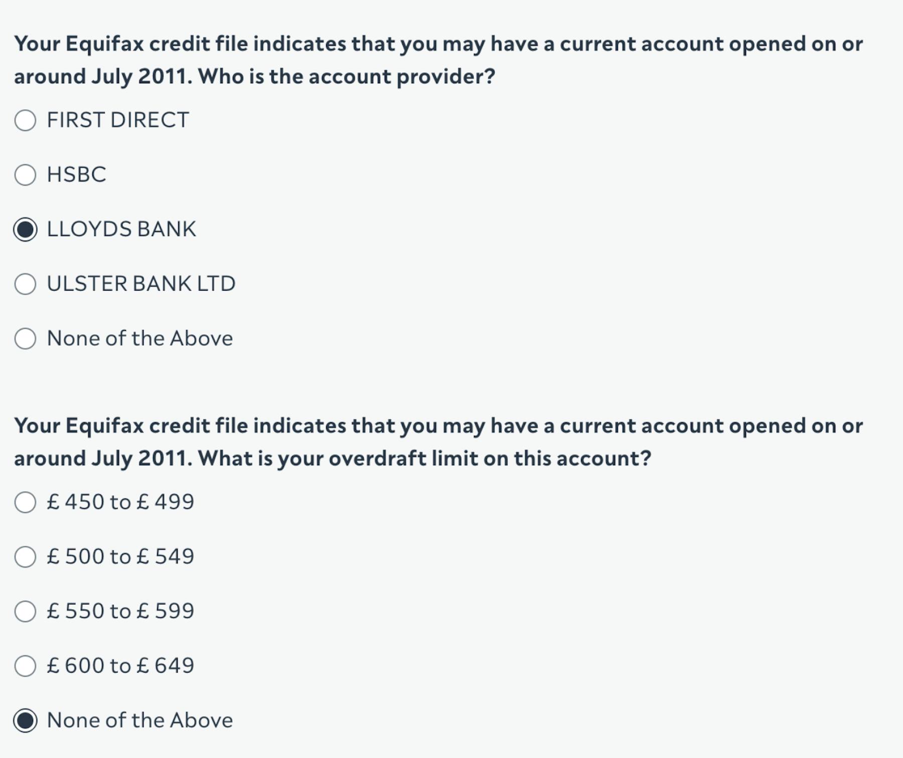
Accessing the credit file requires you to confirm that you’re the owner of the accounts in question, so it asks a few simple questions about the accounts you have.
The use of multiple-choice questions here speeds up the process and makes entering information easy for potential customers.
The last stage is to show your credit score and your financial status.
Once you’ve passed this point you’ve completed your profile and can access information, so the next stage is educational about the various sections and features within the app.
It does this through a tour of the features, explaining how they work, and the information you can find within different sections of the app.
![]()
The onboarding process is simple with reassurances of why information is needed, and a progress meter.
Mint
Mint is a money tracker and budget planner. It’s a product that many first-time visitors may be unfamiliar with, so it has the task of educating users about the service and introducing them to features—while keeping the process as simple as possible.
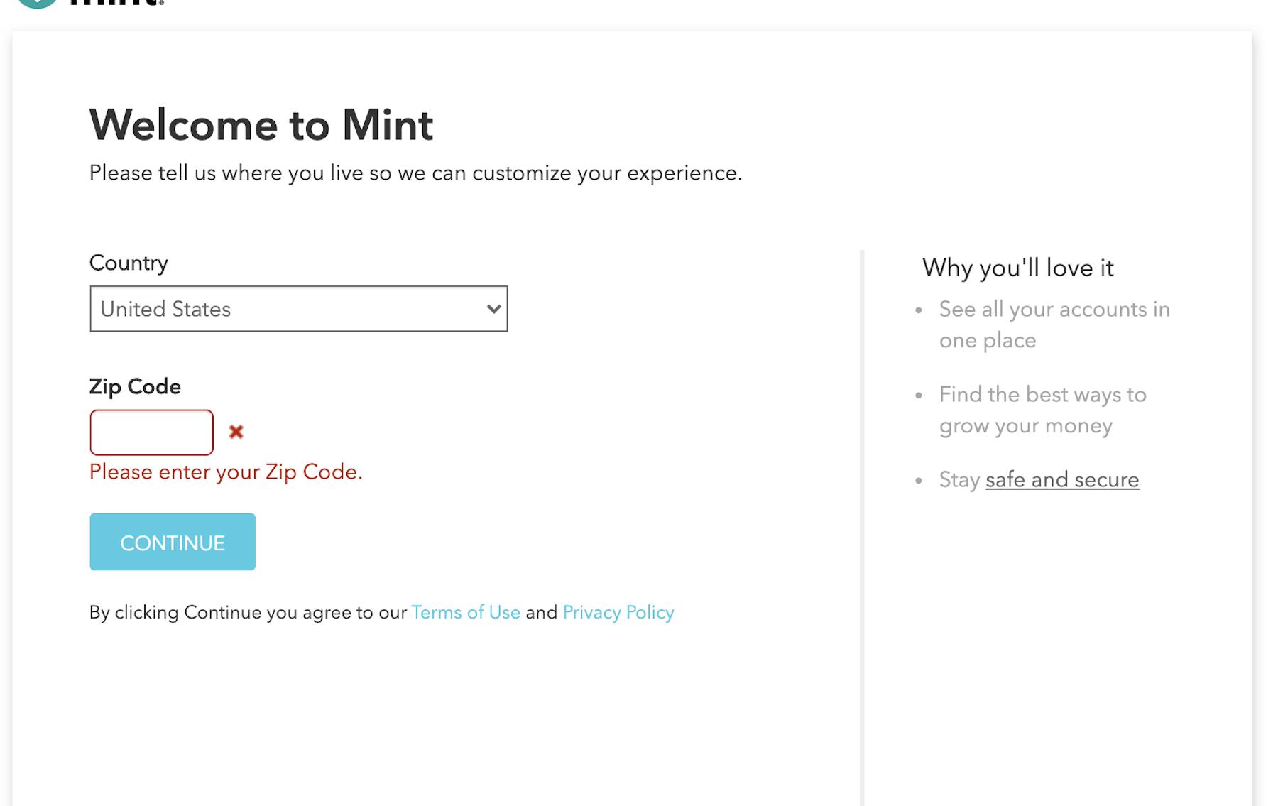
It's a straightforward start, with customers required to choose a country and zip code. Microcopy is also used to reinforce product benefits and reassure users about security.
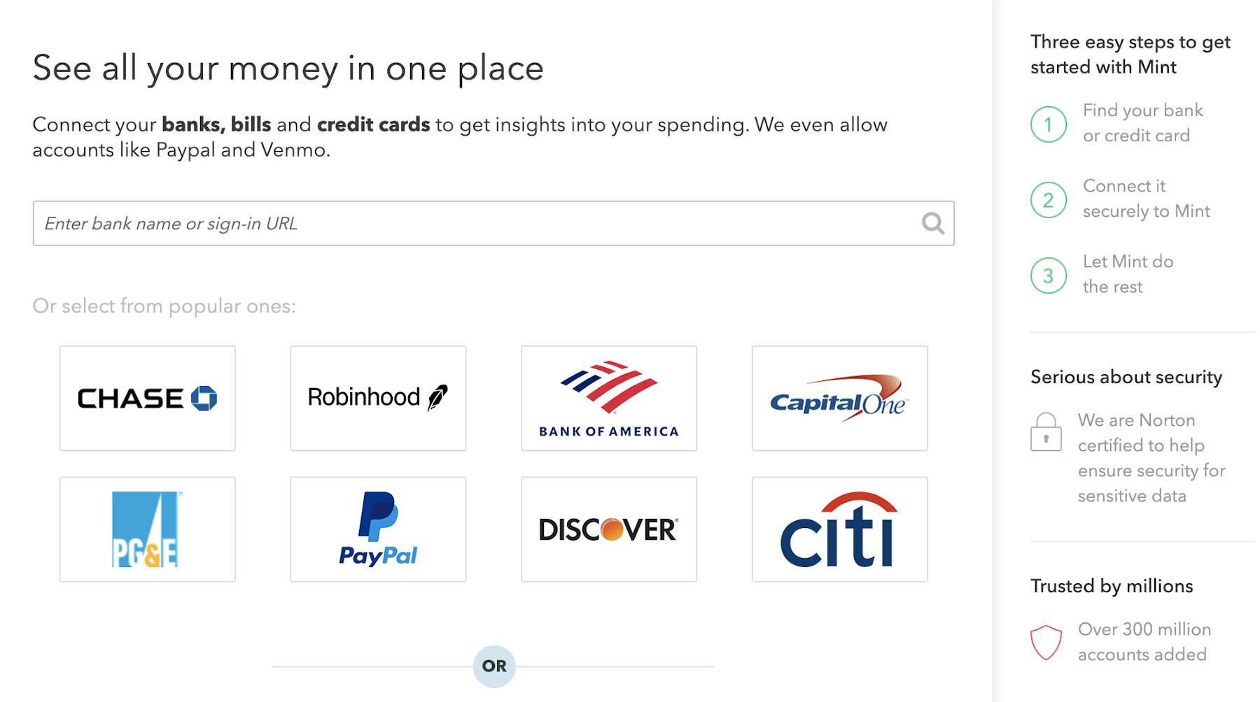
The next step is potentially tricky to handle, as signing up for and using Mint requires customers to connect their bank accounts, credit cards, and more to be able to use the product effectively.
There are plenty of potential barriers here so it’s vitally important to explain the process to customers and to reassure them about security.
The latter point is addressed with messaging about Norton security, and the use of social proof ("over 300 million accounts added".
Mint also reassures people that this is simple, with the three-step process explained, and popular bank options shown to save users the work of typing in the name of their bank or card provider.
Once users have been through this process, they're ready to start using the app. There’s a lot to take in so Mint provides a quick tour, using tooltips to explain the different features.
Users can choose to go through each tip, select the areas that are important to them, or dismiss the tips altogether.

There’s a lot of potential complexity in the whole process, and some potential barriers for new users, but Mint builds trust and educates customers, and carries the momentum through the onboarding experience.
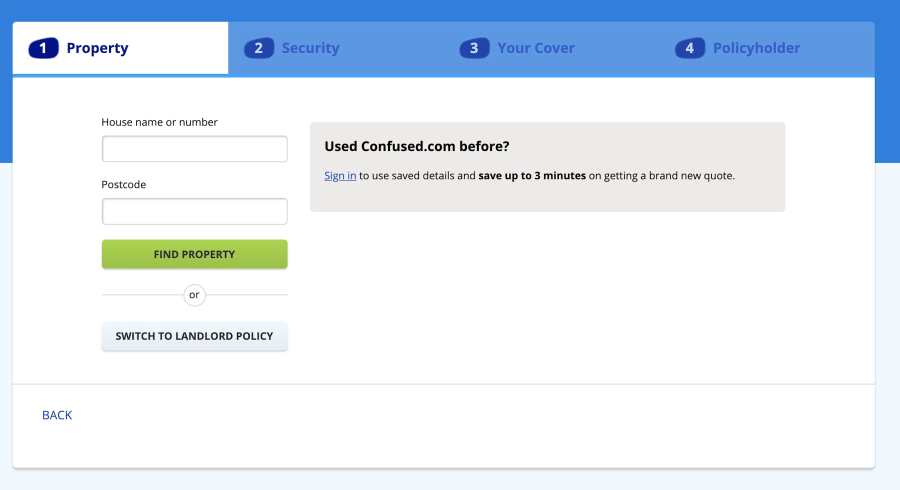
Confused.com
This is a great example of turning a normally complicated process into a smooth experience.
Requesting quotes for insurance–car, home, or otherwise–can require plenty of information from the user. Without a focus on UX, the process could contain many potential barriers for users.
Confused.com breaks the quote process up into stages, making the process clear from the beginning, and providing an estimate of how long the quote will take.
There are a lot of questions to ask for a home insurance quote and Confused.com has made the layout of questions and the input format as easy as possible.
The simple button format with possible answers laid out is easy to complete. By contrast, text entry or drop-down would require much more effort from the user and could potentially lead to more mistakes.
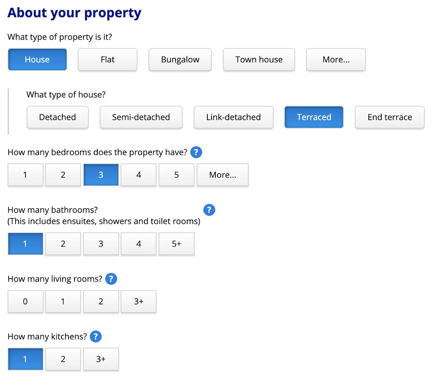
For questions where the user may not have the answer to hand or know the terminology, images are used effectively. People may not know what a 5 lever mortice deadlock is, but show them a picture and they can then check it against their own lock.

Tooltips are there for many questions where users may be unsure, to provide clarity or further information. Mistakes on home insurance quotes can be costly later on, so it’s important that customers have the information they need to complete the form accurately.

Like the Mint example above, this is an onboarding process that really helps the user. By keeping the user's experience top of mind during design, Confused.com turns what could be a complex and frustrating form into a far smoother experience.
In summary
Onboarding UX is key to encouraging new sign-ups and helping users learn how products work so that they can use them effectively once they’re set up. When done well, proper onboarding leads to more sign-ups, and greater user retention.
Good onboarding in fintech is a mixture of reassurance and education—ensuring that customers are confident when entering personal details and that they understand how the app will work once the process is completed.
The balance is to provide the information needed to help the user without overwhelming them with so much detail that it will deter them. If steps are too complex or forms difficult to complete, they may not make it through the signup process. If the experience is great when they make it on board, then they’ll keep using the product.

Get started with experience research
Everything you need to know to effectively plan, conduct, and analyze remote experience research.


