How color psychology in UX design impacts conversion rates

Color psychology in UX design is one of the most powerful tools in a designer’s toolkit. The right color choices can influence users’ emotions, draw their attention, and even guide them toward making a purchase. It’s one of the main factors in shaping how customers perceive a brand, and can directly impact conversion rates.
With an infinite number of color combinations out there, it can be hard to decide what colors will make the biggest impact on your site or app. It would be impossible to test everything, but we’ve picked up a few tricks and trends on how color affects users’ attitudes and behavior, so you can create more impactful designs.
In this article, we’ll cover:
- Basic color theory
- Color psychology and emotional associations
- Color accessibility issues
- The impact of color on conversion rates
- Sample questions for testing color choices
We’ll also share insights from a study we conducted on how men and women perceive color schemes differently and how color can attract attention and make a website more memorable.
Basic color theory
If you’ve ever taken an art class, chances are you’re familiar with the color wheel.
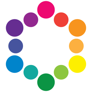
Primary colors (red/magenta, yellow, and blue/cyan) can be mixed to create secondary colors (orange, green, and purple). White can be added to a color to create tints, and black can be added to create shades. The lightness or darkness of a color is known as its value.
Colors that are opposite each other on the wheel are complementary. They contrast strongly, and they can be used to attract the viewer’s attention and build energy. Take a look at Apple's Messages app icon. The complementary scheme immediately catches the eye, and the red notification demands attention.
ON-DEMAND WEBINAR
Winning repeat customers: How retailers can optimize every digital touchpoint for more conversions
In this webinar, you'll learn:
- How to uncover hidden obstacles driving bounce rates
- Common customer frustrations crushing loyalty and repeat purchases
- Actionable strategies to reduce friction and enhance trust during online purchases
Colors that are next to each other in the wheel are analogous. They have lower contrast, and they can be used to create a sense of harmony and continuity in a design. Calm, a meditation app, uses the analogous colors blue and green to help users feel relaxed and peaceful.

When you’re using colors in text, be aware that placing two colors with low-value contrast next to each other can make your copy very difficult to read (whether they are complementary or analogous colors).
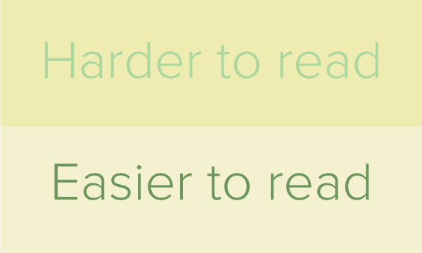
Low-contrast text is beautiful and harmonious, but the higher-contrast text is much more usable.
This is especially true on mobile screens, where users are more likely to be outdoors or in bright places that cause screen glare.
Color psychology and emotional associations
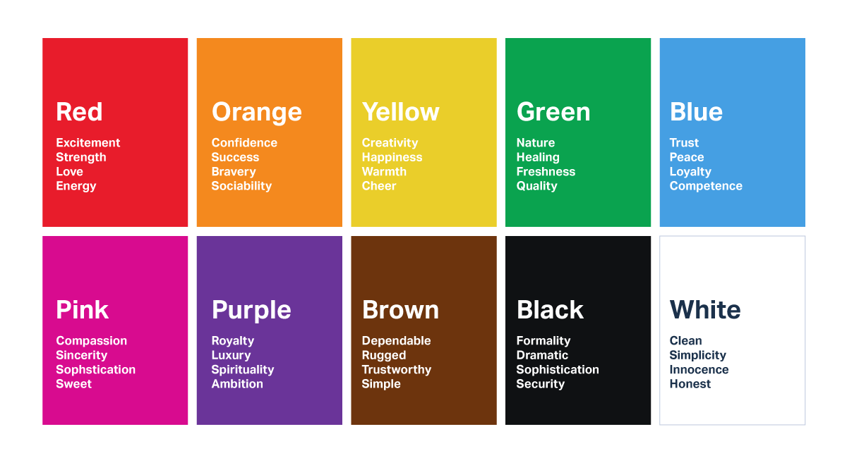
Colors can evoke powerful emotional responses, often influencing how a person feels. Understanding color psychology in UX can help designers create a certain mood for their audience and brand. For example, looking at the color psychology chart below, we see that blue is often linked to feelings of trust and loyalty, while red is often linked to strength and energy.
Keep in mind that color associations aren’t universal and vary depending on culture, gender, age, and even socioeconomic status. Colors that are en vogue this year might be much more effective with a younger, trend-conscious audience compared to an older audience with a different lifestyle.
Aura colors and their impact on digital user experiences
While traditional color psychology focuses on emotional associations like trust (blue) or excitement (red), aura colors introduce a more nuanced, metaphysical perspective on how people interact with and respond to color. In aura photography, each color represents a different energy or personality trait—and these associations may offer UX designers new ways to think about conversion-oriented color choices.
Consider incorporating the energy of aura colors into your palette for emotional resonance:
- Red: high energy, passion, drive. A red aura is often tied to physical vitality and action. In UX, red can create urgency and boost conversions when used for calls-to-action—but too much red may feel aggressive
- Orange: sociability, creativity, and emotional intelligence. Orange is tied to the sacral chakra and encourages connection. It can be used to build a sense of warmth and openness on product landing pages or onboarding flows
- Yellow: intellect, confidence, personal power. Yellow auras reflect optimism and focus. Use this shade to convey friendliness and inspire users to explore deeper into your site
- Green: growth, healing, balance. In aura terms, green reflects harmony and heart-centered energy. UX designers may find success using green on wellness apps or anything meant to build trust over time
- Blue: truth, communication, clarity. Blue in the aura symbolizes calm and truth. It’s ideal for interfaces where clarity and trust are vital, like banking or healthcare apps
- Purple or violet: imagination, vision, intuition. Violet aura energy speaks to creative insight and future-forward thinking. These colors are effective for brands positioned around innovation or aspirational products
- White or indigo: spirituality, connection, deep empathy. These rare aura colors suggest transcendence and sensitivity. When used thoughtfully, they can elevate minimalist UI design and create a sense of spaciousness and calm
While aura color meanings are more subjective than traditional color psychology, they offer a rich, human-centered layer of insight. Designing with these energetic tones in mind can help UX teams create not just functional experiences—but emotionally resonant ones.
Brand and industry
As you can see in this chart, many popular companies have used color psychology in marketing to evoke a particular emotion in their customers.
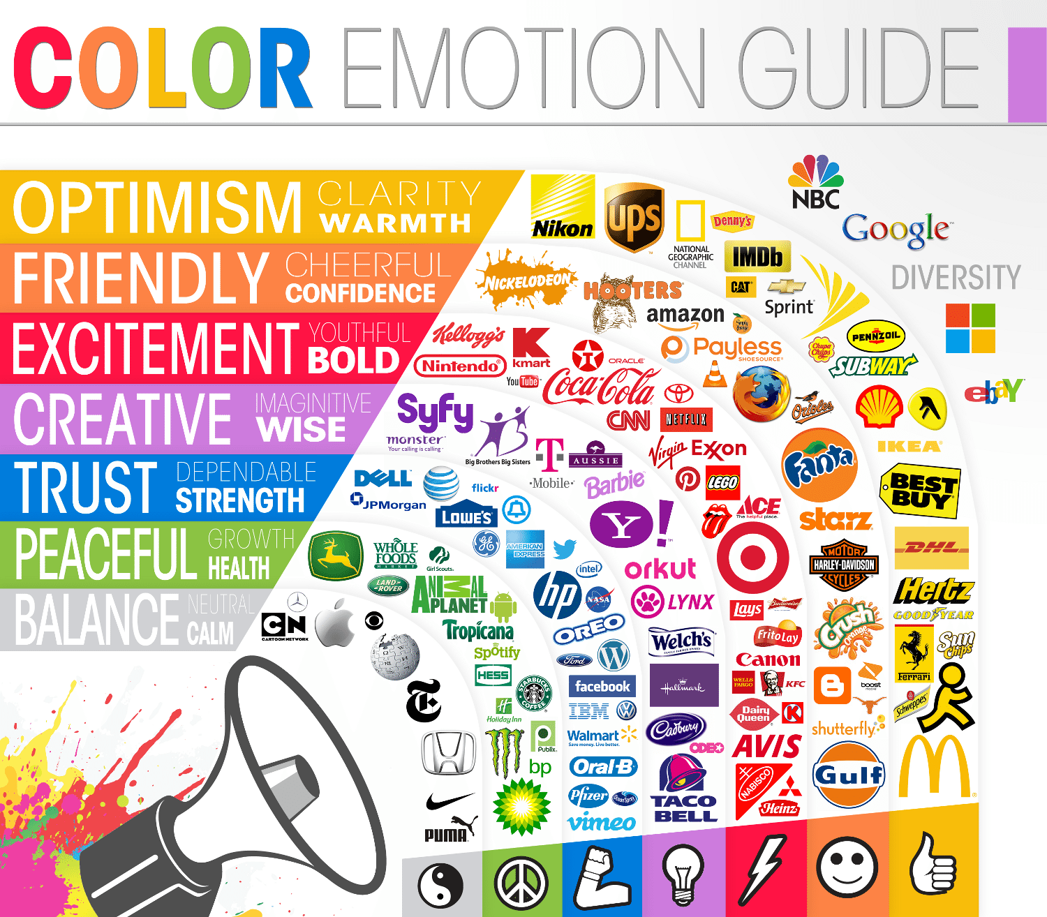
Customers also form color associations for certain industries, such as blue for tech, green for health, and red for fast food. While some companies choose to match customer expectations by using their industry’s common colors, others have found that going against the grain can be a very effective way to make an impression.
Think about how traditional your target customer is. How would they react to a change from the norm? Would it be delightful or disorienting for them? What message would your company be sending if your color scheme broke away from traditional expectations?
Women's preferences vs. men's preferences
We conducted a 50-person study in which we selected 30 websites that fit into three color scheme categories: Bright, Dark, and White/minimal, like the three examples below.
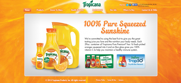
10 of the websites in our test used very bright, bold colors.
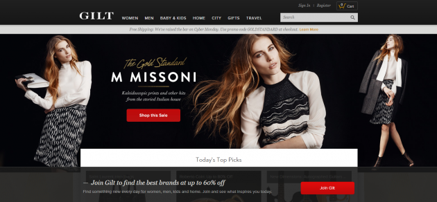
10 of the sites used primarily dark colors, with pops of color here and there.
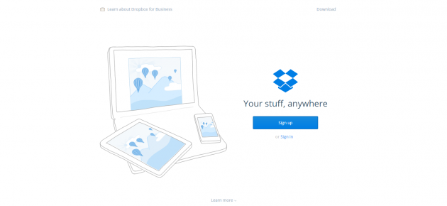
The other 10 websites in our test were predominantly white, with sparing use of color.
We asked an equal number of women and men to rate how unpleasant or pleasant the websites made them feel on a scale of 1 to 5 (1 = very unpleasant; 5 = very pleasant). Here's how they rated the sites:
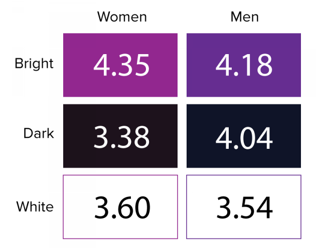
We learned that women preferred the bright sites most strongly, giving them an average rating of 4.35. While men also liked bright sites best (giving them an average score of 4.18), they ranked the dark sites as a close second (4.04, on average). By contrast, women gave dark websites the lowest rating, with a score of 3.38. Both genders felt almost equally “meh” about the white/minimal websites, giving them an average rating of 3.6 (women) and 3.54 (men).
Men who gave dark websites a high rating were more likely to describe those sites using very positive words like “happy,” “fun,” and “amazing.” By contrast, women who rated the dark sites highly tended to use more reserved descriptions, like “expensive,” “professional,” and “elegant.”
(Editor's note: This study had a fairly small sample size, and the differences were not large enough to conclude that all women like bright websites and hate dark ones. Keep gender differences in mind, but be sure to run your own tests to see how men and women respond to your site or app.)
GUIDE
Optimizing conversion rates for retail and consumer brands
This guide shares how some of the most successful retailers and consumer brands have tackled challenges with conversion rate optimization.
Color and accessibility
When designing your app or site, it’s imperative to consider how users with visual impairments experience your content.
Approximately 8% of men and 0.5% of women are affected by some form of color blindness, with red/green color blindness being the most common. Folks with red/green color blindness have trouble distinguishing reds, greens, and yellows of similar values, especially when the greens have more yellow than blue in them, like the olive background in the picture below.

The same button as seen with full-color vision (left) and a type of red/green color blindness (right)
One of the biggest challenges for users with color blindness is low contrast. Color combinations with too low of a contrast between the text and background or certain images can be difficult for users to see and understand, leading to missing key elements of the CTA. This is especially a problem around the winter holidays when lots of websites are decked in festive red and green.
Remember, if 8% of your male visitors can’t see the words on the button telling them to Buy Now, then you’re probably missing out on quite a few conversions. If you're in a situation where you have to use a color combination that could be difficult for people with color vision impairments, you can still improve accessibility by increasing the value contrast between colors.
For example, take a look at the picture below. It's much easier to see a dark red against a light green—even if you aren't color blind.

This button is easy to see with full-color vision (left) or with color blindness (right).
Color accessibility testing tools
There are some great tools available to help you test your site or app's accessibility. You can download Color Oracle’s color blindness simulator for Windows, Mac, and Linux, or you can upload your static images into Coblis to experience them with nine different types of color vision.
If you want to take it a step further, you can conduct user testing with people who have color blindness to identify which elements were difficult to perceive.
Other accessibility concerns
While we’re thinking about accessibility, don’t forget about the people who will be using screen reader software and other assistive technologies to view your website. Have you ever gotten an error message when filling out a form that says, “The fields marked in red are required”?
This can be an extremely frustrating experience for people who can’t see the red characters. It’s better to avoid referencing the colors on the site or app, and give more specific error messages like, “An email address is required.”
By designing with accessibility in mind, you’re not only creating a more inclusive experience, but improving the overall usability of your site or app. A more accessible design ensures that all users can navigate, interact, and convert more effectively, regardless of their abilities.
The impact of color on conversion rates
Okay, let’s dig into what everyone wants to know—the colors that sell.
What colors will improve your conversion rates and boost your bottom line? How can you use color theory and psychology to get people to click on a button?
For every conversion rate optimization expert out there who claims that a bold, eye-catching red is the best color for a button, another says that green is the best because green means “go.”
There are plenty of A/B test results that show how a change in the color of a CTA button made a drastic impact on signups. HubSpot shared this famous test from their early days when they were known as Performable:
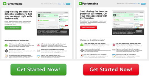
Performable's A and B versions of the button color test
Even though they originally predicted the green button would perform better, the red button resulted in 21% more clicks.
But they also warned their readers that this test result alone shouldn’t make everyone run out and change their buttons to red. It’s possible that their audience simply prefers red, even though other audiences might prefer green. Or, more likely, the red button got more attention because it was one of the only red objects on the page.
The bad news is that there isn’t a magical color that consistently performs best for all websites. The good news is that some rules of thumb can help you use color to your advantage.
Tips for irresistible designs
1. Contrast is key
It seems obvious, but we’ll go ahead and say it anyway: If you want users to click something, make it stand out! If your site or app uses a lot of orange, users probably won’t notice an orange button right away, no matter how well orange buttons performed in another company’s A/B test.
Remember, contrast isn’t just about complementary colors on the color wheel; it’s about value, too. A light button won’t stand out against a light background as much as a dark button would. On top of that, the copy needs to stand out against the button, too.
In our study, we asked users to show us the first thing they would click on each website. Not surprisingly, users were much more likely to click a CTA button that strongly contrasted with the background.
2. Bright is memorable
As the final question in our 50-person study, we asked users which of the sites they visited was the most memorable. 50% chose one of the bright sites as the most memorable.
Many users who chose one of the dark or white websites did so because of something unrelated to the design. For example, one user thought Dropbox was the most memorable because she already had an account with them.
Testing color choices: sample test questions and test templates
Here are a handful of test questions you can ask users when you're testing out your color choices:
- Before visiting [this site/app], please tell us what you would expect from a company that does [what your company does]. What do you expect to be able to do? How do you expect the site/app to look?
- What is the first thing you would click/tap?
- What are three words you would use to describe this site/app?
- On a scale of 1 (very unpleasant) to 5 (very pleasant), how did this site/app make you feel?
- How likely or unlikely would you be to trust this company?
- How did this site/app compare to your expectations?
- Can you think of any other companies that have very similar offerings? How would you compare this company to them?
You can also leverage a UserTesting test template to test your design choices with users.
Try the visual design evaluation template
Most of all, listen to your users
We’ve covered several color-related issues that can affect the user experience on your site or app, from traditional color associations and gender-based color preferences, to accessibility concerns. These factors are a great place to start when you’re creating a new design. But ultimately, the right design decision is the one that resonates with your users the most.
That’s why it’s so important to get feedback from your target market early in the design process. Find out if your color choices are affecting your users in the way you expect them to.

Get actionable insights today
Uncover human insights that make an impact. Book a meeting with our Sales team today to learn more.