
In this report
Comparing the digital experience of the top 5 US banks
Comparing the digital experience of the top 5 US banks
Nearly two-thirds of the US population uses digital banking services, according to Bankrate. A figure that's even higher for younger consumers, as almost four in five Millennials do online banking. Digital banking experiences, when done right, make customers feel special, understood, and valued—not to mention establish trust.
As organizations double down on digital transformation in an era when customers do almost everything on a device—expecting the high-touch service of an in-person experience—we wanted to understand how the top US banks compare in their digital customer experience.
To do this, we asked 1,500 people to visit one of the websites of the top five US banks, including Bank of America, Chase, Citibank, U.S. Bank, and Wells Fargo, and perform one of three common activities:
- Find the interest rate for a savings account
- Apply to open a savings account
- Get customer support
Participants shared their qualitative feedback and provided quantitative metrics scoring five key attributes on a scale of 1 (lowest) to 5 (highest), including:
- Ease of use
- Efficiency
- Trust
- Aesthetics
- Ease of understanding
We learned that the digital experiences of the top 5 US banks are good. Generally, participants had positive things to say. They praised various aspects of the visual design: “I like how you guys gave icons for each of the sub-categories, like a piggy bank for a savings account.” Another said, “I am more of a visual person, and I often ignore words. These icons can help me organize my thoughts while searching for things on this website.”
Yet, there were negative comments. Many were about ease of use. For example, someone looking for a chatbot feature on the website. “I mean, it's easier to use if I scroll down to the site map, and most websites have that, but the actual chat option, when I put in contact customer service, that really wasn't very clear.” Another said, “I struggled finding the information I needed, and I didn't expect to struggle the way I did” when looking for the interest rate for a savings account.
In fact, ease of use was the lowest-scored attribute across all five sites, receiving an overall rating of 3.97 on a scale of 1 to 5. Efficiency was next lowest, at 4.03, followed by trust (4.08), aesthetics (4.40), and comprehension (4.59). This means the online experience banks provide may not be as universally frictionless as it should be.
At the same time, there was good news: Ease of understanding was the highest-scored attribute, which means that once people found information, it was fairly easy to understand.
In this report, we’ll dive into more detail about where banks already excel and where they can improve in an increasingly changing digital landscape.
Study methodology
 We asked 1,500 people to visit one of the websites of the top five US banks, according to domestic assets, such as loans, mortgages, and credit card accounts, which included Bank of America, Chase, Citibank, U.S. Bank, and Wells Fargo—and perform one of three everyday activities: find the interest rate for a savings account, apply to open a savings account, and get customer support. Participants were asked to share their experiences via qualitative feedback and quantitative metrics.
Information-seeking task | Conversion task | Help task |
Participants were asked to find the interest rate for a savings account. This measures the just-looking or information-gathering phase of the customer journey before prospects decide to become customers. | Participants were asked to demonstrate how they would open a savings account. This measures the conversion point of the customer journey where a prospect signs up for an account and becomes a known customer. | Participants were asked to get in touch with the bank if they had questions about opening a savings account. This measures the support function of the website when a visitor requires assistance. |
Note: Study participants were asked to use a desktop computer to complete these tasks. Scores would likely differ on mobile and tablet. Anecdotally, organizations tend to optimize their desktop experience over other channels.
After they completed the task, participants were asked to rate five qualities of the digital experience: ease of use, ease of understanding, trustworthiness, aesthetics, and efficiency.
Key takeaways
 As you read the key takeaways and supporting data, remember that the digital experience of the top banks is good overall. At this level, it’s the small differences that make one experience superior to others. The important lessons to be learned are in the details. So let’s dig in. Based on the study's results, three things stood out.
1. Banks are too focused on optimizing account setup and lose conversions along the way
Web visitors typically go through a series of actions before becoming a customer. First, they look for information to decide where they want to bank. They compare rates. Then, they sign up for an account. While it’s not surprising that banks would optimize the conversion point or account setup initially, results from the study suggest that they stop there, leaving most other interactions unoptimized.
While task scores look decent as an average, comparing the scores for each task, we see a different story.

According to our results, the conversion task, or setting up an account on a bank’s website, was the easiest for participants to complete. The most common word to describe the conversion task experience across all sites was "easy," suggesting that the digital banking experience is optimized for creating an account.
However, the first task, finding the interest rate for a savings account, was less straightforward than setting up an account. In a real-life scenario, customers likely wouldn’t skip the information-gathering stage of their journey—bee-lining straight for an account. If information is hard to find, prospects won’t be persuaded to set up an account nor have confidence that the bank they’re looking at is right for them.
In terms of accuracy, participants asked to find the interest rate of a savings account struggled to get it right. Some participants found the wrong interest rate or gave up.

Note: Participants were compensated for their feedback. They’re more likely to spend time looking for information than standard web visitors.
When comparing the money-maker experience of applying for a savings account with the experience of getting help—similar story. Three of the five banks scored higher on the conversion task than on the getting help task.
And while the conversion experience was the highest-scored task for most of the banks, it wasn't for Wells Fargo and Citibank. Wells Fargo was the only bank whose score for setting up an account (3.70) was lower than its score for the information-seeking task (3.90), and Citibank scored better in getting help than it did on the conversion task. The bank with the highest scores for the account setup experience was Chase (4.70), followed by Bank of America (4.52).
While optimizing the conversion point is critical, it doesn’t ensure a painless customer experience. Banks can lose prospective customers before and after setting up an account if the experience isn’t similarly optimized.
Watch participants struggle to find the interest rate for a savings account.
Remote video URL
What this means
Banks should treat the digital channel as a holistic experience. While optimizing the conversion point is essential, financial organizations leave money on the table if they end there.
Actionable next steps
- Interview customers who recently opened an account. Ask them about their journey. What got them there? What were the positives and negatives? Identify points in the experience that drag sentiment down.
- Test the end-to-end experience by replicating our study. The study details are towards the end of this report.
- Use the Human Insight Platform test templates to comprehensively gather feedback on retail banking experiences to understand key customer experiences.
2. Digital friction points can compound into a loss of trust
When departments own pieces of the digital experience, they can’t manage the experience as a whole. Each task (find the interest rate, open an account, and get help) lives independently. Ideally, banks should have a well-orchestrated and consistent experience throughout their website regardless of what the customer tries to achieve.
Interestingly, success levels for the information-seeking task appear to correlate to trust scores. Wells Fargo had the least participants finding the interest rate for a savings account and had the lowest overall trust rating (3.85 out of 5). Chase and Citibank participants were most successful in finding the interest rate for a savings account, and those banks were given the highest overall trust ratings (4.3 and 4.1, respectively).
Here’s how trust scores compare to the overall experience of each task, showing that the poorer the experience, the lower the trust score.

Friction points may seem like minor issues to the teams supporting these experiences. Still, after watching consumers struggle, banking teams build a sense of empathy for the end users and some urgency to fix the problem.
Watch banking customers lose trust after a challenging digital experience.
Remote video URL
After ease of use and efficiency, trust was the lowest-scoring UX attribute for the banks.

Here are how the trust scores for the top 5 banks stack up.

In the qualitative feedback data, study participants describe what can chip away at their trust:
- “They won't give me the interest rates upfront, so I don't feel that's very helpful. You know, I don't feel like they've got my best interest in mind.” (57, Female)
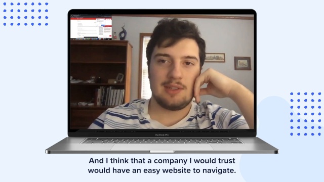
- “It was time-consuming to find it. And if I have all those three factors and I want to go with this bank, at the end of the day, I'd probably go somewhere else where it would have an easier website to use.” (31, Female)
- “I do think some trust comes from being easy to use and being consumer-friendly, and I don't think that this platform was overly consumer-friendly.” (30, Male)
- “I would rather know that I have the option to just talk to somebody, and they don't give you that option until you scroll down to the bottom. And even then, it's not 100% sure that you're not gonna get a live person. You don't know what you're really getting when you call this number.” (53, Male)
- “I have to go beyond just the website. Websites are so easy to make, and they can be so professional. I need to talk to some people, and I need to begin a relationship before I can give over my trust. That's, uh, something that has to be earned.” (60, Female)
Other points to note
- Finding the interest rate for a savings account was perceived as more difficult than opening a savings account. This resulted in lower trust scores for the banks. Overall trust scores for the info-seeking task were 3.90 out of 5, while the account setup task was 4.20.
- Unfortunately, for Wells Fargo, participants experienced a technical bug when using the navigation menu. According to participants, this negative experience was further impacted by confusing industry jargon and an unintuitive information hierarchy, where vital information was located at the bottom of a page.
What this means
While banks scored well overall, some participants still had a negative experience due to minor, seemingly unrelated issues that compounded on one another. Digital friction points are hard to detect via surveys and analytics data. Their impact on customer perception is hard to measure when siloed groups own various products and website functionality. When banks add qualitative data to their arsenal, they get a deeper, more meaningful look at the holistic customer experience.
Actionable next steps
- Use human insight test templates to regularly test the live experiences of your website, mobile app, and multi-channel journeys to mitigate customer friction points.
- When testing experiences, include a follow-up question about perceived trust, e.g. Rate your agreement with the following statement: “Based on this experience, I trust this company.” 1 - Strongly Disagree, 5 - Strongly Agree.
- Use Invite Network Live Conversations to get feedback from customers who indicate dissatisfaction in surveys or other feedback points.
3. Quick and easy digital banking experiences are big differentiators
The lowest-scoring UX attribute across all five websites was ease of use, followed by efficiency. This is surprising because consumers expect digital experiences to be easy and efficient. Issues like a technical bug in the navigation menu, which led to Wells Fargos’ low overall score, are detrimental to the experience. Menu navigation should perform as expected, be intuitive, and map to clear categories that don’t require people to think hard or click too much.

Time on task
Regarding how long participants took to complete tasks, it appears that the top five US banks are neck and neck. From the customer's perspective, every additional second of searching increases the likelihood of abandonment. Typically, a longer average time on task represents a misalignment with customer expectations. Compare each bank’s average time on task with the overall average to identify the degree to which an experience might deviate from expectations.
The relatively fastest average time-on-task was getting help on Bank of America’s site (1 minute and 45 seconds). Participants expected to have access to a chatbot to answer questions, yet Bank of America was the only site offering one. As this feature aligns well with customer expectations, we also saw significantly higher scores for perceived ease of use and efficiency of the Bank of America site.
Conversely, the relatively slowest average time-on-task was finding a savings account's interest rate on the U.S. Bank website (3 minutes). We saw the highest rate of task abandonment here (23%). Additionally, the scores for perceived ease-of-use and efficiency of the U.S. Bank site were the lowest of any bank on that task.
Here’s a look at how long it took participants to complete the tasks:


Ease of use
What we’re looking for regarding ease of use is—can participants interact quickly enough with the website to complete their tasks effortlessly? Consumers want complex information communicated clearly and simply in an easily scannable way. Participants gave dings across the board for cluttered web pages, information that felt hidden, and industry jargon. On the flip side, participants appreciated clarity. For example, they praised Chase for breaking up the savings account application process into three clear steps.
One missed opportunity for the banks was efficient and preferred ways to get help, such as website chat. Participants frequently sought a chat feature when asked how they would get help setting up a savings account. Four of the five banks didn’t appear to offer chatbots to visitors—a feature consumers expect to see in the digital age.
Watch consumers search for chat support and share their perspectives:
Remote video URL

When asked to find support for opening a savings account, participants had difficulty finding digital help channels. Ultimately, most participants could find reasonable support options, including phone numbers and options for in-branch meetings. Still, less than half arrived at customer service pages for immediate assistance.

While perceived success rates were high, it’s reasonable to expect that there will be a user drop-off on scheduled support options. Not having access to immediate assistance leaves room for competition to swoop in or for potential customers to abandon their goals altogether.
Alternatively, ease of understanding was the highest-scored UX attribute across the banks. This means it was easy to understand once people found the information they were looking for. A few instances where this was not the case were when Bank of America visitors struggled with banking jargon, and Chase visitors couldn’t understand the difference between savings account options.
What this means
Consumers want faster, easier banking experiences, which means less scrolling and clicking to find what they’re looking for. They want information, such as interest rates, to be openly available without needing to provide their information, even if it’s a ballpark number. They also want more ways to access support regardless of whether they’re current customers.
Actionable next steps
- Ensure customers can efficiently accomplish their goals by regularly testing important banking tasks and other flows.
- Ensure key information is easy to find in an existing or proposed menu by asking audiences to complete a tree test.
- Design the next version of your menu with intuitive categories by conducting a card sort.
The report

In this study, we asked 1,500 participants to complete a series of tasks on desktop computers, using each bank’s website, and then answer questions about their experience, which resulted in both quantitative data (a CX score on a scale of 1 “negative” to 5 “positive”) and qualitative insights. According to domestic assets, the top 5 US banks, such as loans, mortgages, and credit card accounts, included Bank of America, Chase, Citibank, U.S. Bank, and Wells Fargo. Study data was gathered between December 2022 and February 2023.
UX attributes
Participants were asked to rate their experience via single questions based on common usability attributes to measure their subjective evaluation of the banking experience.

Ease of use
Participants were asked to rate their level of agreement with this statement: “This website is exceptionally easy to use.”

Ease of understanding
Rate your level of agreement with this statement: “This website has language that is easy to understand.”

Trust
Rate your level of agreement with this statement: “Based on my experience today, I trust this company.”
Aesthetics
Rate your level of agreement with this statement: “The colors, images, and style of this site are pleasing to the eye.”

Efficiency
Rate your level of agreement with this statement: “The website enabled me to quickly get things done.”

Tasks
Participants were asked to complete one of the following tasks for one of the banks included in the study. The tasks and banks were assigned randomly to both customers and non-customers.
Information-seeking task
In this task, participants were asked to take as much time as needed to find the interest rate for a savings account. This task tests the top-of-funnel experience for website visitors who aren’t yet customers. This is where prospective customers become aware of your brand and get a sense of how much they can trust your organization.

Test plan
- Take as much time as you need to find the interest rate for a savings account. Once you have found this information, move on to the next task.
- What is the interest rate for a savings account? [Written response]
- Rate your level of agreement with this statement: "I completed that activity successfully." [5-point Rating scale: Strongly disagree to Strongly agree]
- What three words would you use to describe that experience? Please explain your answer in detail aloud. [Verbal response]
- Please write down the three words that you used in the previous question to describe the experience. Enter them into the text box in a list separated only with spaces, no punctuation. (e.g. *word word word*) [Written response]
- Rate your level of agreement with this statement: "This website is exceptionally easy to use." [5-point Rating scale: Strongly disagree to Strongly agree]
- Rate your level of agreement with this statement: "This website has language that is easy to understand." [5-point Rating scale: Strongly disagree to Strongly agree]
- Rate your level of agreement with this statement: "Based on my experience today, I trust this company." [5-point Rating scale: Strongly disagree to Strongly agree]
- Rate your level of agreement with this statement: "The colors, images, and style of this site are pleasing to the eye." [5-point Rating scale: Strongly disagree to Strongly agree]
- Rate your level of agreement with this statement: "The website enabled me to quickly get things done." [5-point Rating scale: Strongly disagree to Strongly agree]
- What did you **like** about this experience, if anything? [Written response]
- What did you **dislike** about this experience, if anything? [Written response]
Conversion task
Participants were asked to take as much time as needed to demonstrate how they’d start opening a savings account. This task tests the conversion point of the website or how easy it is to become a customer.

Test plan
- Take as much time as you need to demonstrate how you would start the process of **opening a savings account.** If you find yourself on a form, **do not enter any personal information**. Simply review the page and share your thoughts on the required fields.
- Rate your level of agreement with this statement: "I completed that activity successfully." [5-point Rating scale: Strongly disagree to Strongly agree]
- What three words would you use to describe that experience? Please explain your answer in detail aloud. [Verbal response]
- Please write down the three words that you used in the previous question to describe the experience. Enter them into the text box in a list separated only with spaces, no punctuation. (e.g. *word word word*) [Written response]
- Rate your level of agreement with this statement: "This website is exceptionally easy to use." [5-point Rating scale: Strongly disagree to Strongly agree]
- Rate your level of agreement with this statement: "This website has language that is easy to understand." [5-point Rating scale: Strongly disagree to Strongly agree]
- Rate your level of agreement with this statement: "Based on my experience today, I trust this company." [5-point Rating scale: Strongly disagree to Strongly agree]
- Rate your level of agreement with this statement: "The colors, images, and style of this site are pleasing to the eye." [5-point Rating scale: Strongly disagree to Strongly agree]
- Rate your level of agreement with this statement: "The website enabled me to quickly get things done." [5-point Rating scale: Strongly disagree to Strongly agree]
- What did you **like** about this experience, if anything? [Written response]
- What did you **dislike** about this experience, if anything? [Written response]
Help task
Participants were asked to take as much time as they needed to demonstrate how they’d get in touch with the bank if they had a question about opening a savings account. This task tests the customer support experience of the website.

Test plan
- Take as much time as you need to demonstrate **how you would get in touch with this bank** if you had a question about opening a savings account. Once you have identified how you would contact the bank for assistance, move on to the next task.
- Rate your level of agreement with this statement: "I completed that activity successfully." [5-point Rating scale: Strongly disagree to Strongly agree]
- What three words would you use to describe that experience? Please explain your answer in detail aloud. [Verbal response]
- Please write down the three words that you used in the previous question to describe the experience. Enter them into the text box in a list separated only with spaces, no punctuation. (e.g. *word word word*) [Written response]
- Rate your level of agreement with this statement: "This website is exceptionally easy to use." [5-point Rating scale: Strongly disagree to Strongly agree]
- Rate your level of agreement with this statement: "This website has language that is easy to understand." [5-point Rating scale: Strongly disagree to Strongly agree]
- Rate your level of agreement with this statement: "Based on my experience today, I trust this company." [5-point Rating scale: Strongly disagree to Strongly agree]
- Rate your level of agreement with this statement: "The colors, images, and style of this site are pleasing to the eye." [5-point Rating scale: Strongly disagree to Strongly agree]
- Rate your level of agreement with this statement: "The website enabled me to quickly get things done." [5-point Rating scale: Strongly disagree to Strongly agree]
- What did you **like** about this experience, if anything? [Written response]
- What did you **dislike** about this experience, if anything? [Written response]
Demographics


Why testing your banking experience matters

Retaining customers hasn’t been as difficult for banks as in other industries, traditionally speaking. However, this is changing. American Banker warns incumbents of complacency. As far as consumers are concerned, banks compete on the same stage as the best digital experiences.
And consumer expectations are changing. Tolerance for friction points—interruptions in the digital journey—is decreasing. Consumers know when something feels off or frustrating about a website or mobile app. 32% will abandon a brand they love after a single bad experience, and 59% leave after several, according to PwC.
The problem for banks? It’s hard to measure digital friction points and the holistic customer journey. When organizations rely mainly on surveys, net promoter scores, and analytics data to measure their digital experience, they miss the story behind the numbers—the customer experience. Relying on lagging indicators and data exhaust is risky. When poor scores or ratings reach leadership, and the team is directed to take action, how many prospects and customers have they lost?
Try a free test
See for yourself how UserTesting makes it easy to gather fast actionable feedback from users.
Start a free testGet the latest news on events, research, and product launches
© UserTesting 2024