Seven ways to visual research for deeper understanding

Visualizing data plays a huge role in how we record, collect, analyze and store the stories of our users.
Maneuvering data in multiple ways helps us pull out every possible insight, and gives us different opportunities to share insights with stakeholders who don’t have the time or training to look into the research.
In this guide, we've collected tips to help you maximize the impact of your UX research insights every step of the way — from data collection and analysis, to presentation and storage.
Things to keep in mind
There are so many visualizations for research that it’s hard to know where to start. To begin, here are some questions that are helpful to ask yourself:
- Who are the audiences for this research?
- How can this visualization be interpreted, in both positive and negative ways?
- How long will these insights be relevant to each audience?
Visualizations need to be easy to read and unambiguous for those less familiar with research or design. Understanding the audience will heavily determine which visualizations to choose.
In addition to the longevity of the visualizations, there is a maintenance aspect. Will the insights inform the designs for the next sprint? Or will the insights feed into solutions that answer bigger picture questions?
For long-term insights, you need to choose a visualization that presents insights so far, while allowing for growth as data is added.
Visualizations while collecting data
How you may need to visualize your data during the collection phase may determine which research methods you use from the start.
For example, if you need to gather thoughts on a product or behavior, you’ll need to collect users’ faces and dialogue. So, you'll need a method that involves video and audio recording. If you need to gather groupings and hierarchies of items, then you need to conduct a card sort followed by a tree test. Remember to prioritize your research by asking targeted questions about your goals, deliverables, and timelines.
1) Video
Video is usually the first visualization as an outcome of user interviews. Videos are a great way to start. You can go through the session to recheck what was actually said, you can see any actions they took on a screen and you can see their faces which may have captured any facial expressions missed whilst moderating.
The audio of the video will also capture any tones which may provide insights into how participants are actually feeling. Like when someone hesitates to answer if they like something, followed by a high-pitched, “This is such a great website!” This tone and doubt behind the insight could not be captured by the simple text of “This is such a great website!”
2) Text
Text may feel like an obvious visualization but it’s still worth mentioning. Firstly, what text do you need to extract from videos? Do you need exact transcriptions? Do you need the basic gist of what people are saying? Do you need to pepper the text with actions users took in the video?
Creating text visualizations can be quite tedious to do in the grand scheme of things. If you or your users have strong accents, then automatic transcription services typically don't work as well. You may be lucky to have a live note-taker but they can only type so fast and may miss important parts. Knowing exactly what you need to include in the text, provides succinctness and consistency across participants, and makes life a little easier.
3) Notes
There are numerous arguments for and against taking notes during user interviews. Some say you need to concentrate on the user and the conversation. While others say it helps to pull out themes immediately after the interview. Even when you have a note-taker, there are things only you may catch being the one who is moderating, and things they may catch being an observer. This visualization comes down to what you, as moderator, are comfortable with.
Note-taking is a skill. First and foremost, you can't allow yourself to get distracted while writing and forget to ask the next question. And while note-taking can reassure the shyest of users that what they’re saying is helpful, you want to avoid causing users to overthink or feel like what they are saying is exactly what you want to hear.
Notes from an interview, particularly in an agency environment or after a round of usability tests, can help pull together other visualizations of the data.
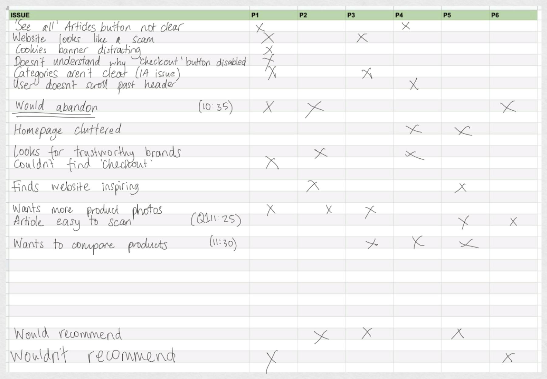
Let’s say you have a list of issues and a marker next to each issue to indicate who experienced that issue. You can take this list of issues, transfer them to sticky notes and move them around on a wall or desk to cluster the notes in themes. Then, if you have a presentation or report, you can quickly build together a skeleton of themes and issues.
Visualizations while analyzing data
Analyzing data in visualizations is one of the most experimental and fun parts of research. These visualizations tend to be short-lived and for personal use, so you don’t have to worry about maintenance or interpretations from untrained eyes. The trick here is to ask yourself what answers you need to uncover, and then try quick and simple visualizations to see which ones help you draw out this information.
4) Action maps
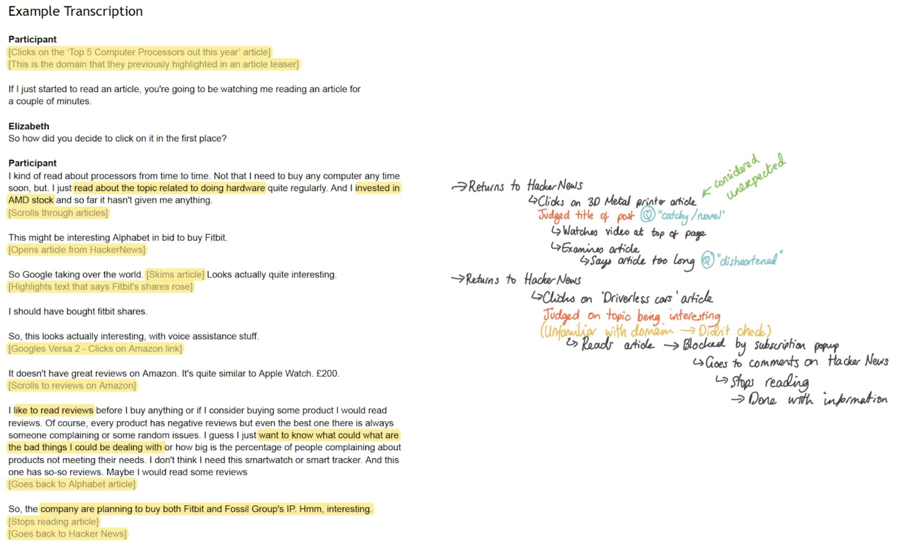
An action map is where you take your transcript and strip out the speech, leaving only the actions, reasons, and journey. This leaves you with a linear map of what happened in a session. For example, you'd see the websites visited, buttons clicked and decisions made, so that you can pull out behavioral patterns per user and across participants.
This type of visualization eliminates the distractions of "ums," "errs," and other unnecessary dialogue, allowing you to concentrate solely on users' actions. Document each action and support it with the reasoning behind it, users' feelings, and direct quotes.
To facilitate comparison and identify behaviors across multiple participants, use consistent summaries or tags for each action map. Consistent summaries help patterns emerge more clearly, while supporting quotes provide deeper insights into the specific reasons behind users' actions.
5) Affinity mapping
Affinity mapping is a more involved method, using sticky notes, walls, and usually collaborators to cluster insights into themes and obtain an overview of findings.
Affinity mapping is also referred to as ‘collaborative sorting’ as it’s a great technique to work with others to visualize, organize, discuss and prioritize everything so far. This technique leaves you with a richer understanding and organization of your data, using multiple data sources and not just notes from a session.

Visualizations for presenting data
The next stage comes with a new set of challenges. User research is rich with details leading up to insights that build into user stories. How do you convey the stories in the right amount of detail to those who base important business decisions on the research and have little time for the full picture?
The key to effective visualizations is to make them concise and digestible. Presentations or blog post-style reports are ideal for providing a linear narrative, guiding the audience through the information step-by-step. This approach ensures that the content is easy to follow and understand, enhancing engagement and retention.
6) Presentations
The benefits of visualizing research via a presentation are that they're easy to share, are a widely understood format, and take users through the story in a linear way. This is likely the first visualization you'll use where the audience is not usually researchers or designers.
Start with an executive summary followed by recommendations based on the insights, regardless of whether it’s more research or designs. This will help people first go through what they need to and then decide if they want to read further details.
Longevity is also an important theme for presentations of research, so adding details like dates, who conducted the research and the strategy employed is important. This provides context for readers who join the company after the research was done and the researchers running the project move on to new employment opportunities. Proofread the presentation as much as possible to limit confusion.
Visualizations for storing data
When storing data, longevity and context are crucial in deciding how to visualize it. Text visualizations offer excellent indexability and searchability, making it easier to locate specific information. Video provides the most accurate record of events. However, both mediums can be cumbersome and time-consuming when extracting highlights for future related research questions. To optimize data retrieval, consider combining concise text summaries with relevant video snippets, ensuring a balance between detailed accuracy and ease of use.
7) Tagging
There are tools dedicated to helping visualize data from any source. UserTesting smart tags offers an effective approach to storing, tagging, visualizing, and sharing research. It also provides an almost automatic thematic analysis based on the tags you create.
The world is your oyster with how you tag data, which is its biggest advantage and disadvantage. There are many challenges that come with tagging insights, from designing your taxonomy to creating your mindset of how to tag. So, I've picked two methodologies of tagging, each with scenarios of when these techniques work best.
a) Query filters
The first method involves using tags as a way to filter highlights. Think about what people are asking and how they would logically combine queries to find specific highlights. Extract repeated intricacies in research questions and convert them into tags
Common questions include:
- How do people browse on mobile?
- How do people search on desktop?
- Why do people want to share?
- What do people share?
- What competitors do people use?
- What do people want to see on the homepage?
The bold words translate into individual tags that can be used alone or in combination, allowing users to build a query and retrieve the necessary research. This approach offers maximum flexibility.
However, the downside is that most tags will be very detailed, often making them less useful on their own. While tags like ‘mobile’ would include all mentions of mobile, providing comprehensive information, it can be long-winded.
b) Individual Insights
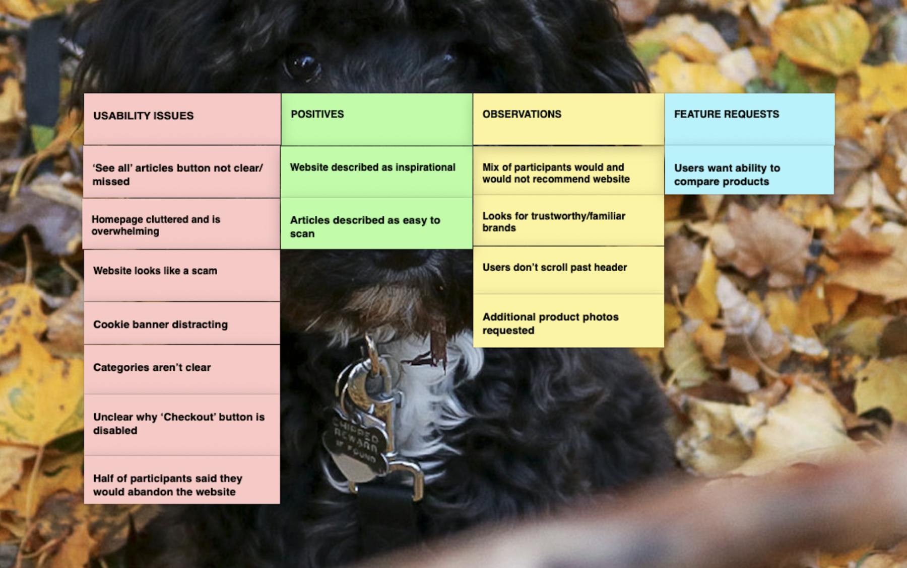
The second methodology involves creating tags that provide insights on their own. For example, if the research question is, "What are the usability issues in our product?" using tags that only work in combination isn’t practical. Instead, tags like ‘usability issues’ or common themes like ‘positive’ or ‘negative’ comments fill the gap in your research repository.
The number of highlights with these tags also becomes meaningful, unlike combination tags. This helps in roadmap planning by identifying top-mentioned usability issues or feature requests to address in upcoming sprints.
Overall
These tools help quantify insights, translating them into business language. Stakeholders appreciate numbers. The frequency of tag usage provides insights into how often a topic is mentioned, the themes frequently discussed, and the timeframes in which these insights appear. This data, combined with the insights, supports business needs like product road-mapping, as tags highlight priority and urgency.
In Summary
There are endless possibilities of how research can be visualized. Remember to make sure you've asked yourself what the visualization needs to do to succeed. Know who you’re designing the visualization for, why you’re creating it, and the questions you’re answering.
Ideally, visualizations are designed to last as long as necessary. No matter the visualization, include as much context as possible. Even if it’s only being used by yourself, don't forget that you next month and you in a year’s time are different people and may need different contexts. Be sure to include details like dates, names of those who played a role in the project, and any methods or techniques used. Follow these and your visualizations will last you and those who follow in your footsteps a long time.
On-Demand Webinar: How UXR Leaders Can Shape the Role of Research in the Age of AI
Explore how leading UX Research teams are evolving from a service model to becoming strategic insight leaders.